Project Scope
Brand strategy
Repositioning
Visual identity
Verbal identity
Brand signature
Creative concept
Storytelling
Integrated communication campaign
Challenge
Vianas is a Portuguese company with more than 40 years of experience in safety and protection.
It began by serving firefighters and civil protection, and progressively expanded into industry, engineering, technology and consultancy.
For decades, its communication made perfect sense: it was organised around products and business areas.
If a fire brigade needed new suits, Vianas supplied them. If a factory needed fire extinguishing systems, Vianas installed them.
But the world changed.
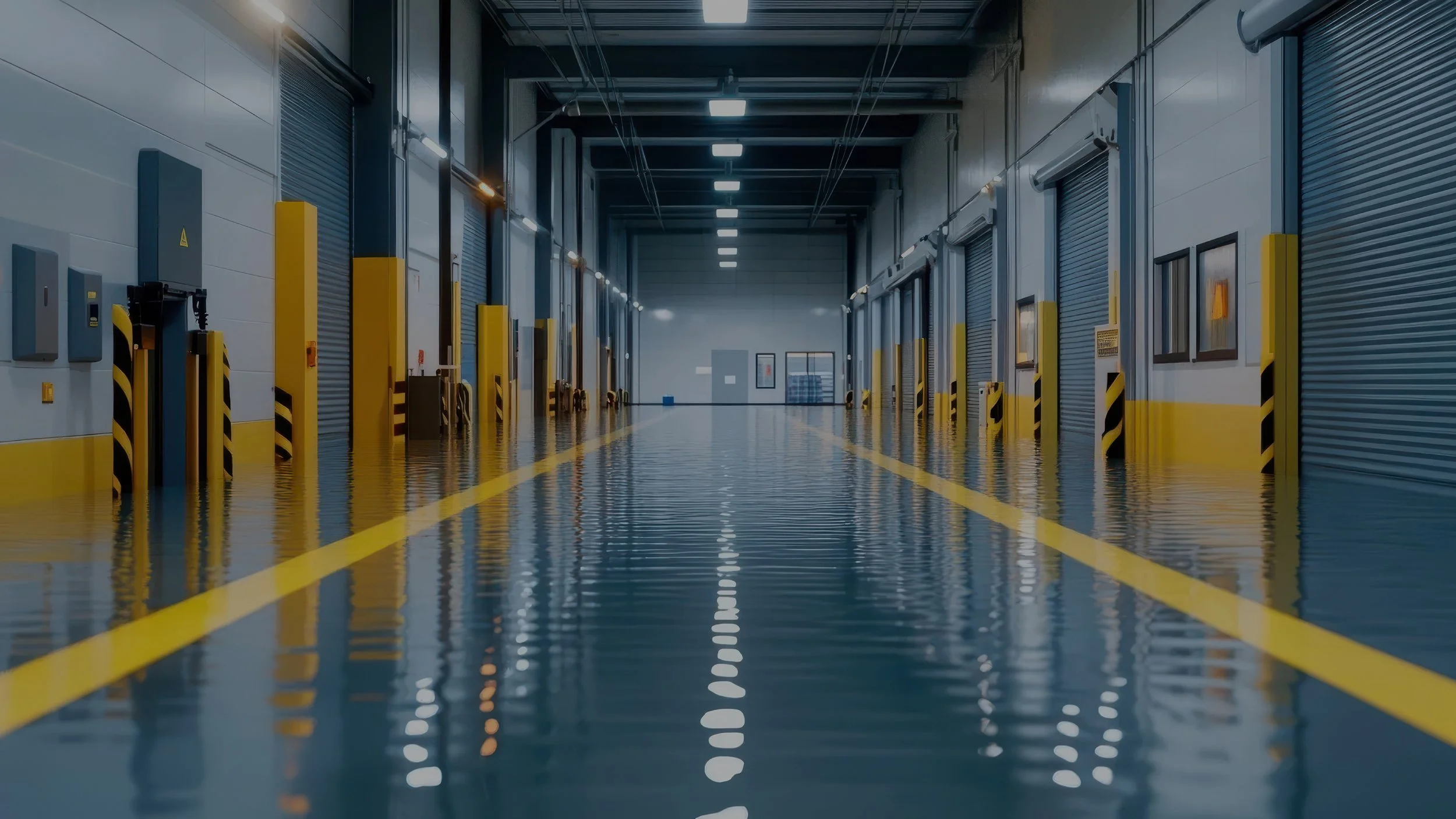
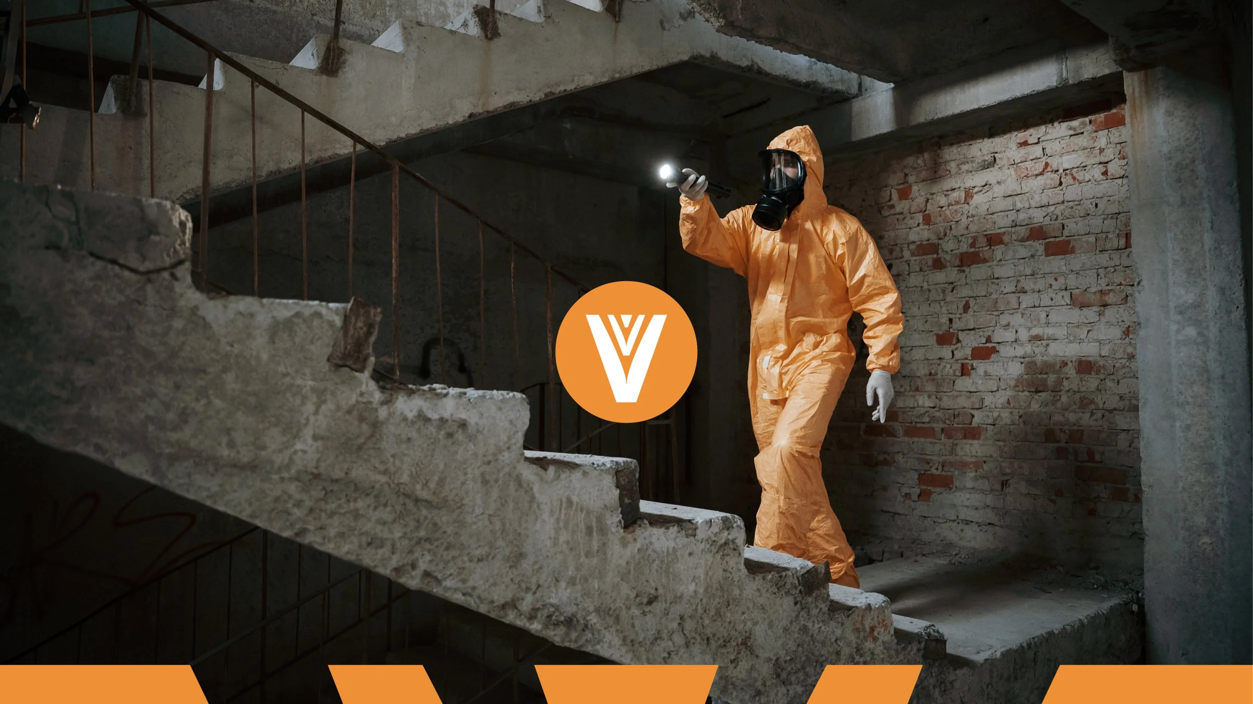
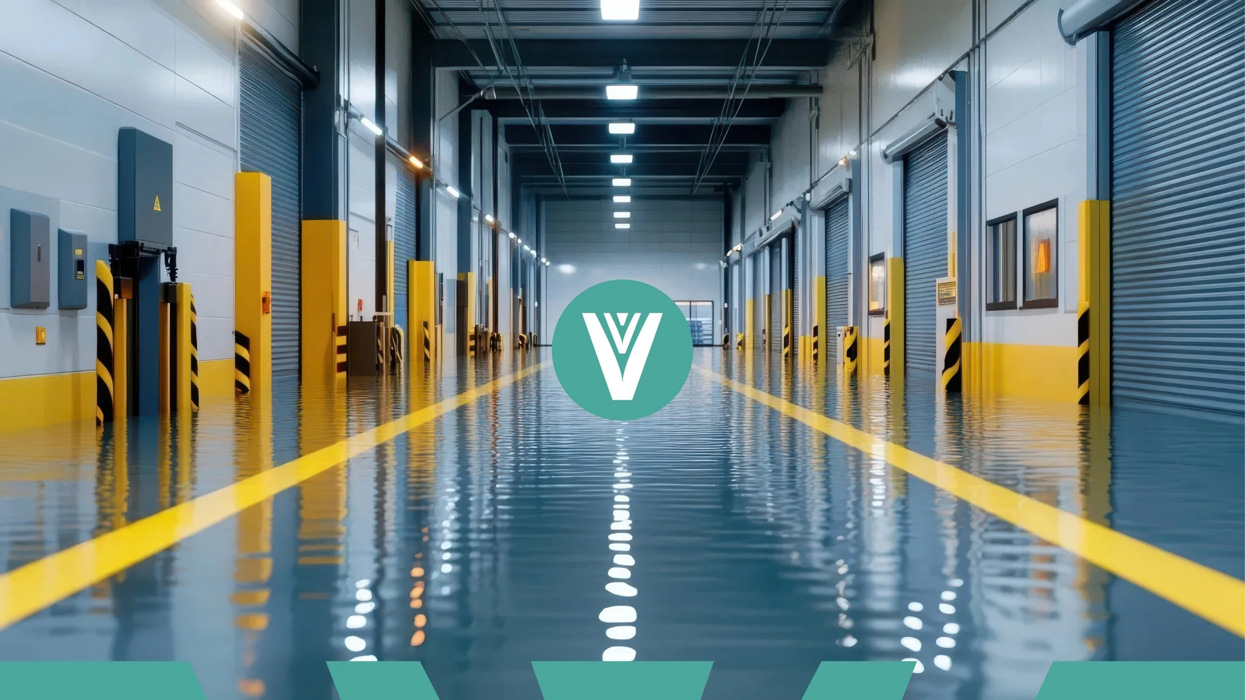
Today, risk no longer comes from one direction. It multiplies, accelerates and overlaps. Fire, floods, theft, gas leaks, industrial accidents, extreme weather events — threats now emerge everywhere, all at once. In this new context, reacting is no longer enough.
The real challenge was helping Vianas move from a reactive mindset to a proactive one — from answering needs to anticipating risks.
The question we were asked was not how to refresh a brand, but how to reposition an organisation that had outgrown its own narrative.


Work
The Strategic Leap
The key strategic move was changing the point of view.
Instead of asking “What does your company need?”,
we reframed the conversation to “What threats does your company face?”
This subtle shift completely transformed the brand’s logic:
from products to threats,
from areas of business to real-world risks,
from reaction to anticipation.
Going forward, Vianas would organise its offer around the threats its clients face — fires, floods, theft, climate events, industrial hazards — and only then recommend the most relevant products and services.
This repositioning naturally led to a rebranding.
Not as a cosmetic exercise, but as a consequence of a deeper change in mindset.
The Creative Challenge
The Blue Colour
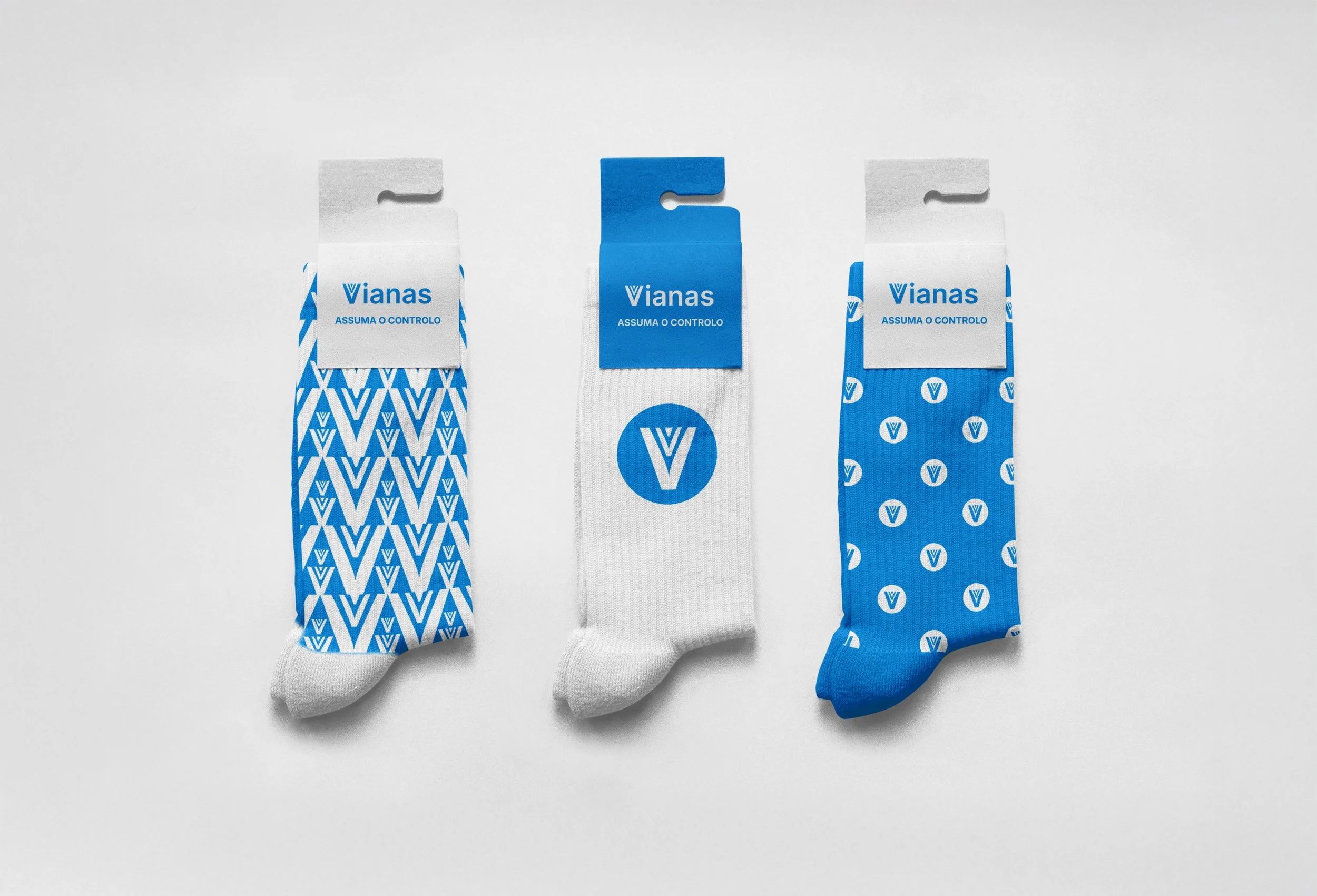
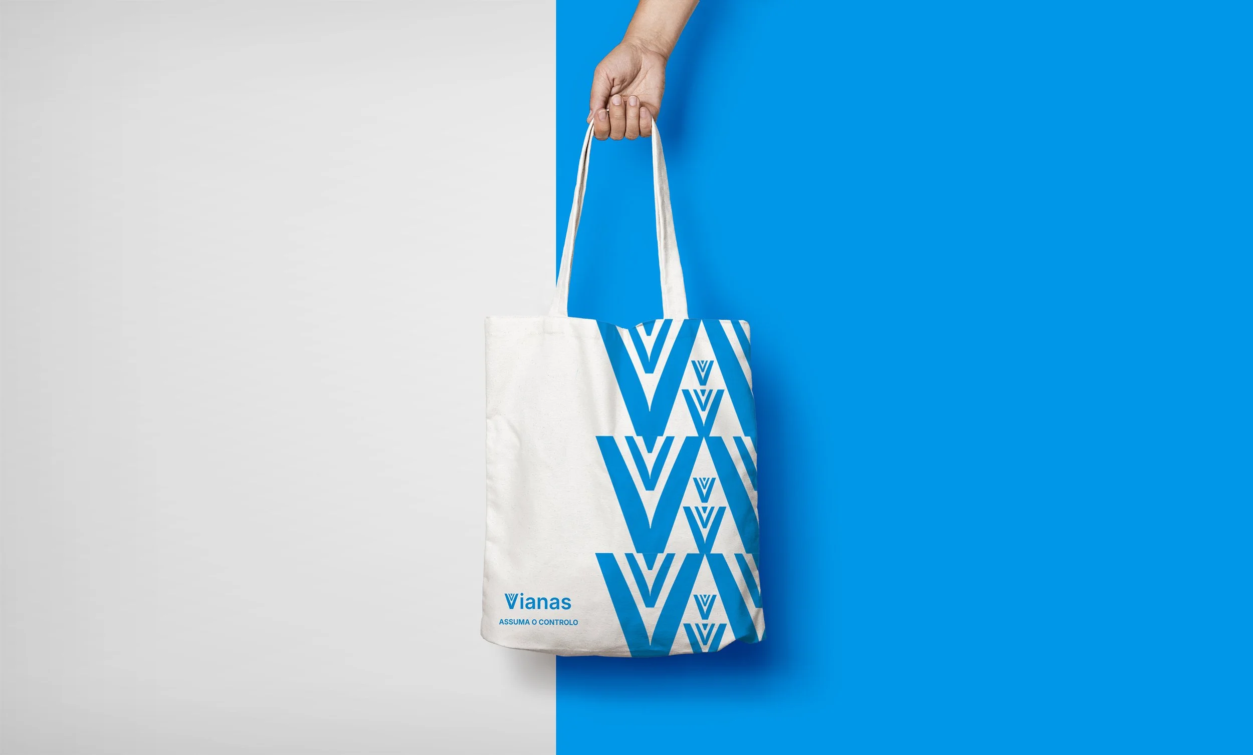
We chose a positive blue as the core colour of the new identity.
A blue that conveys serenity, trust and control — essential values in a world defined by uncertainty and risk.
It reflects calm decision-making under pressure and confidence in preparation.
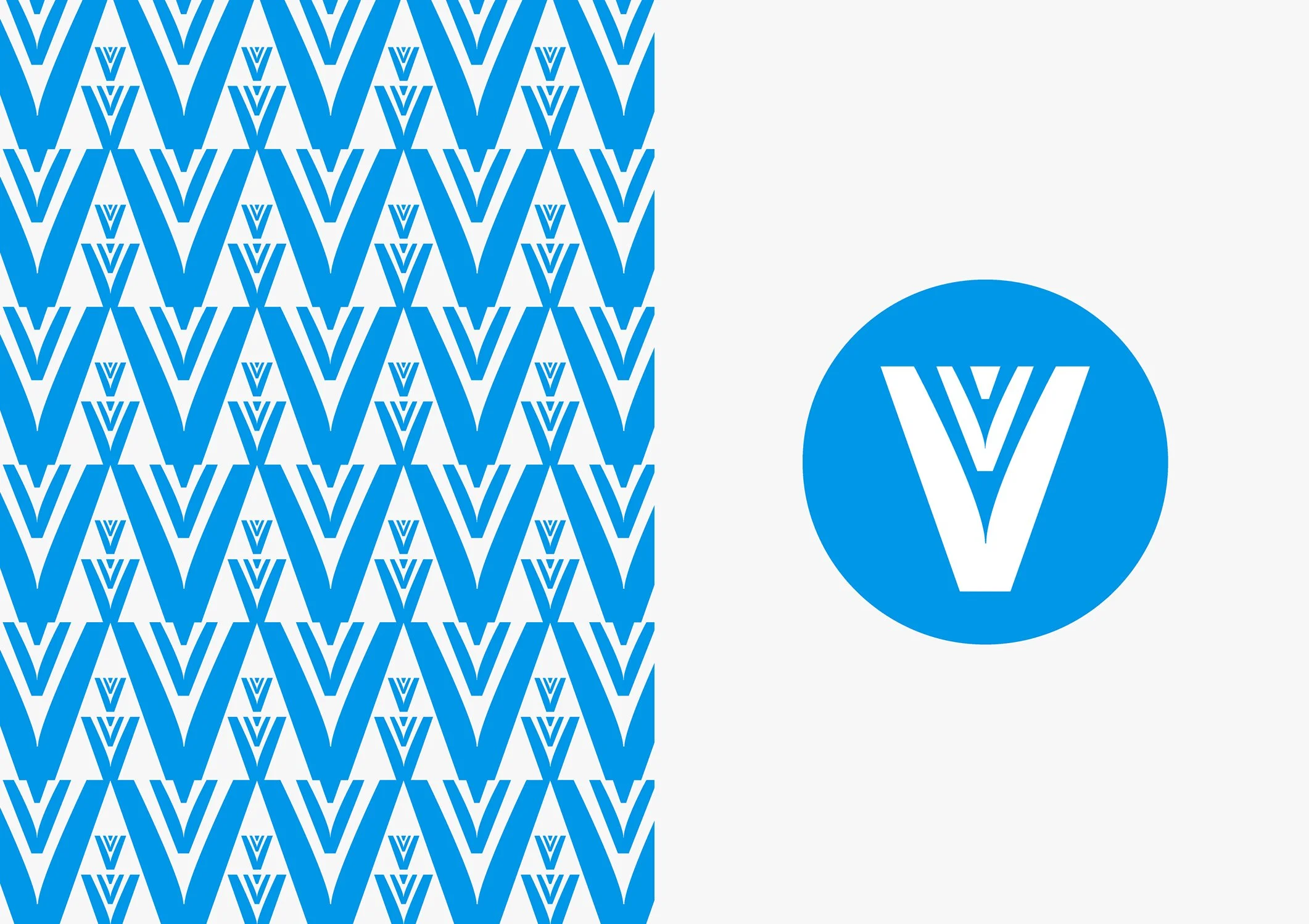
The Symbol: a V made of Vs
Vianas has always shown an exceptional ability to multiply and adapt.
From firefighters to industry. From a few people to many. From local partners to a strong professional network.
That idea inspired the symbol: a single V built from multiple Vs.
It represents plurality, collective strength and unity — many forces working as one.
Typography
The typeface was selected to balance technical precision with contemporary clarity.
Modern, structured and readable, it supports the brand’s move towards a more strategic, future-facing position without losing credibility or rigour.
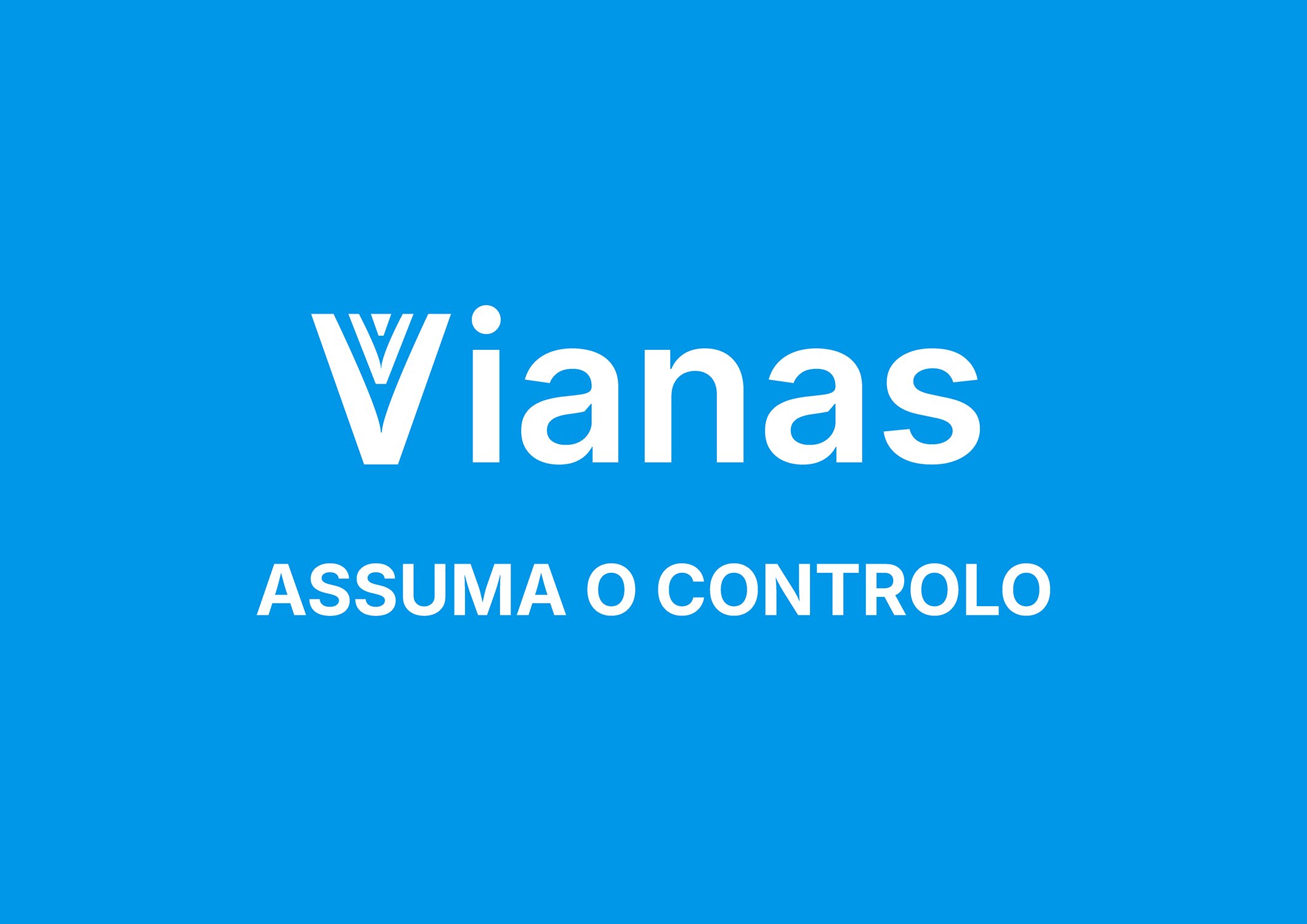
The New Signature
Vianas. Assuma o Controlo. (Eng “Take Control”)
More than a tagline, it is a statement of attitude.
It invites clients to move from fear to preparation, from uncertainty to control — with Vianas as their partner.
Brand Voice
The new voice is confident, calm and human.
It speaks about safety without alarmism, about risk without fear.
A voice that reassures, guides and empowers — because anticipation requires trust.
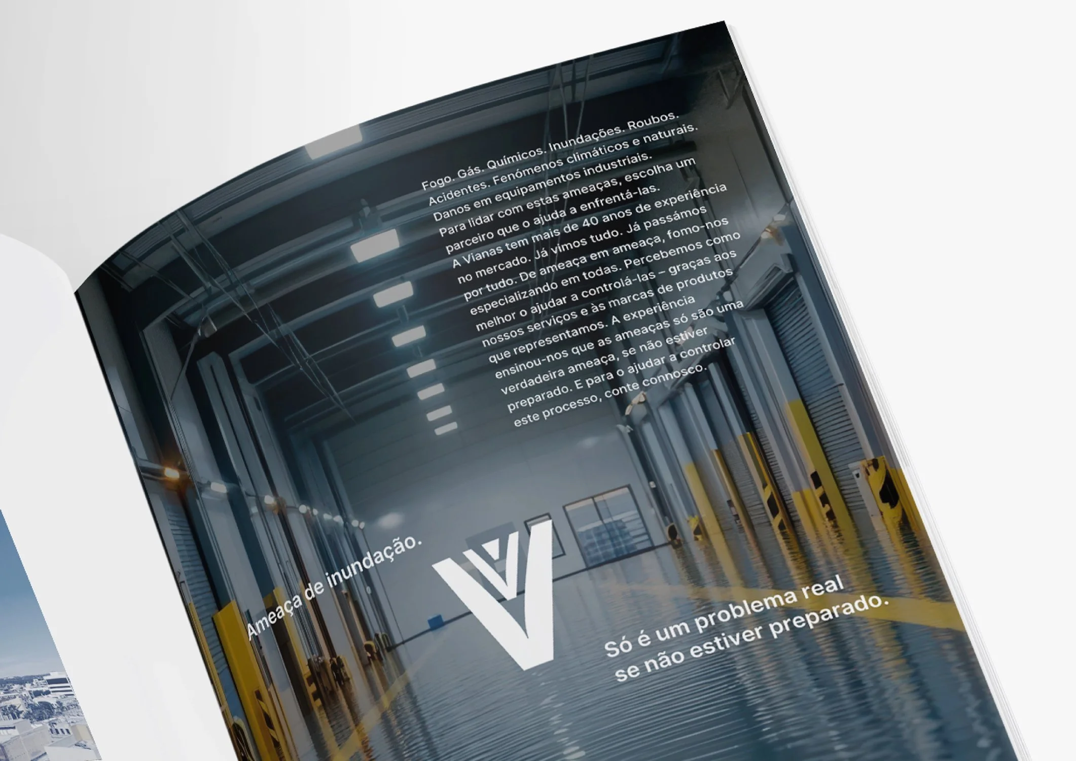
Press Campaign
The press campaign reinforced the same logic:
threats are only real problems if you are not prepared for them.
By framing communication around real-world risks, the campaign positioned Vianas as a strategic partner rather than a simple supplier.


Client Feedback
"Thank you Wonder\Why (wonderful team) for your trust, support and empathy. The path you paved made all the difference! It was a privilege to walk with you on this project, with sharing, courage and a tremendous sense of teamwork. Thank you for believing and taking control with Vianas!"
Pedro Correia, Comercial & Marketing Director