
THE BACKGROUND
Azerbaijan is a country at the intersection of Europe and Asia, bounded by the Caspian Sea and the Caucasus Mountains. No wonder this country is in dire need of transportation. That’s why Azerbaijan has two airline cargo companies: Silk Way Airlines (SWA) and Silk Way West Airlines (SWWA). They both transport merchandise, not people. They’re both a part of Silk Way Group (SWG) – along with Silk Way Technics (SWT), which provides the technical support. It’s called Silk Way because the legendary silk road, a trade route which for millennia connected the Empire of the East (China) and the Empire of the West (Rome & Constantinople), crossed Azerbaijan.
Silk Way Airlines (SWA). This company was created first. Azerbaijan had just become independent, a sovereign nation, cutting the umbilical cord with former Soviet Union in 1991. But political independence required economic independence. To ensure this, the country needed an airline company with the ability to move cargo throughout the South Caucasus region. SWA was hence born in 2001. With a regional focus.
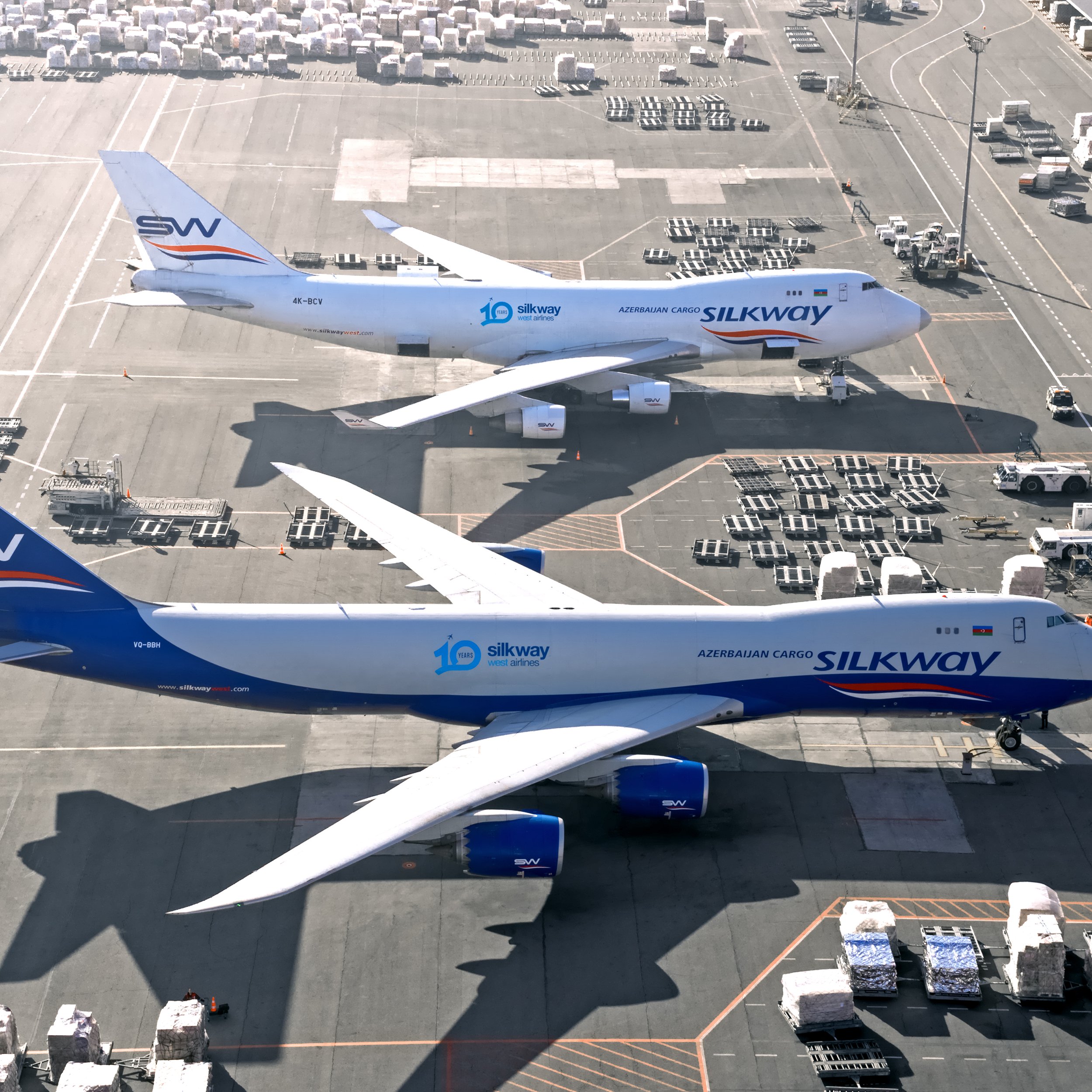
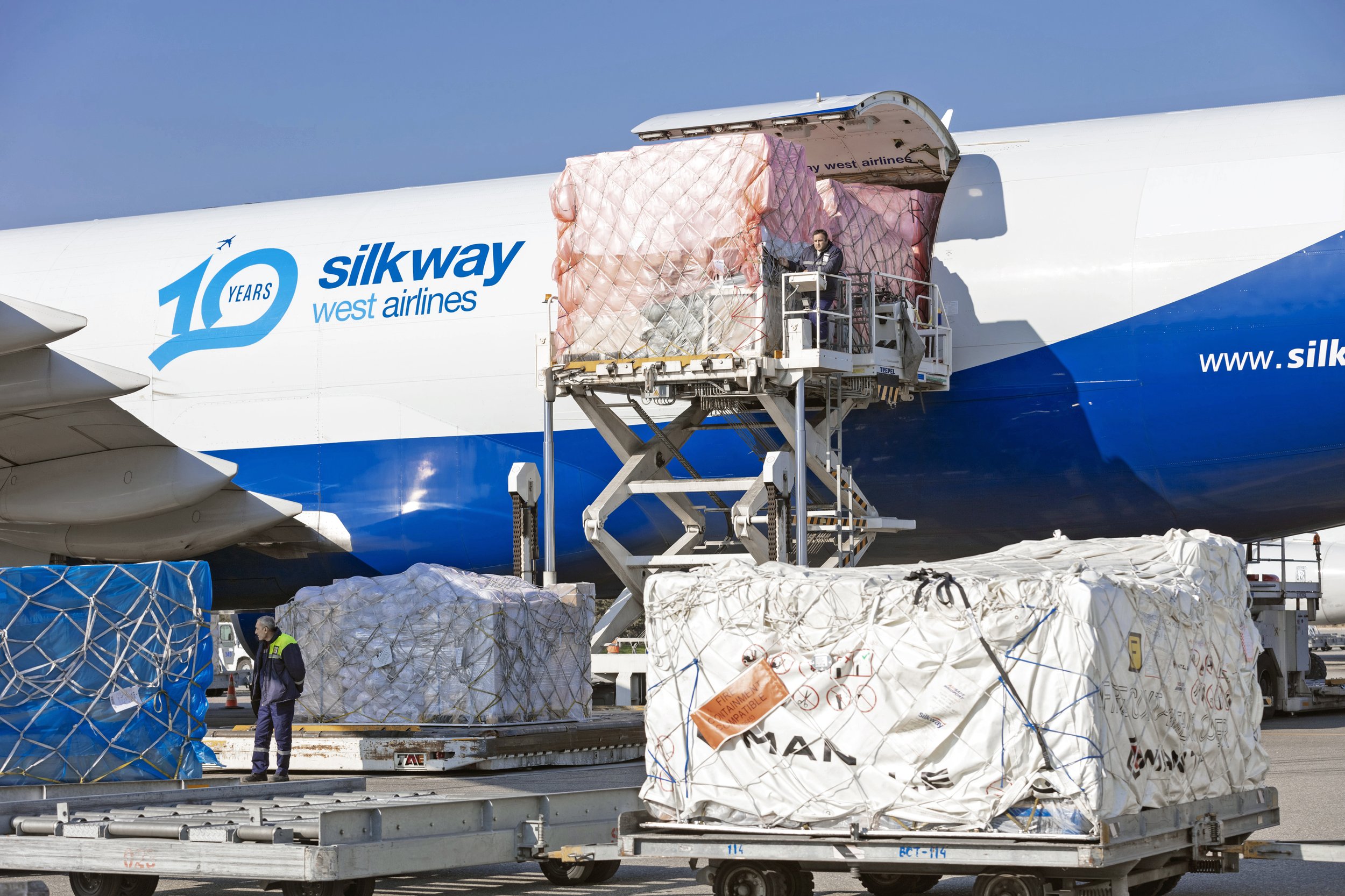
Silk Way West Airlines (SWWA). Its purpose was slightly different. Launched 11 years after SWA, in 2012, it operated in the same business, but its scope was much wider. SWWA wanted to cover the globe. It quickly became the largest cargo airline in the Caspian Sea region, operating around 350 monthly flights across Europe, Asia, and the Americas.
THE CHALLENGE
Silk Way Group was content with the logo it had for both companies and for itself. But a logo is not a brand, and SWG wanted the real thing: an all-powerful brand with a true brand universe. Wonder\Why’s challenge was to conceptualize it, expand it, modernize it, make it bold, and, above all, make it consistent, the trademark of a true great brand.
If ‘expansion’ was the first phase, ‘continuity’ would be the second. Typically, agencies get credit for creating the brand’s ID, and don’t really care about what happens next (“not my problem” attitude). But it’s the follow-up that truly creates the brand. It’s the continuous relationship with people that allows for the brand to establish itself inside the collective mind – and that’s what a brand is, an idea about a product running in the collective self.

THE CREATIVE WORK
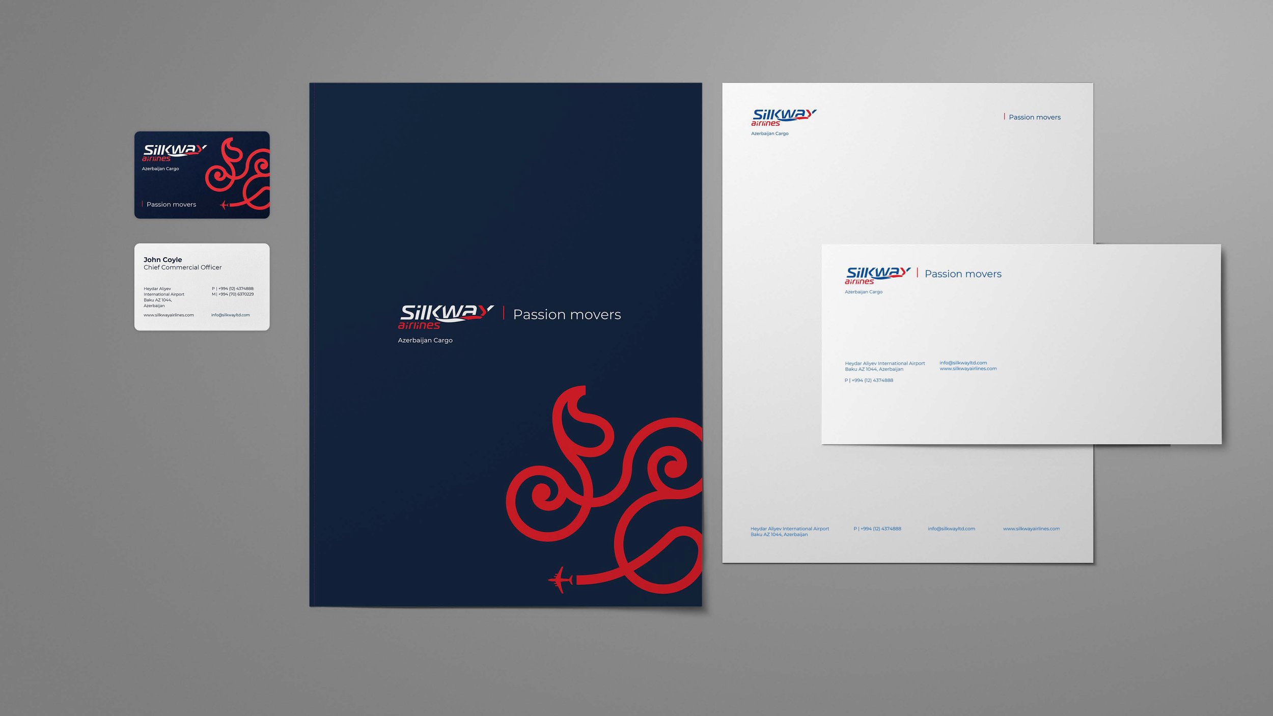
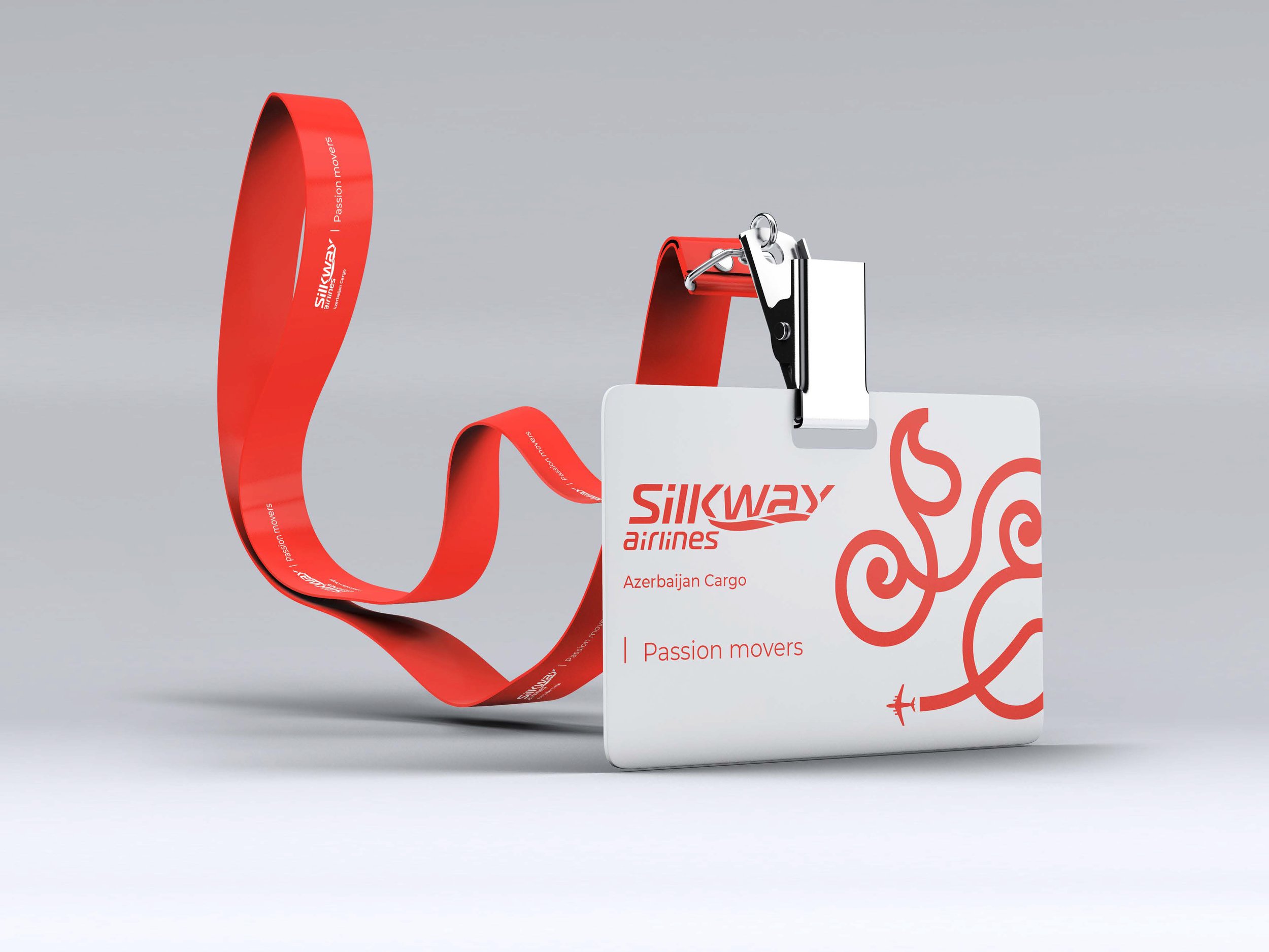
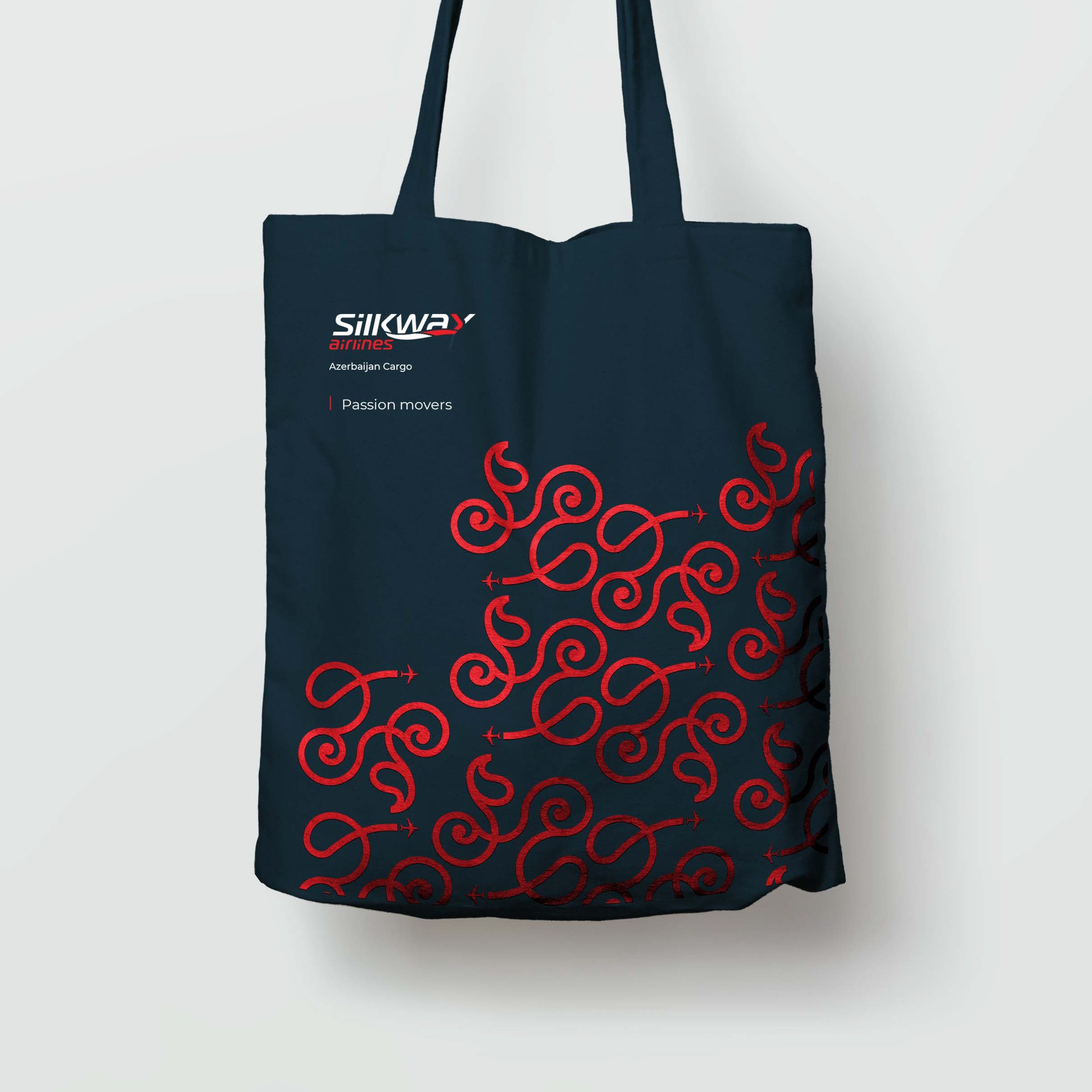
1. Silk Way Airlines
Outputs: brand book + look & feel + tagline + brand voice
Tagline: Silk Way Airlines. Passion Movers.
Brand voice: “Passion is an intense primal human emotion. It deeply connects people to a purpose. Passion makes people move projects, businesses, countries. Azerbaijan needed its own air cargo company as part of a wider strategy to establish its economic independence and relevance in the region, thus SWA was created. SWA was born out of passion for Azerbaijan. So every time SWA moves cargo, this cargo is moved by passion.The same applies to its customers. When they move their cargo, this movement is fuelled by the passion to do business, to create a network of clients & partners.”
Graphic origin: Silky Way Airlines logo starts as a graphic motion, which symbolically mirrors the mentioned above mythical silk road and is inspired by the very identity of Azerbaijan. It wants to draw its culture in a unique and powerful way. It aims to be the subject of conversations, to convey the passion and ambition of the brands.
Graphic inspiration: Azerbaijan floral carpets. The floral influence and tree designs are very popular in carpet weaving. They are often associated with the design of the tree of life. which represents the link between the 3 world levels of the ancient East: Paradise, the world of men and the world below. The idea of representing the axis of the world as a tree is very old and is found in carpets and many other art forms. The representation of the tree in addition to symmetry, comprises spiral tree branches.


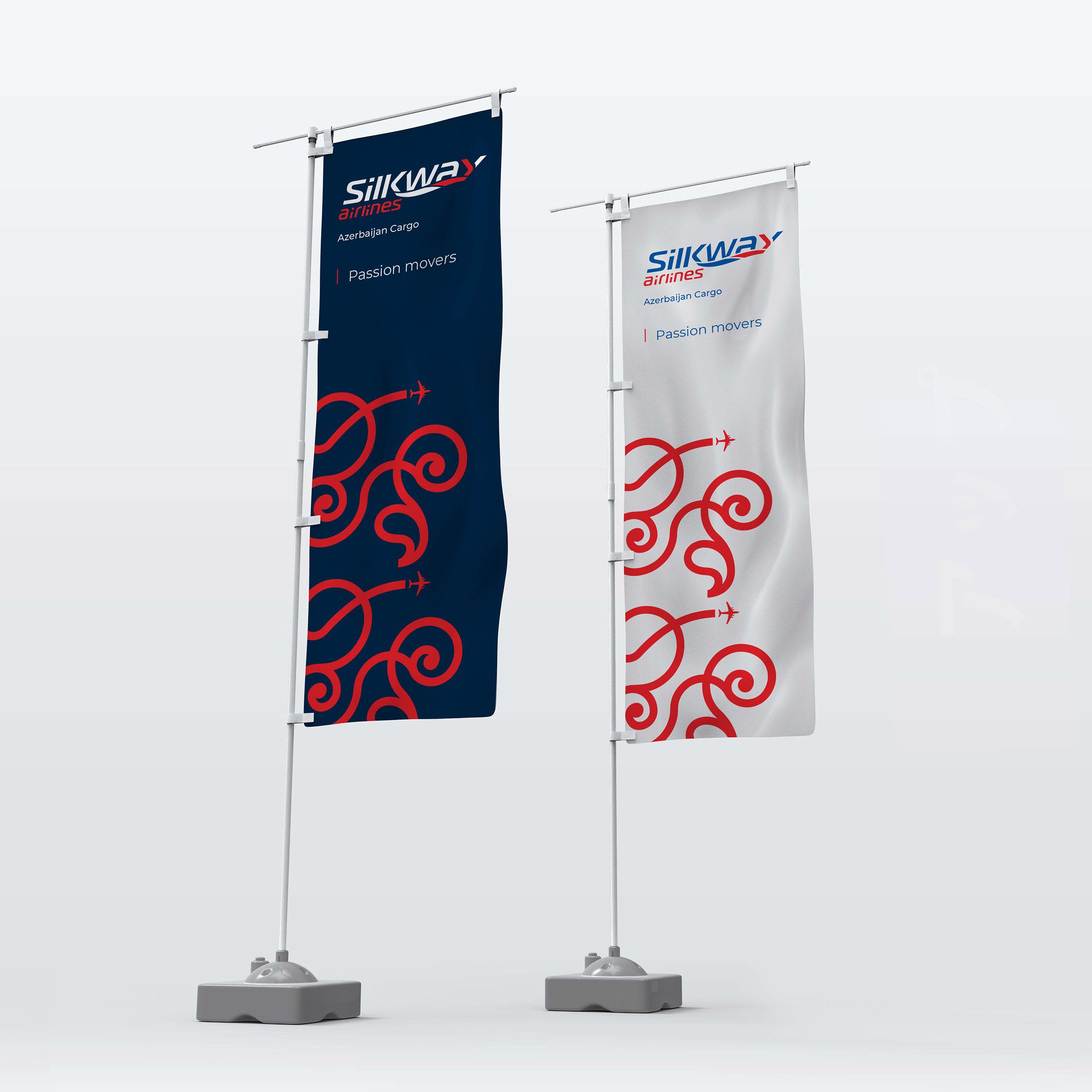

2. Silk Way West Airlines

Outputs: brand book + look & feel + tagline + brand voice
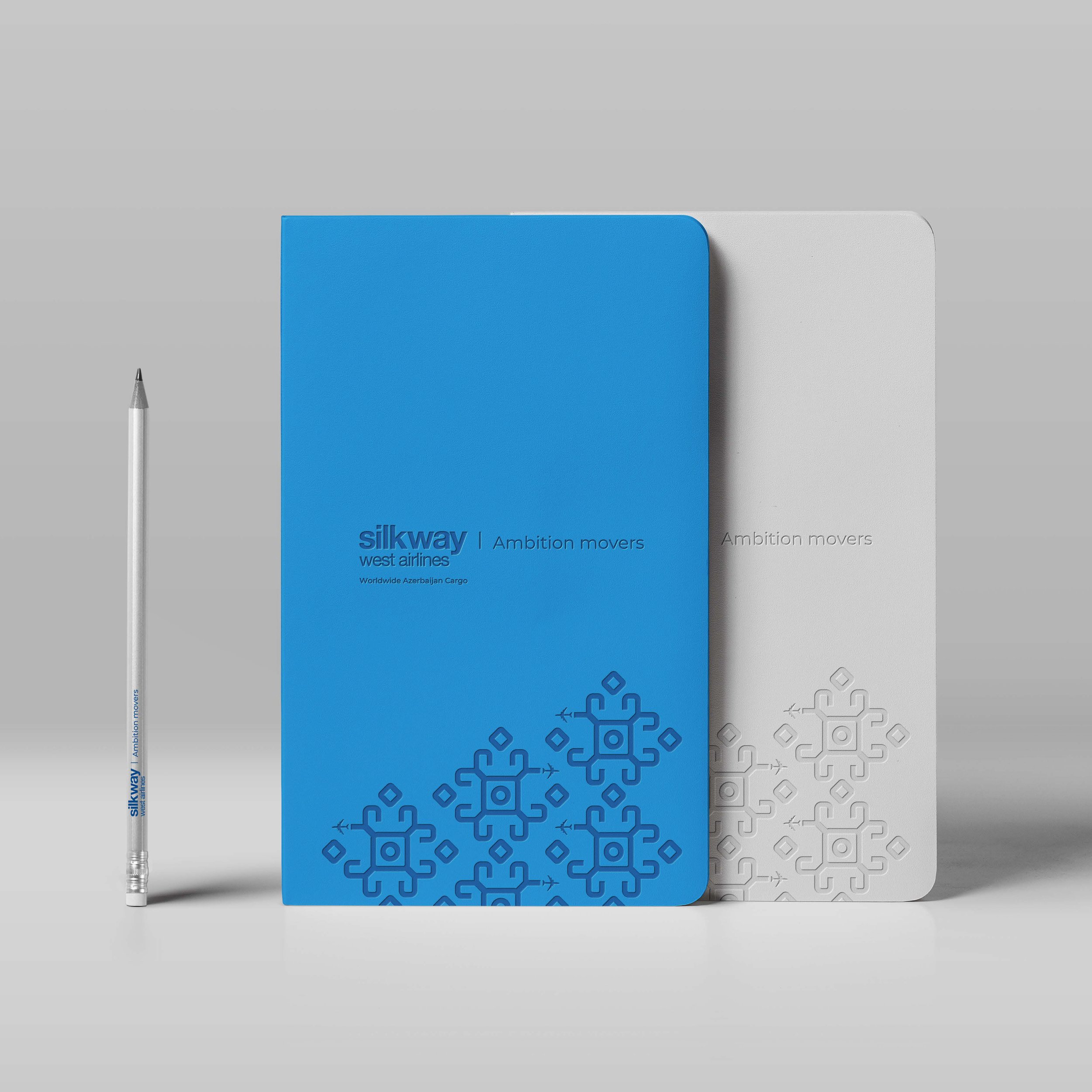
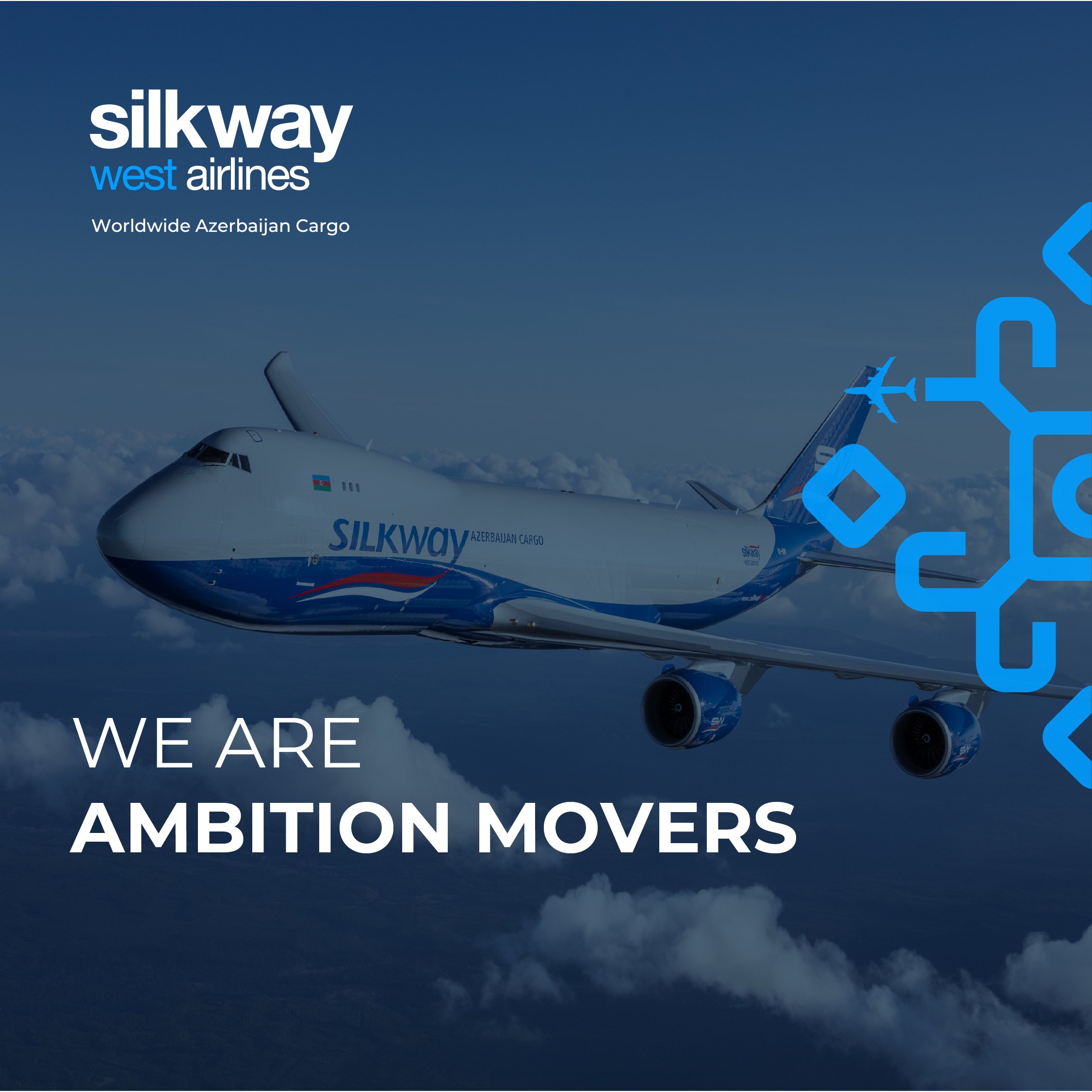
Tagline: Silk Way Airlines. Ambition Movers
Brand voice: “If SWA was born from passion – 1st step –, once economic independence and relevance is established and became sustainable, SWG was able to implement the 2ndlogical step: the ambition to expand Azerbaijan cargo around the world; thus, SWWA was born. Every time SWWA moves cargo to different corners of the planet, this cargo is moved by ambition. The same applies to its customers. When they move their cargo, this movement is fuelled by the ambition to expand their business worldwide.”
Graphic inspiration: Azerbaijan Ram Horns & World Four Corners Carpets. These rugs have similar motifs interpreted as “ram's horns”, found in many Azerbaijan rugs. Sheep and rams were crucial as the main means of subsistence for Eurasian nomads, hence theirstrong symbolism. The ram's horns are a symbol of strength, power, courage, heroism,fertility, and wealth. The 4 arches represent the ram's horns, and the 4 sides symbolize the 4 corners of the world. This symbolism and meaning inspire the ambition established in the tagline, and also the brand’s graphic language.


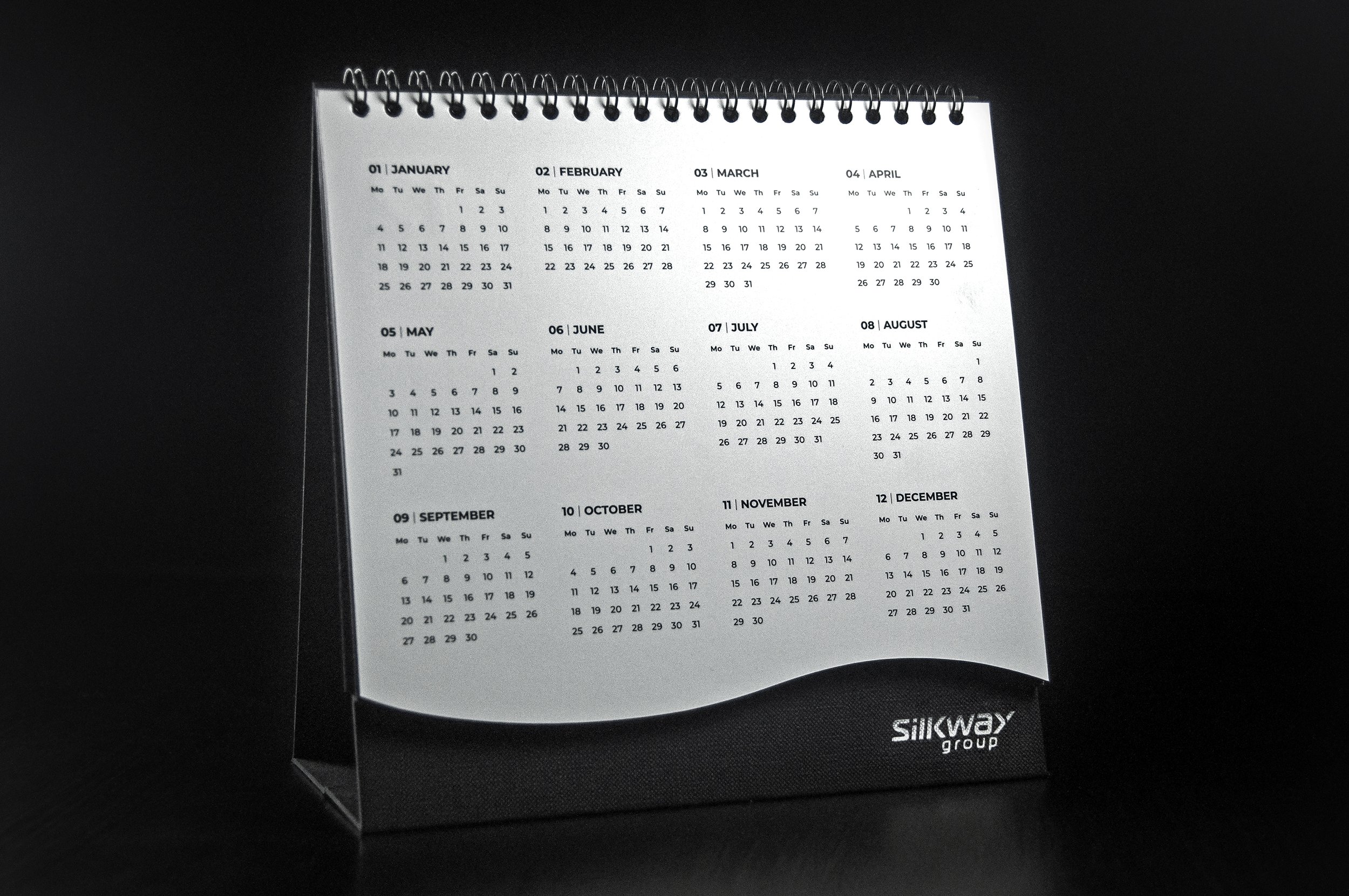
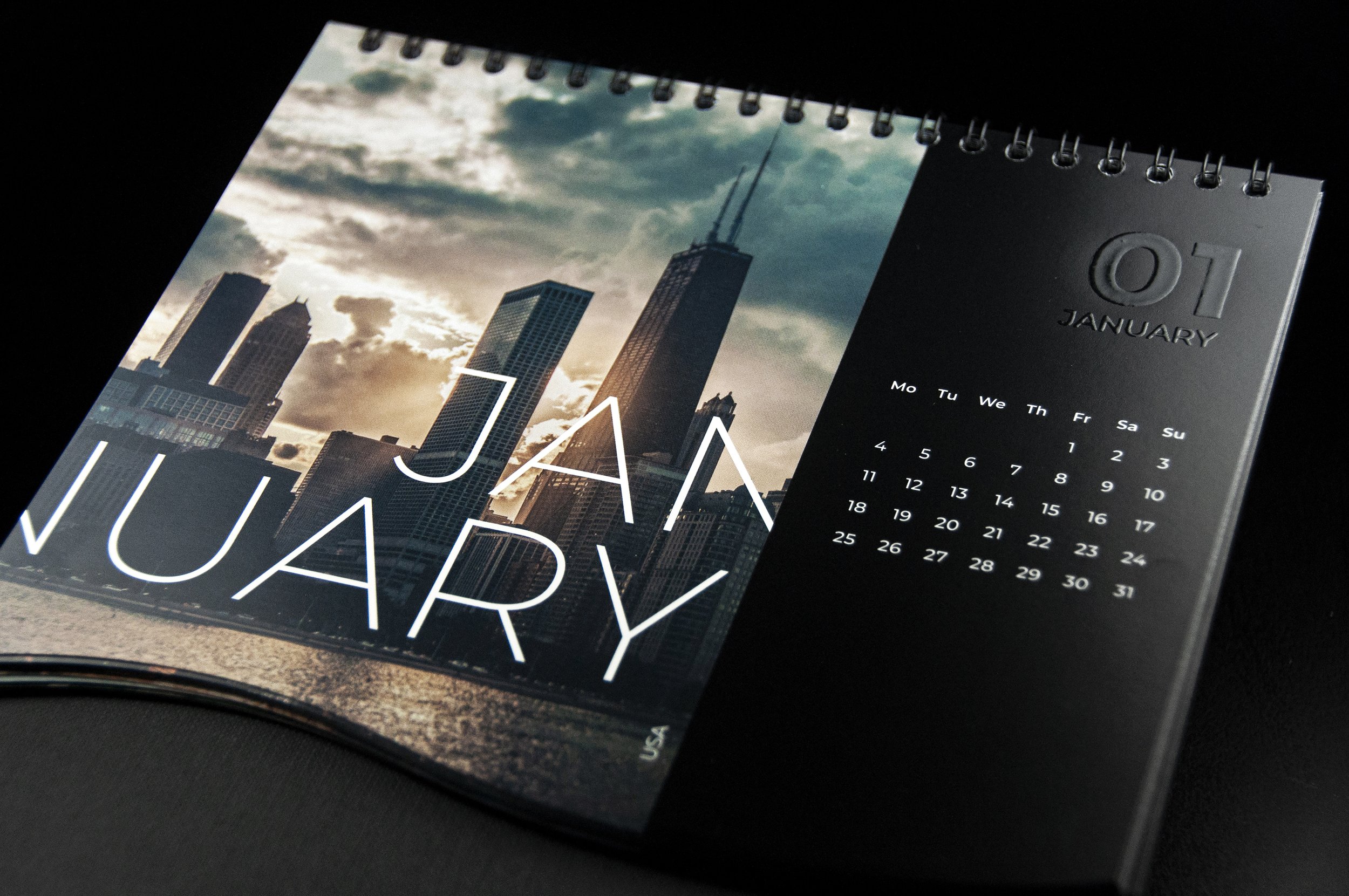
3. Calendar Design
Iconic brand merch. Highly coveted by employees, shareholders, and partners. Extremely valued as a personal gift.


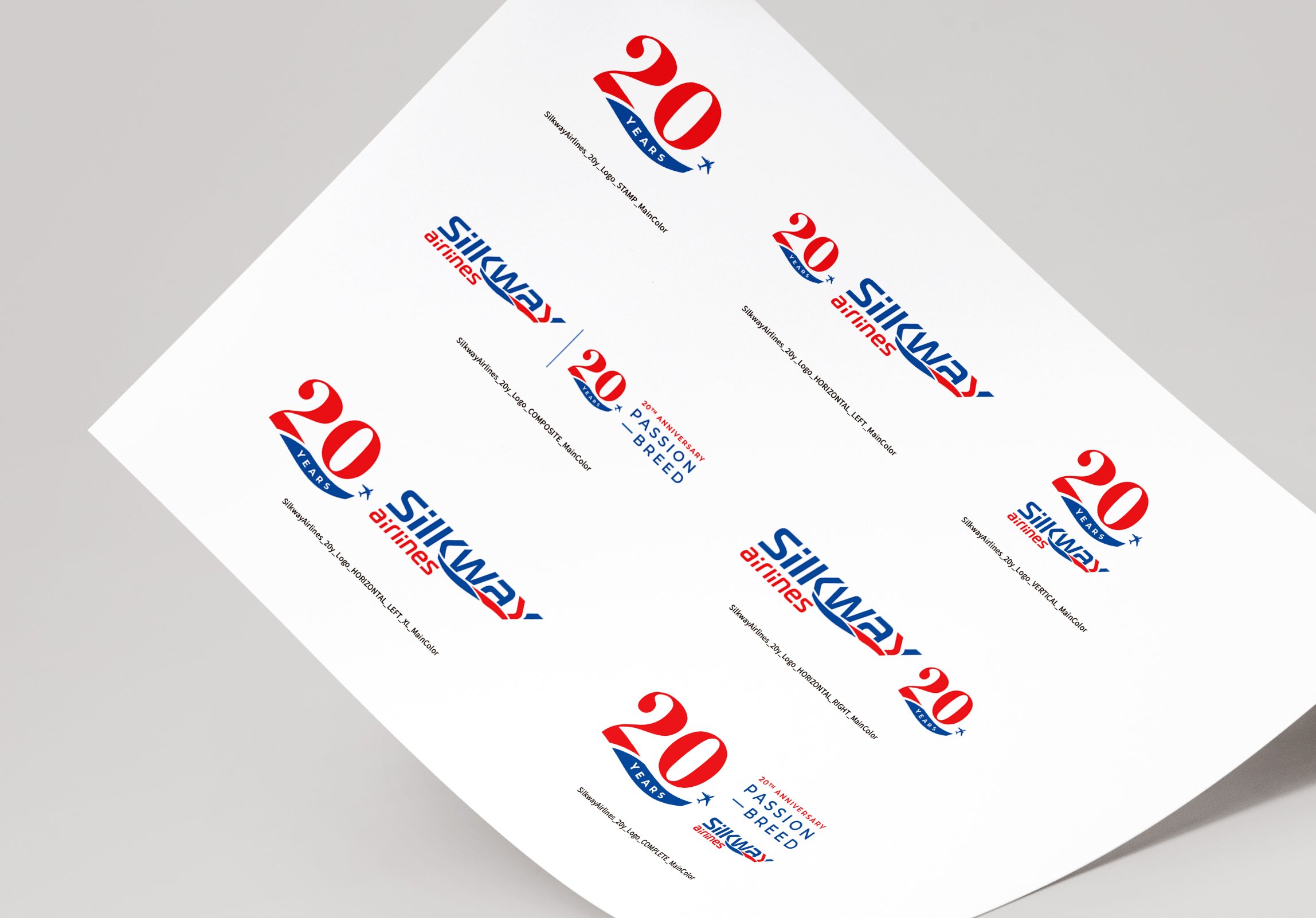
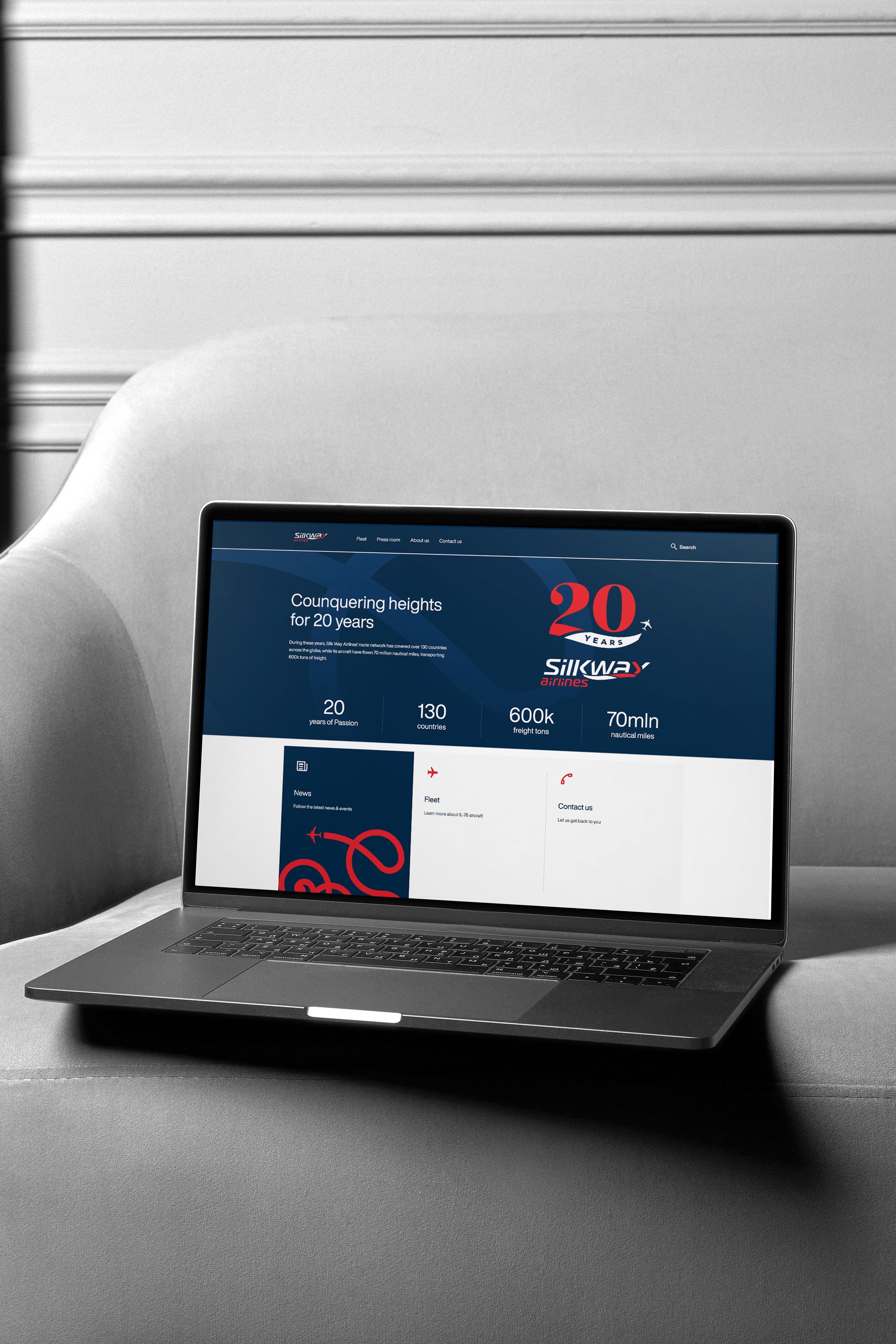
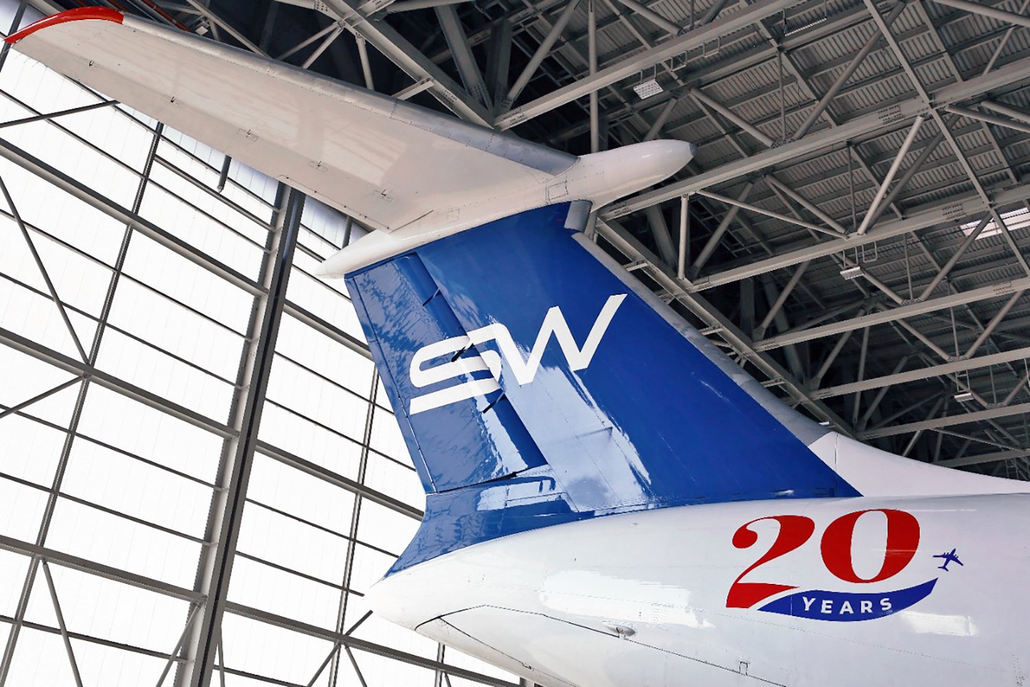
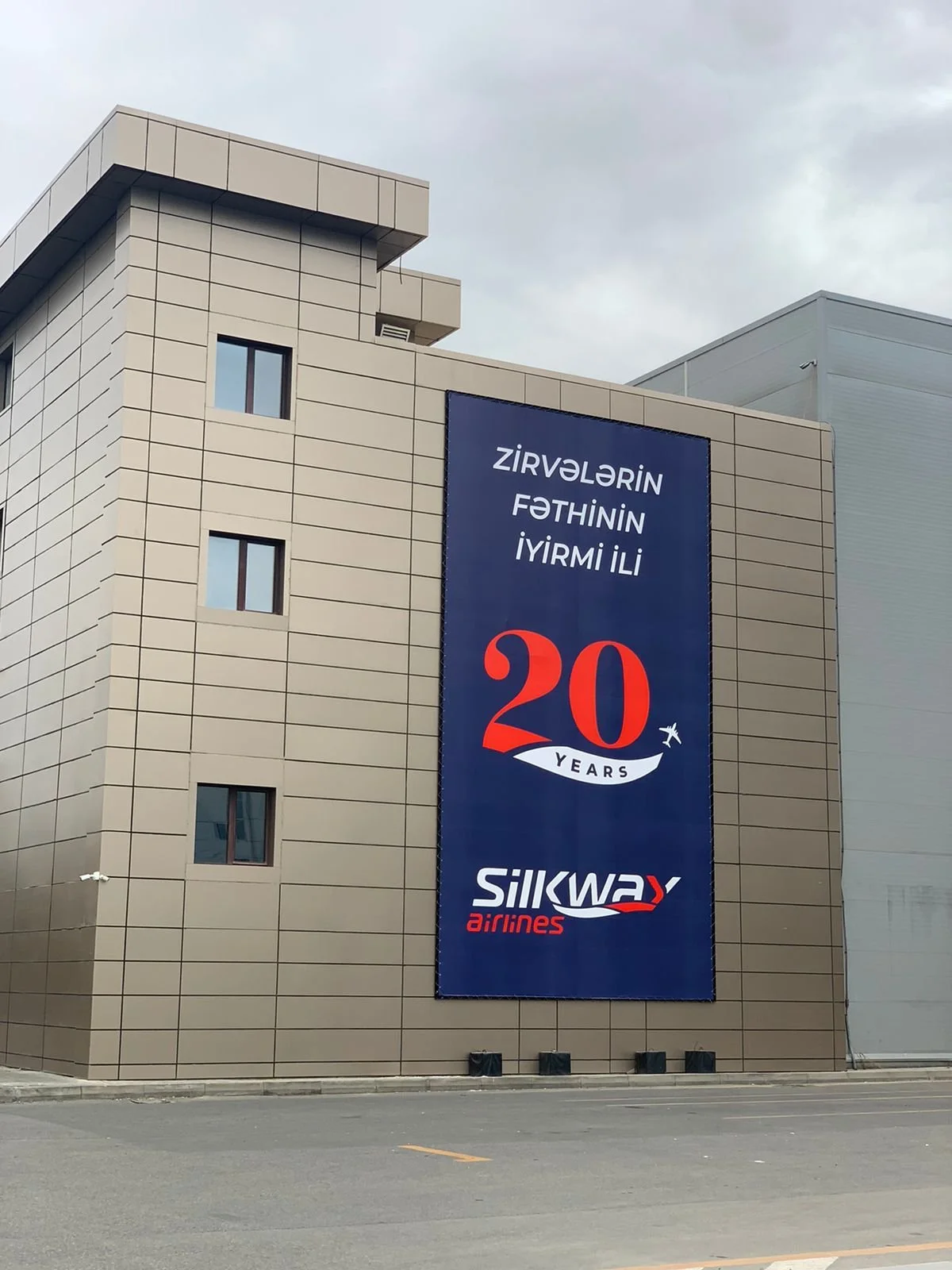
4. SWA 20th Anniversary

Graphic Idea: SWA story started 20 years ago. In 2001, SWA had a logo with a specific typography (lettering). In 2021, SWA has a different logo, with a graphic line below the name representing the movement of an airplane, the “silk way”. In the new SWA 20th anniversary logo, we wanted to show how 2001 and 2021 were united by this celebration. So we created a logo where the number 20 has a typography inspired in the lettering of the first logo. And below that number there’s a line inspired in the actual logo graphic line.
Tagline: SWA 20th Anniversary. Passion breed.
Brand storytelling: “Who would dream such a daring and risky enterprise, such as Silk Way Airlines, would live for 20 years and beyond? … Only a group of special people — a breed — could create such a pioneering project. These special people — this breed — were made by passion. They were PASSION BREED. SWA must never forget who they were, who they are, and in this very special anniversary celebration, this tagline is the perfect place to honour them, and to keep their legacy alive.

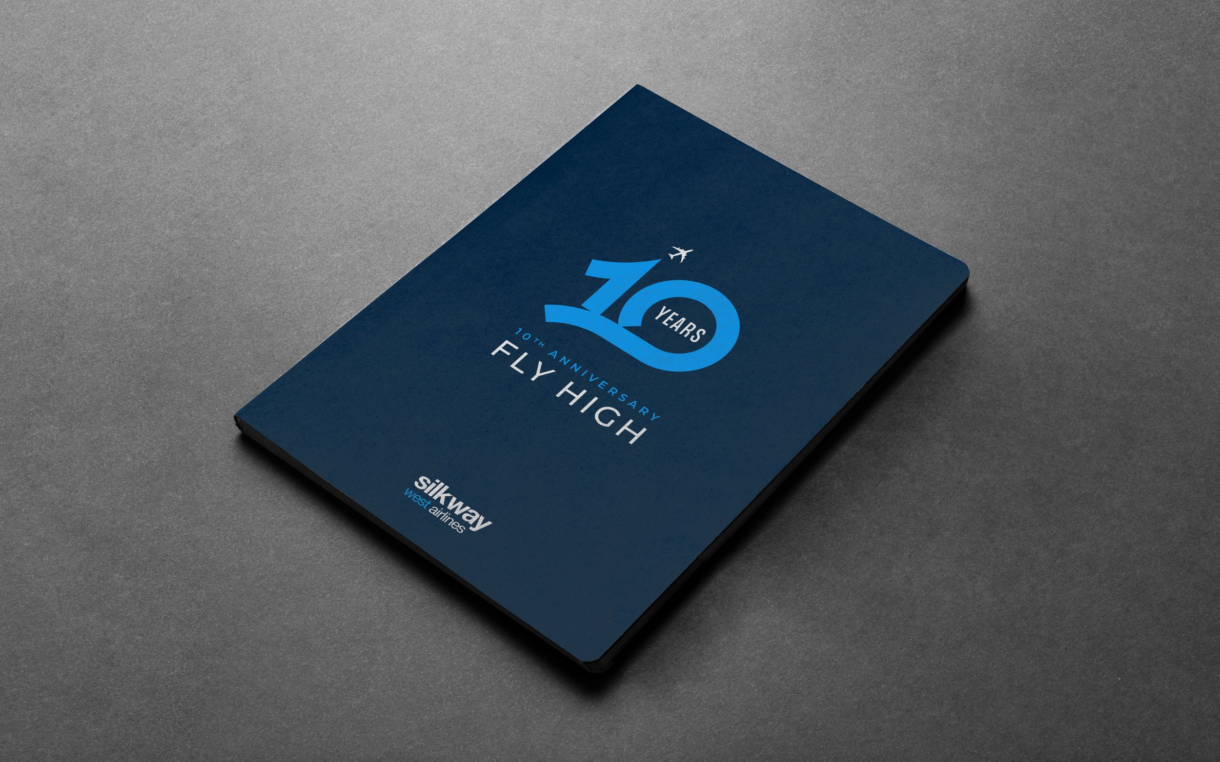
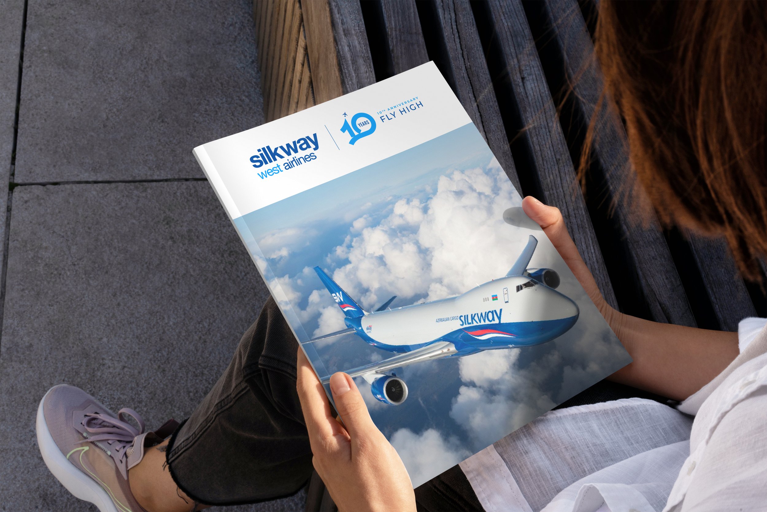
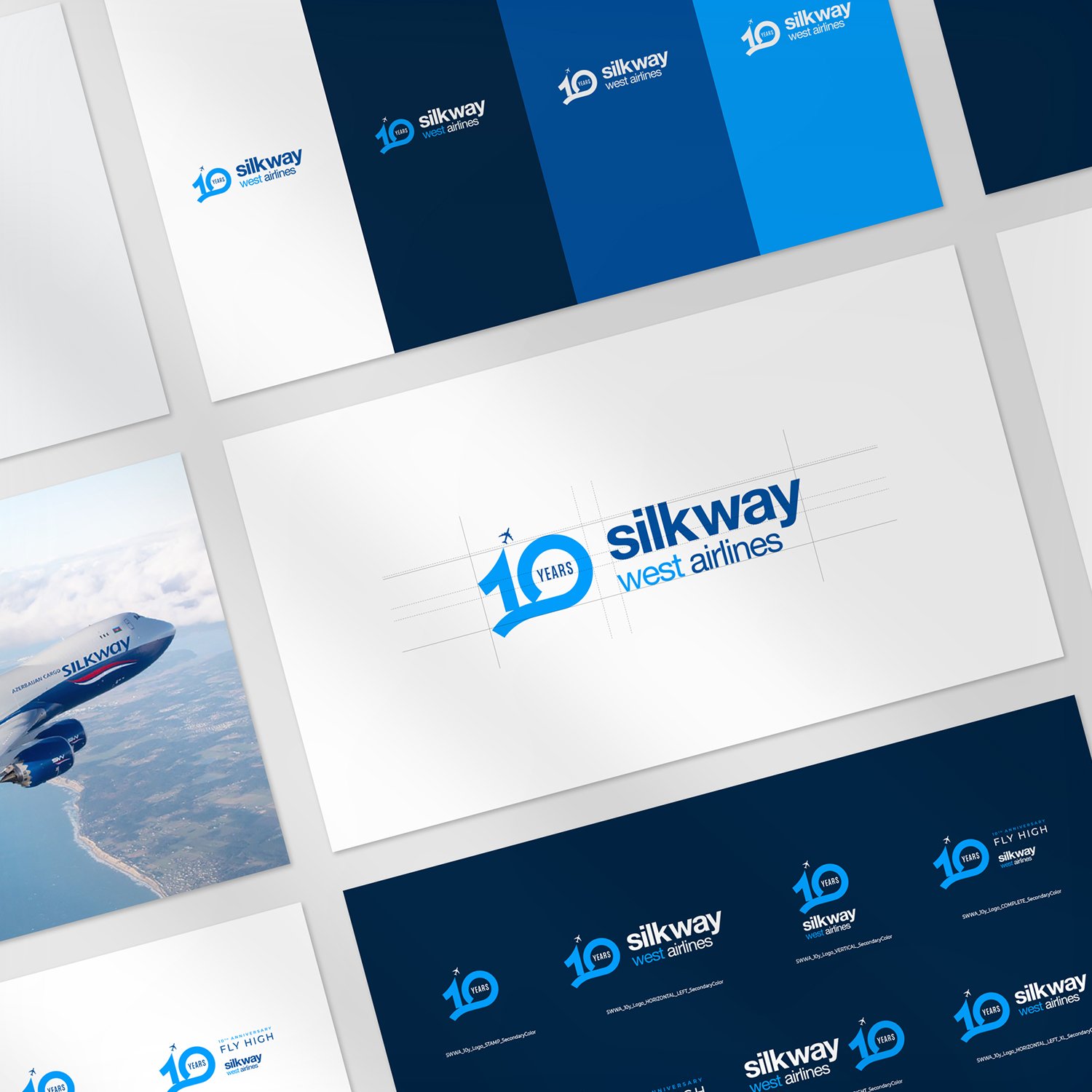
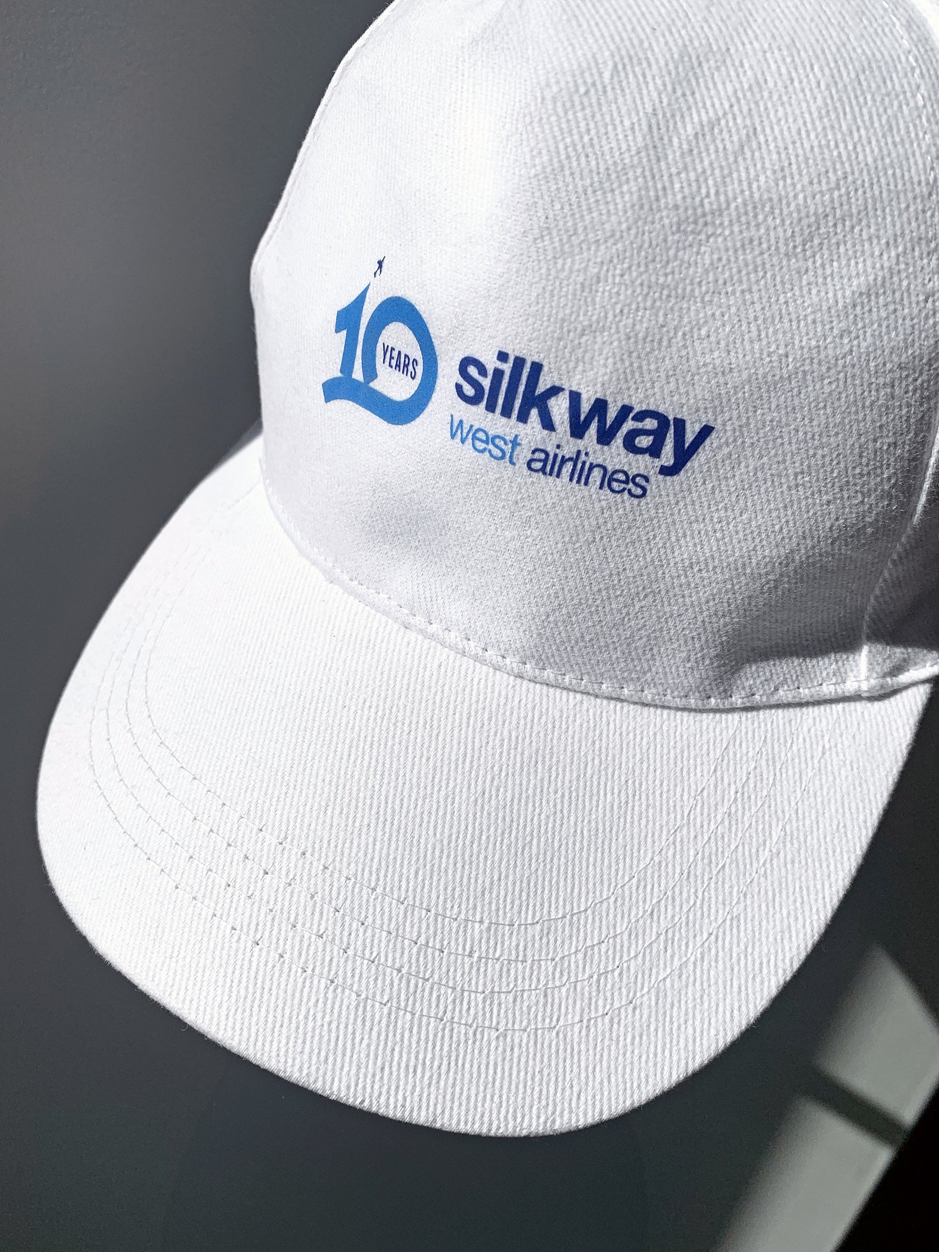
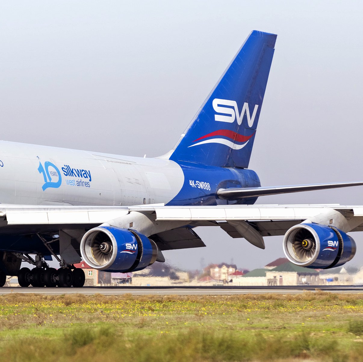
5. SWWA 10th Anniversary

Background: Silk Way West Airlines celebrated its 10th anniversary in 2012. Its growth has been nothing short of amazing. 10 years were enough to become the largest cargo airline in Europe serving a network of scheduled and charter destinations worldwide. It now plays a key role in Azerbaijan's growing economy and regional leadership. The young company demonstrated its potential from the very beginning; the inaugural cargo flight was operated by a Boeing 747-400F on the Baku - Frankfurt-Hahn route in July 2012. Today, SWWA offers effective solutions in many areas of cargo transportation. The company's staff currently consists of more than 1000 professionals with valuable experience and knowledge recognized by IATA and IOSA certificates.
Logo Concept: SWWA’s journey has been a 10-Year flight that keeps evolving. The design resembles an ascending plane track in the sky. Evokes hand-design craftiness.
Tagline: SWWA 10 Years. Fly High. A tagline suited for a company moved by ambition. Double meaning: having success + going up in the sky.

6. SWWA Aircraft design

7. Stand Design - Munich Fair | Air Cargo Europe

Double Challenge: how to transform the Silky Way Movement Design Concept into a space that reveals this language? How to simultaneously differentiate & integrate both Silk Way Airlines and Silk Way West Airlines in the same Munich Fair stand?
Stand Design: establish connection to the fluidity & smoothness of the silk element. Link it to the safety & comfort of the cargo business. Let all these elements come together in a stand design that reflects contemporaneity.
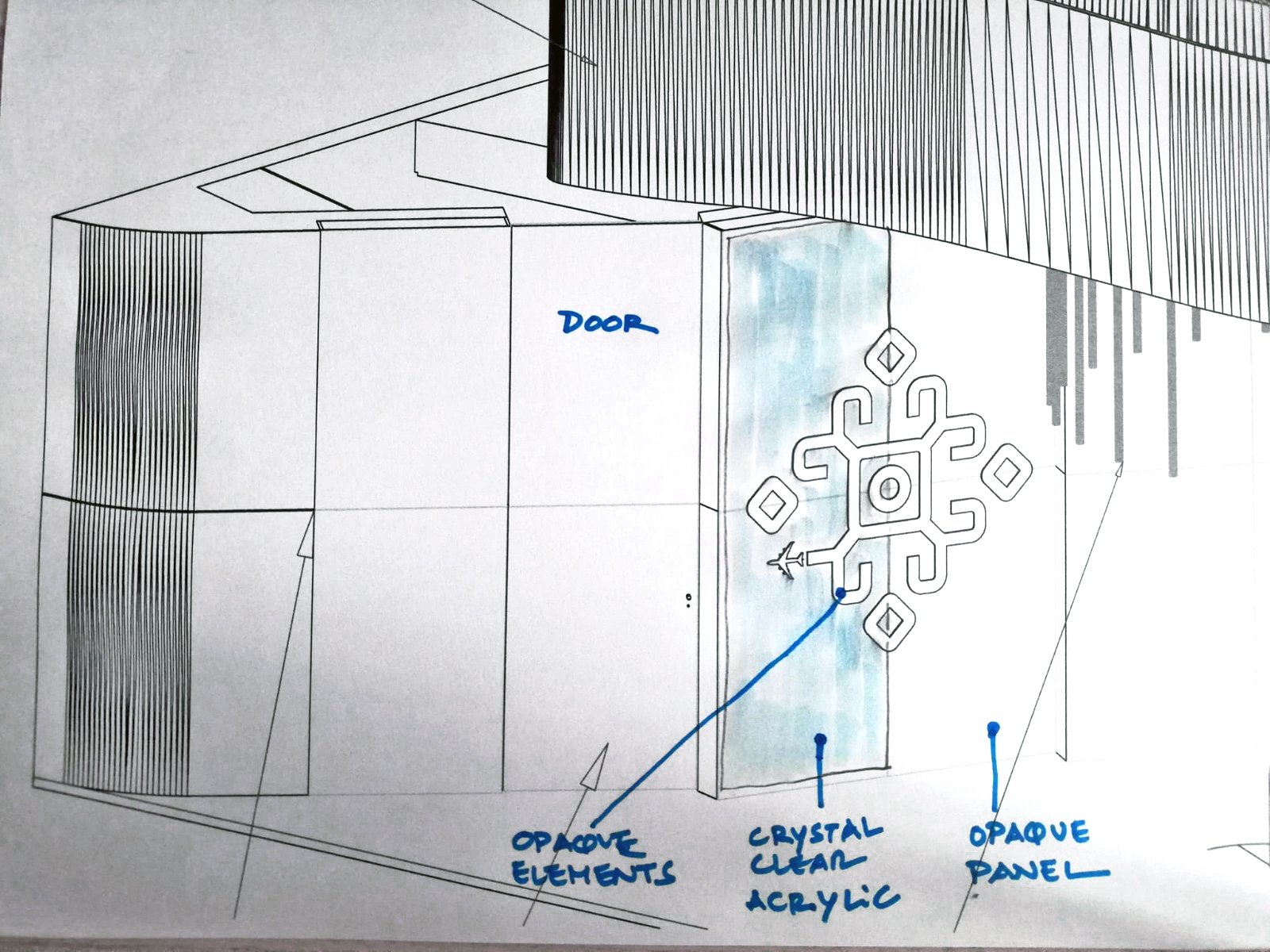
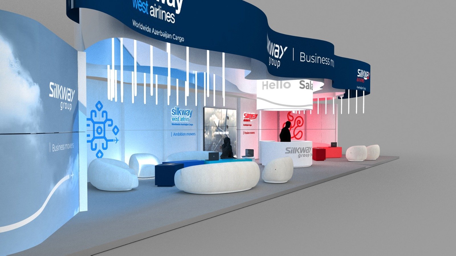
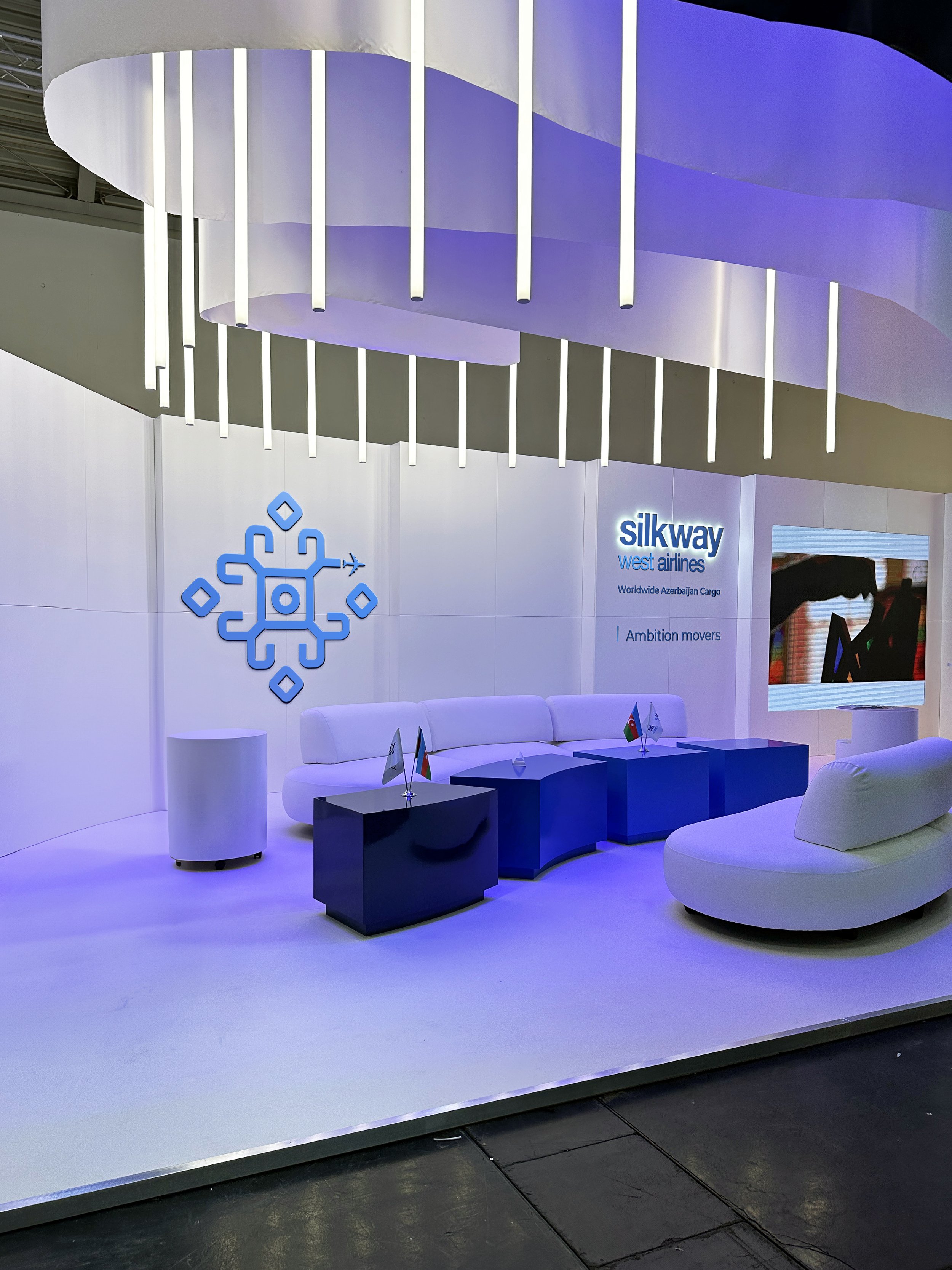
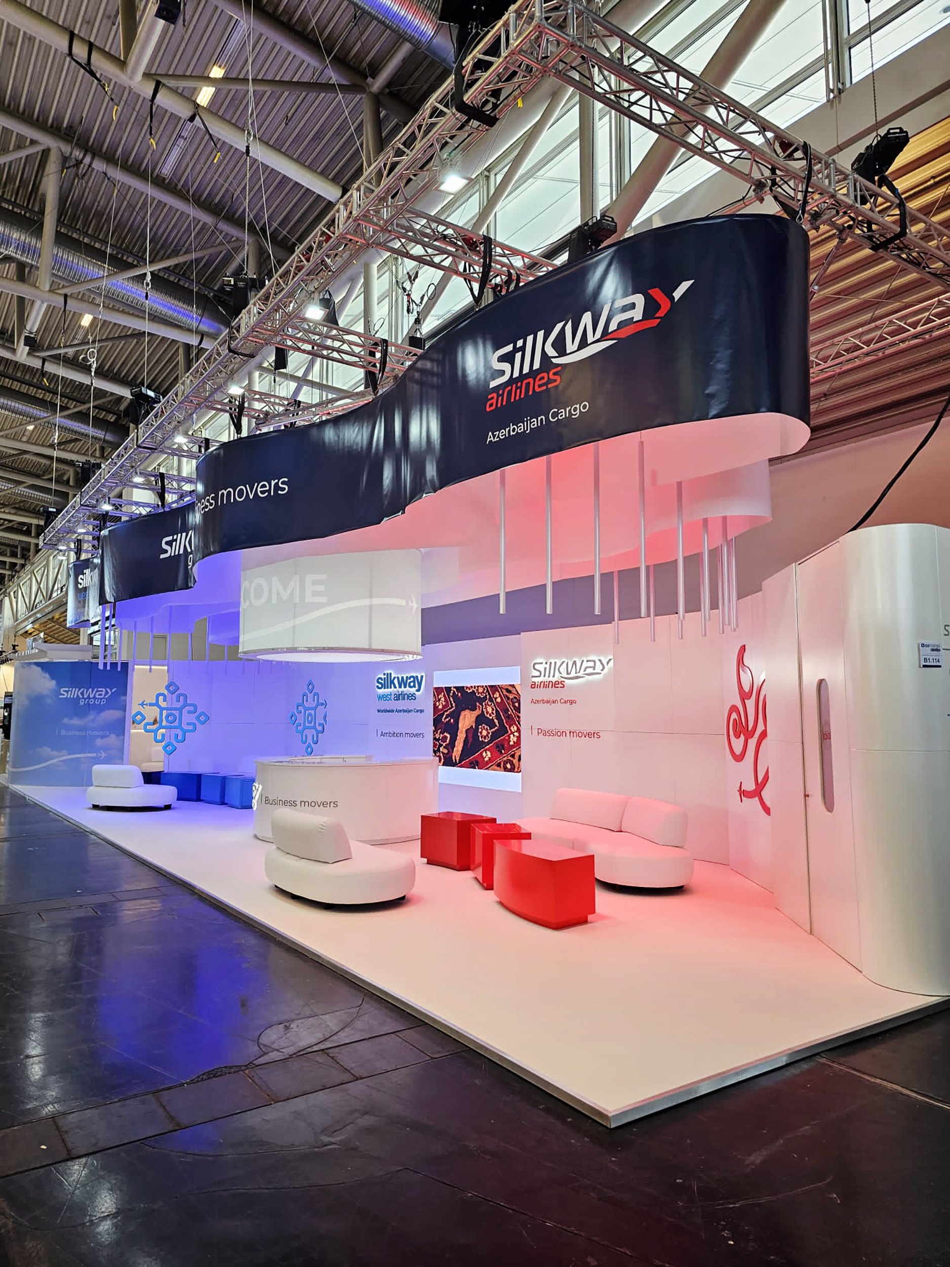
Architectural details:
Suspended wave ceiling — Conveys the idea of fluidity and lightness. The white of the fabric absorbs and reflects the brand's colorful lights.
White elements — Act as a canvas where the marks reflect their own colors through suspended lights.
Colored lights — Mark the different areas and allow a common base color on the stand.
Brand panels walls — Create a smooth curve in the stand and materialize the graphic language for each brand.
Reception — The cylinder organizes the space & brands. Centralizes Group information on the suspended cylindrical element. Small cylinder in the back works as coffee support.
Sofa lounge — Curvilinear shape reflect fluidity. Made of white rollers that offer contemporary look.
Floor with organic design — Aggregates the 3 spaces into a fluid form.
Suspended vertical lights — Aligned with the sofa motion shape.
Lounge tables — Each table has its brand colors. Together, they create an undulating shape.
LCD screen — Airs brand images and small movies of Silk Way Group.

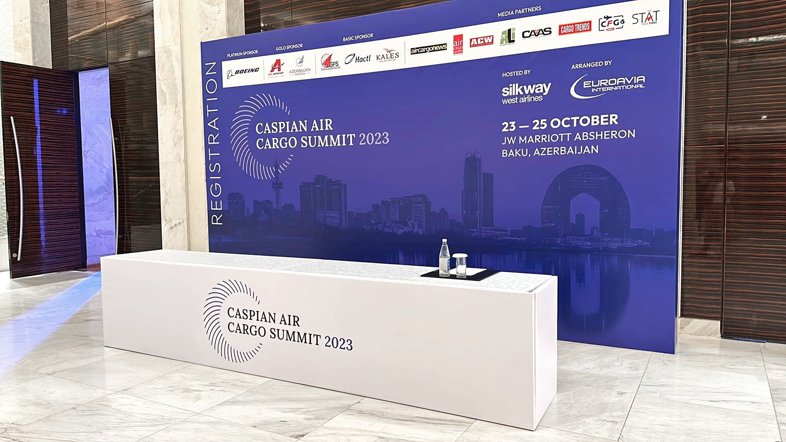
8. Caspian Cargo Summit brand ID

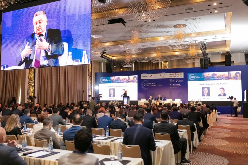
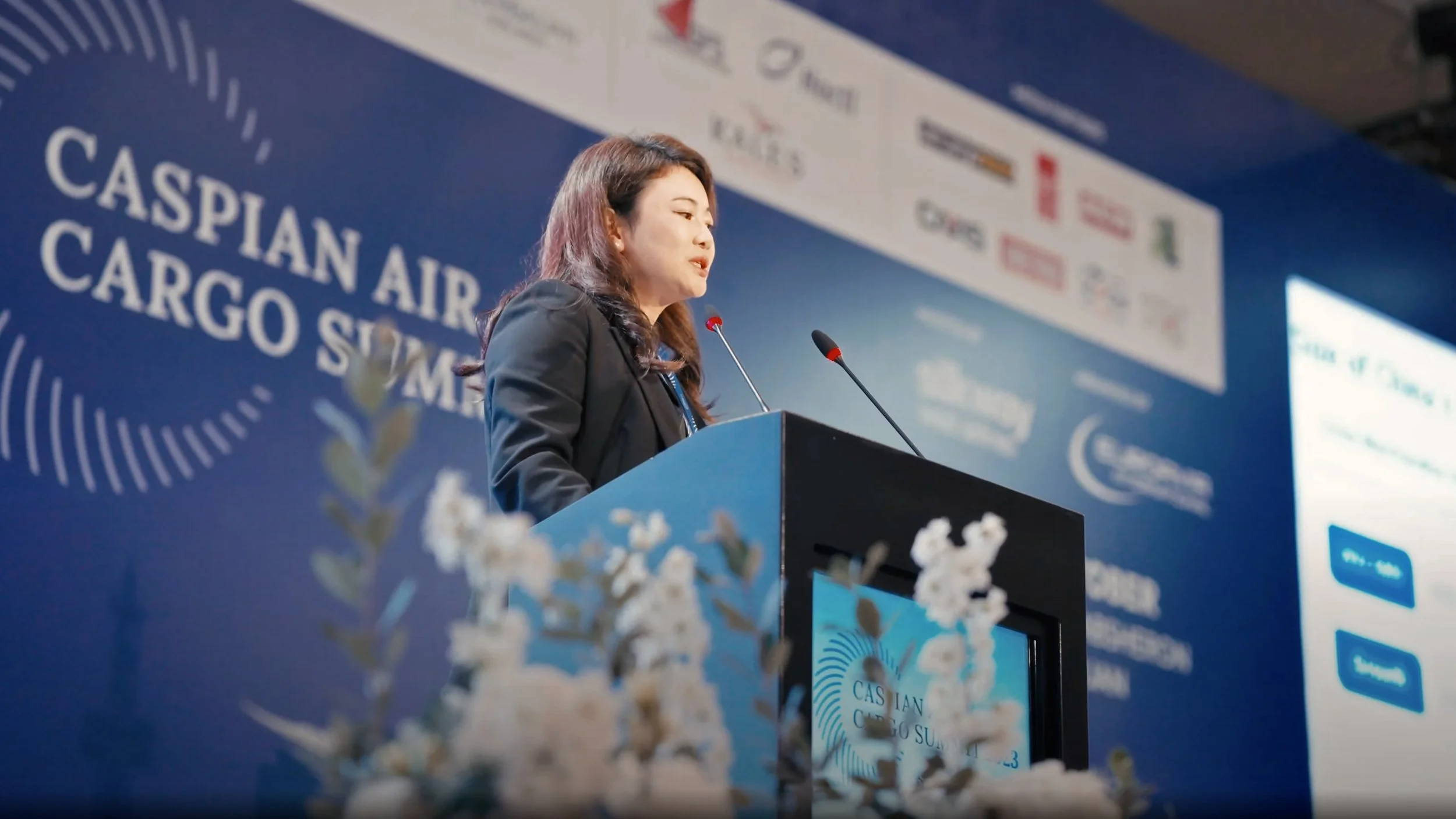
Background: Caspian Air Cargo Summit 2023 is the largest and most comprehensive aviation event in the Caspian Sea region, bringing the international air cargo market leaders to Baku. The ideal one-stop platform to find out about the latest developments. In 2023, its focus was on the Europe-Asia trade lane, innovation in logistics, e-commerce, cargo aircraft, sustainability in the supply chain, business opportunities in Azerbaijan and global market outlook.
Inspiration: The white crescent and the eight-pointed star – from the Azerbaijan flag.
Creative Idea: It’s as if Azerbaijan’s white crescent was constructed by winds, represented by small stripes, to create the Caspian Air Cargo Summit. These winds are bringing air cargo companies from all over the world to the Summit. The white crescent has also a font design purpose: it’s naturally shaped as a C, the same letter we find in the key-words Caspian and Cargo.