Background
Azerbaijan, a country located in the South Caucasus region of Eurasia, between Western Asia and Eastern Europe, is a key hub for the transport of goods due to its position next to the Caspian Sea and the Caucasus Mountains.
Azerbaijan had just become independent, a sovereign nation, cutting the umbilical cord with former Soviet Union in 1991. But political independence required economic independence.
To guarantee this, the country needed an airline with the capacity to transport cargo throughout the South Caucasus region. And so, in 2001, SWA was born with a regional focus.

Challenge
Silk Way Airlines was born in Azerbaijan as the national cargo airline.
Silkway Group wanted the brand to represent two key iconic themes without changing the original logo:
The country’s historic ‘Land of Fire’ legacy due to its natural gas fires.
The mythical Silk Road, which for 17 centuries linked East and West, Europe and South-East Asia.

Creative Work
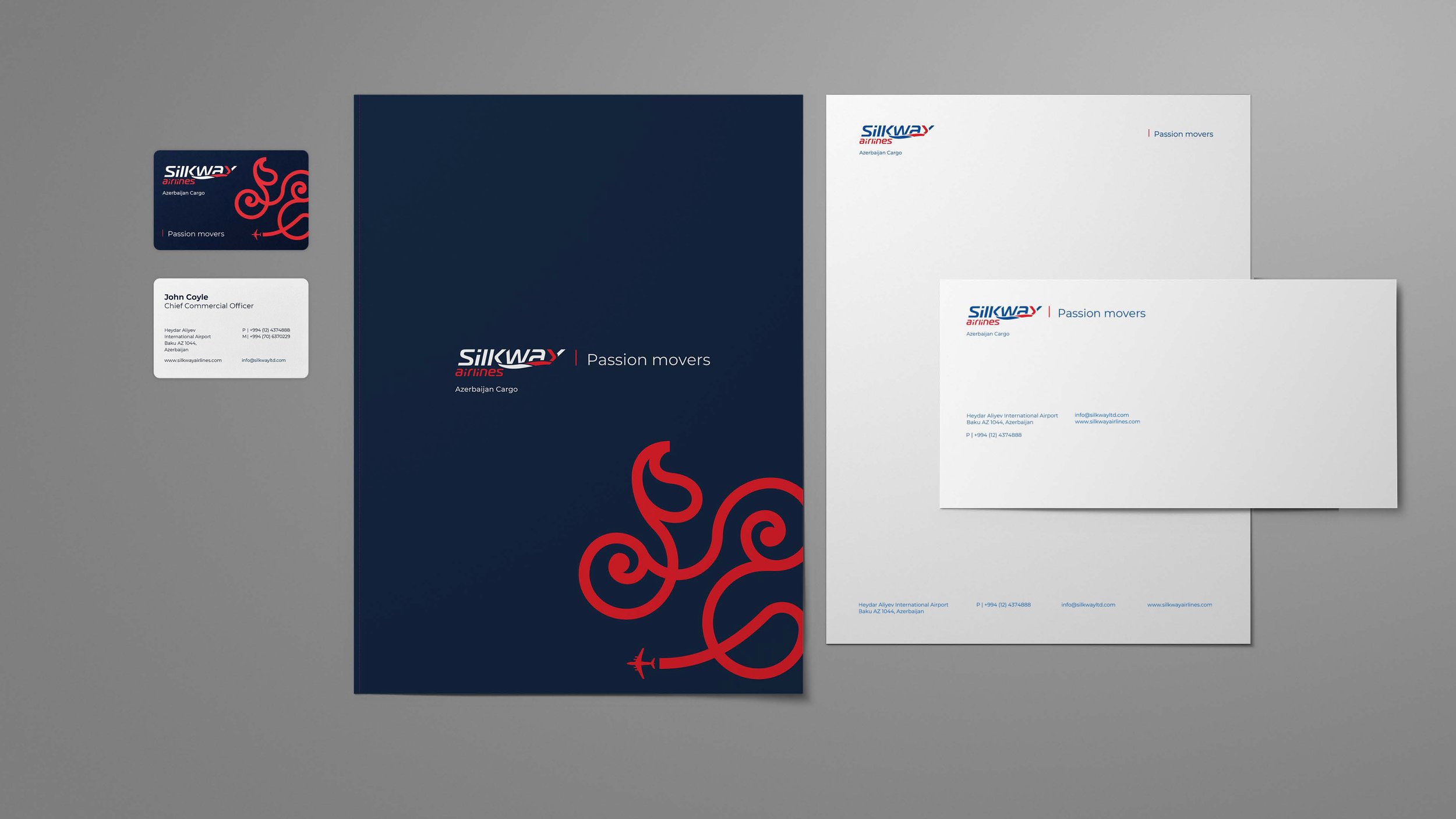
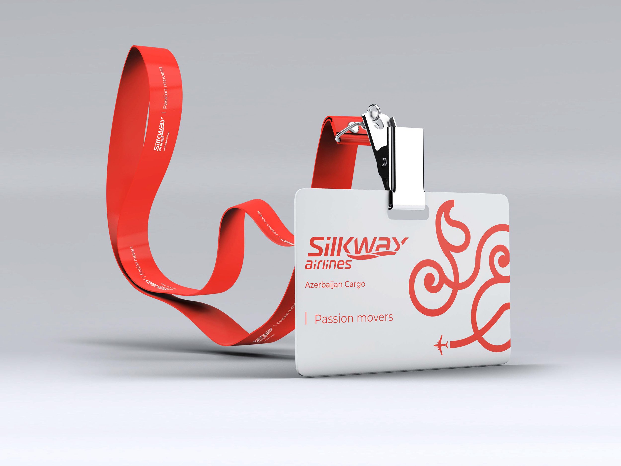
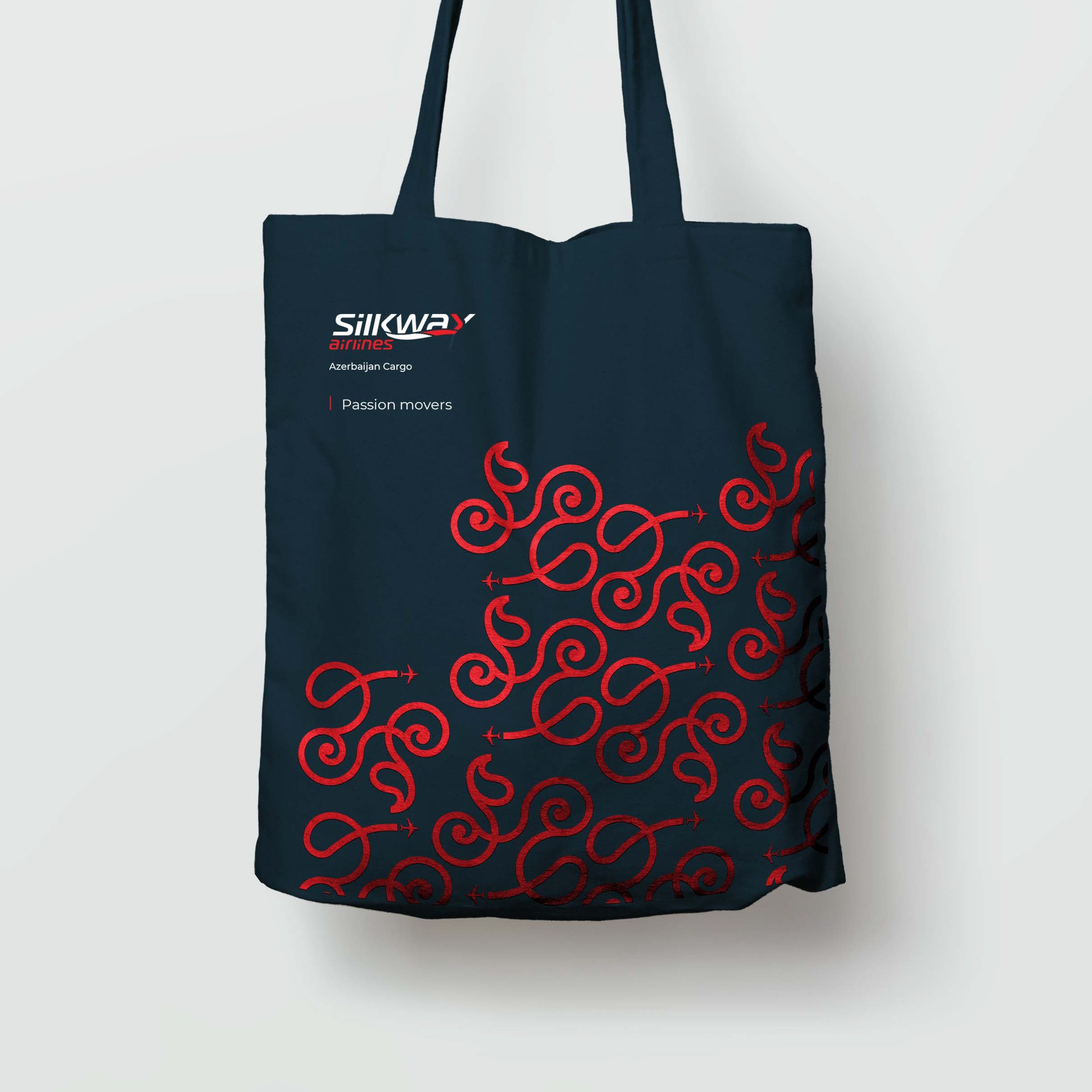
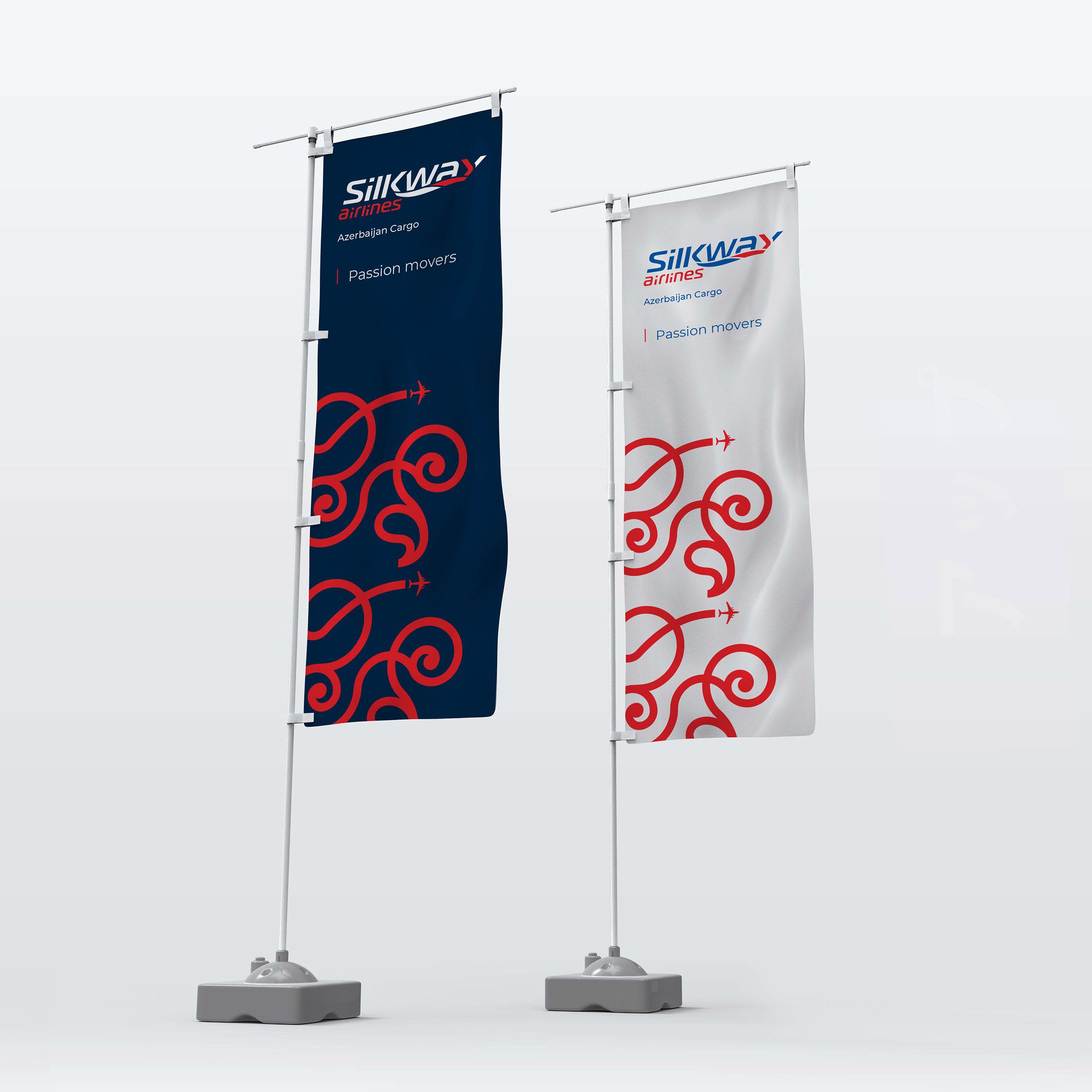
Tagline: Silk Way Airlines. Passion Movers.
Brand voice: “Passion is a primordial and intense human emotion. It deeply connects people to a purpose. Passion makes people move projects, businesses, and countries. Azerbaijan needed its own air cargo company as part of a wider strategy to establish its economic independence and relevance in the region, so SWA was created.
Silk Way Airlines was born out of passion for Azerbaijan. So whenever SWA moves cargo, that cargo is driven by passion. The same applies to its customers. When they move their cargo, that movement is fuelled by the passion to do business, to create a network of customers and partners.”
Graphic origin: Silky Way Airlines logo begins as a graphic movement that symbolically mirrors the mythical Silk Road mentioned above and is inspired by Azerbaijan's own identity. The logo is intended to represent its culture in a unique and powerful way. Its aim is to be the topic of conversation, to convey the passion and ambition of brands.
Graphic inspiration: Floral carpets from Azerbaijan. Floral influence and tree designs are very popular in carpet weaving. They are often associated with the design of the tree of life, which represents the connection between the three world levels of the ancient East: Paradise, the world of men and the Netherworld. The idea of representing the axis of the world as a tree is very old and can be found in carpets and many other forms of art.

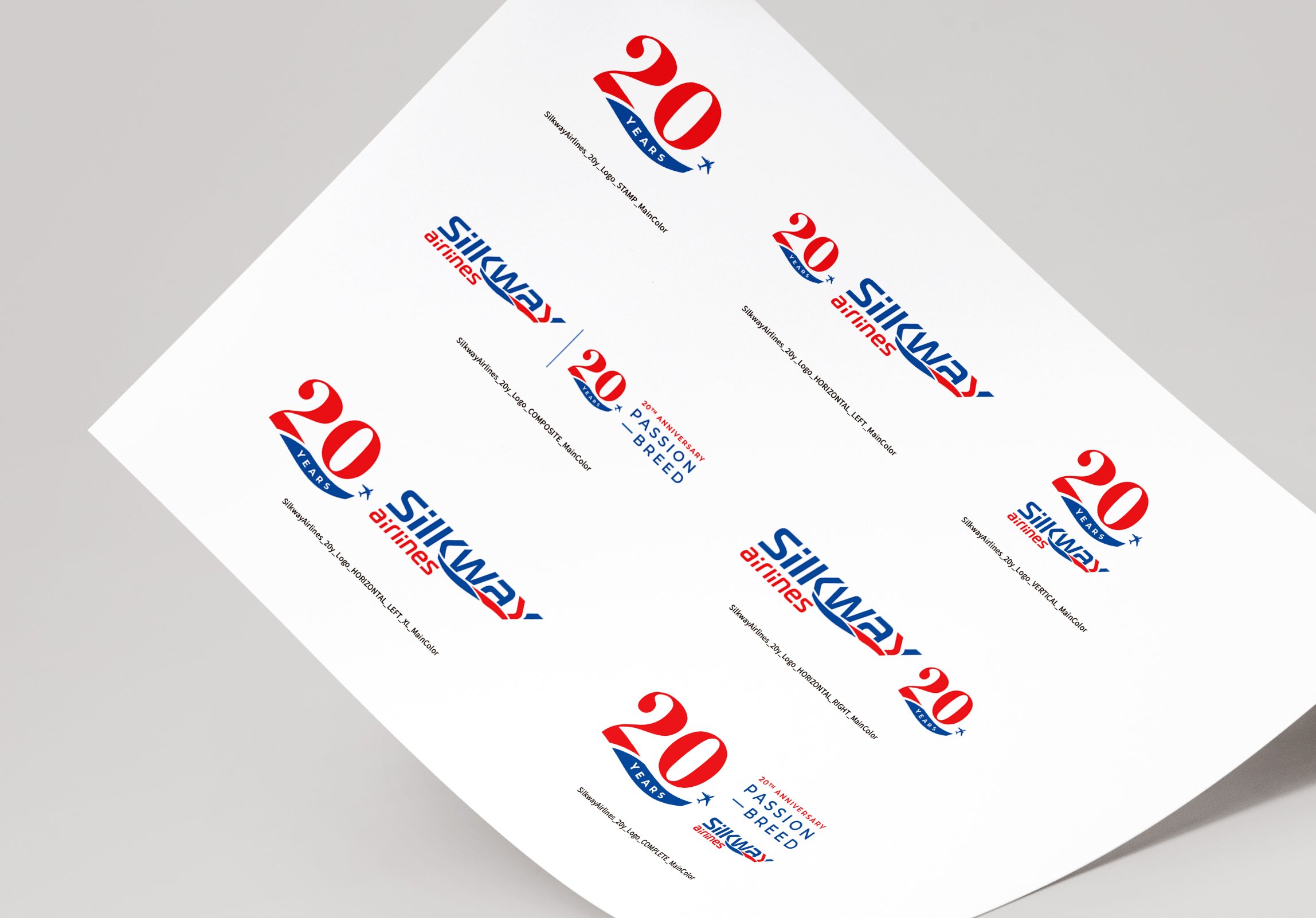
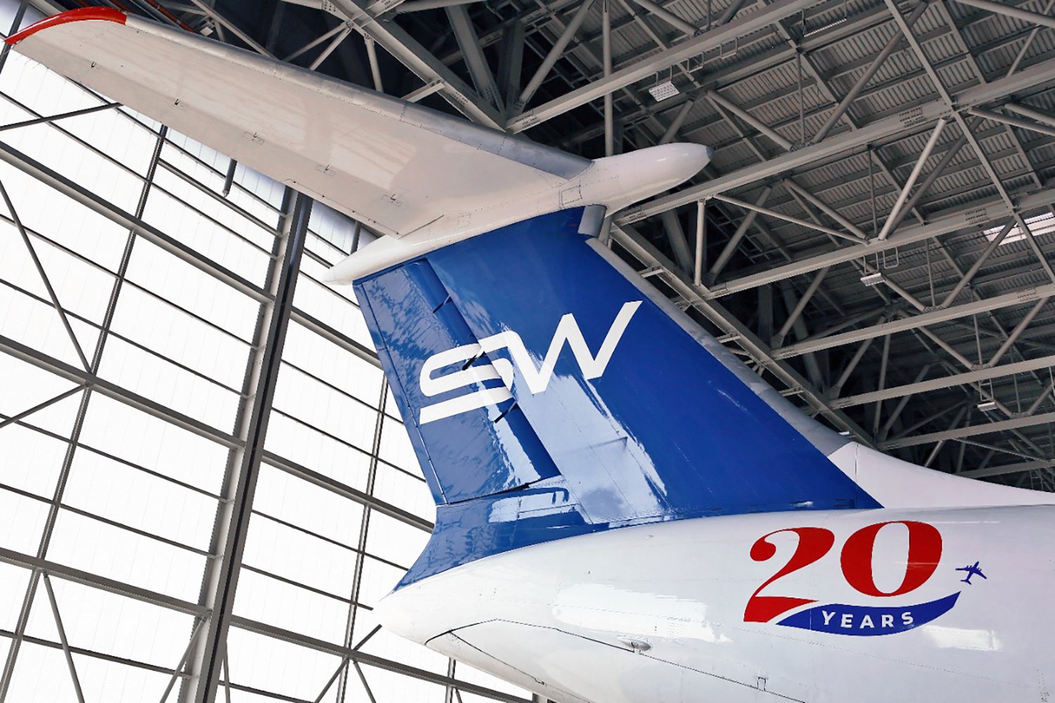
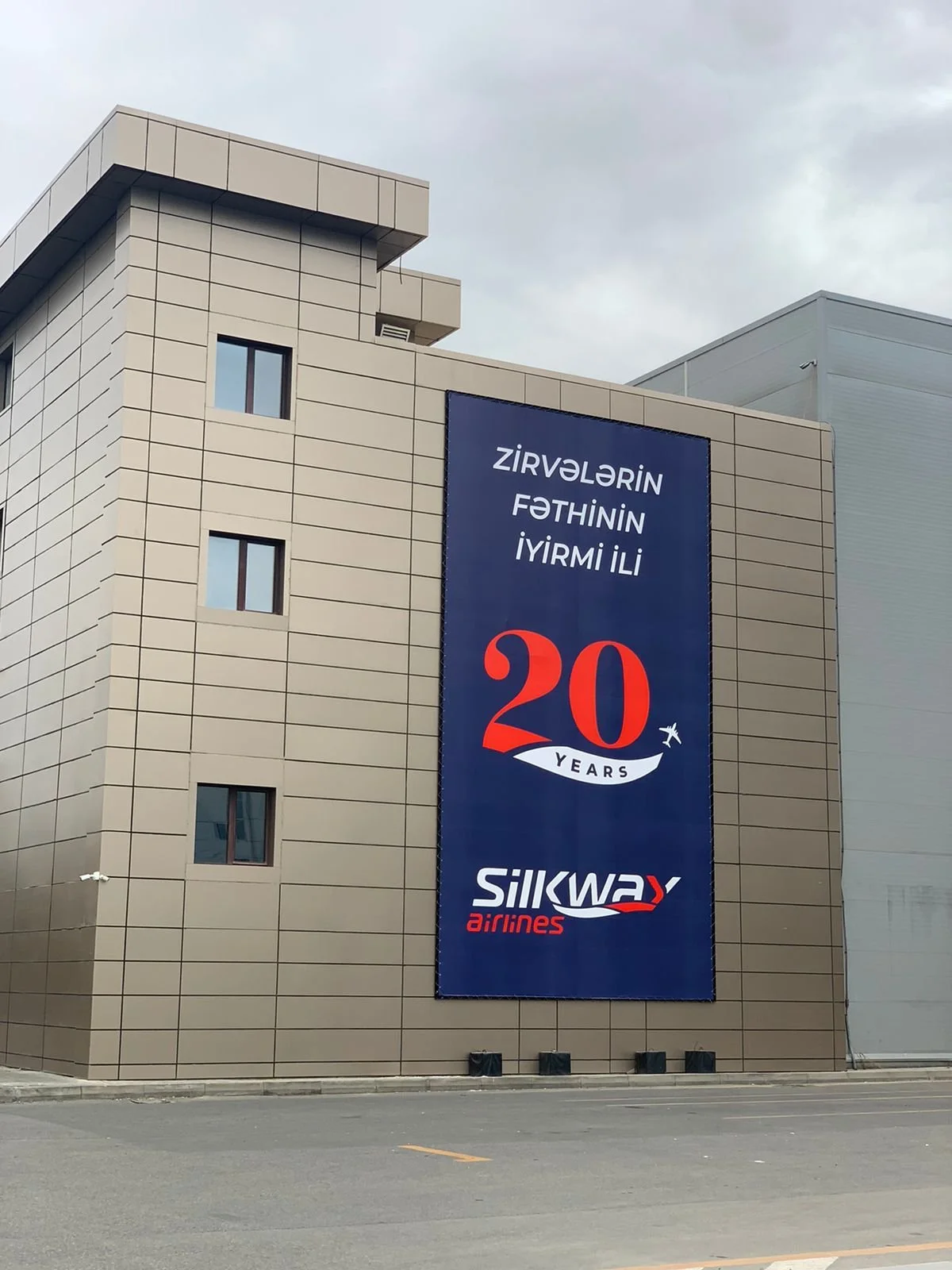
SWA 20th Anniversary

Graphic Idea: SWA story started 20 years ago. In 2001, SWA had a logo with a specific typography (lettering). In 2021, SWA has a different logo, with a graphic line below the name representing the movement of an airplane, the “silk way”. In the new SWA 20th anniversary logo, we wanted to show how 2001 and 2021 were united by this celebration. So we created a logo where the number 20 has a typography inspired in the lettering of the first logo. And below that number there’s a line inspired in the actual logo graphic line.
Tagline: SWA 20th Anniversary. Passion breed.
Brand storytelling: “Who would dream such a daring and risky enterprise, such as Silk Way Airlines, would live for 20 years and beyond? … Only a group of special people — a breed — could create such a pioneering project. These special people — this breed — were made by passion. They were PASSION BREED. SWA must never forget who they were, who they are, and in this very special anniversary celebration, this tagline is the perfect place to honour them, and to keep their legacy alive.