
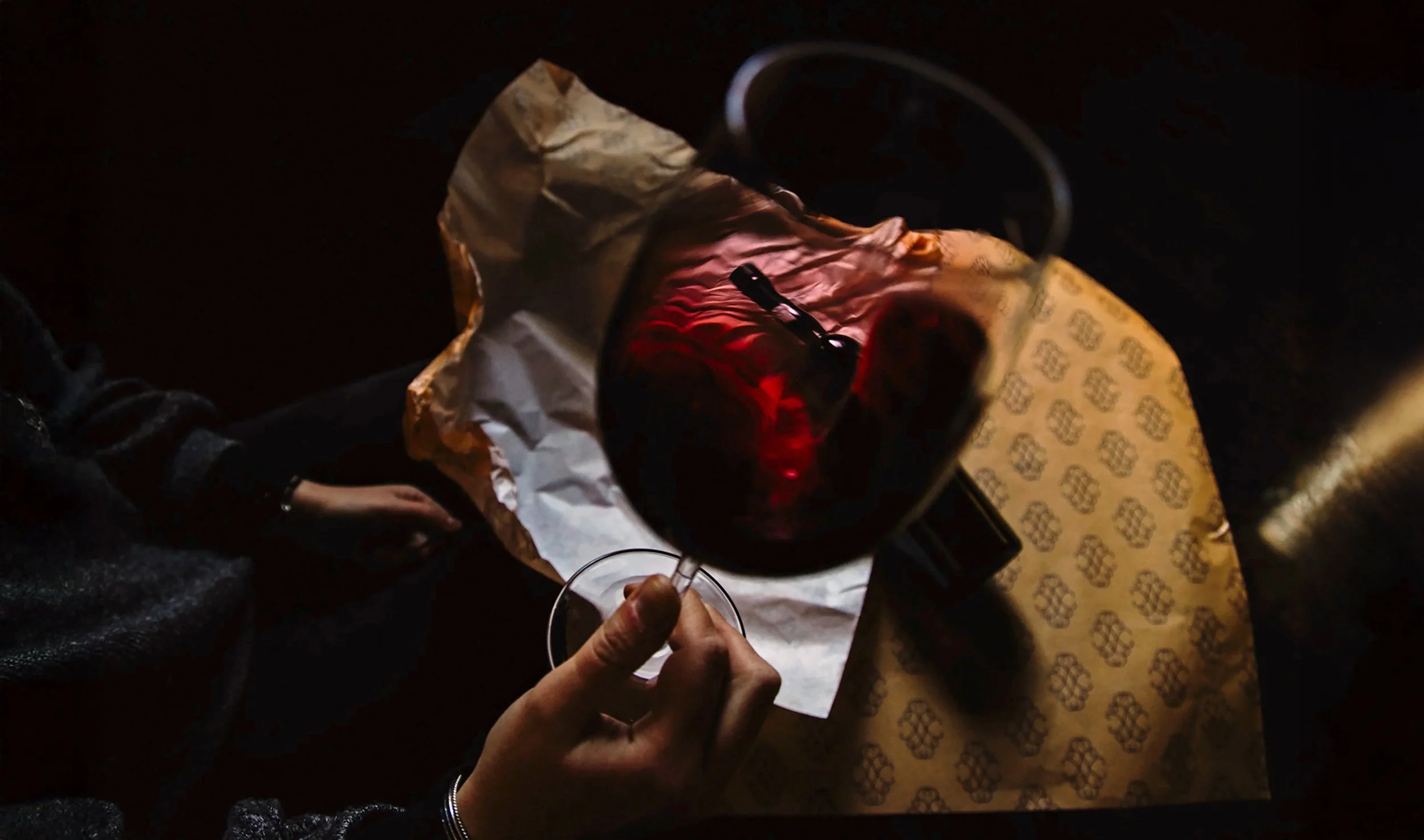
Challenge
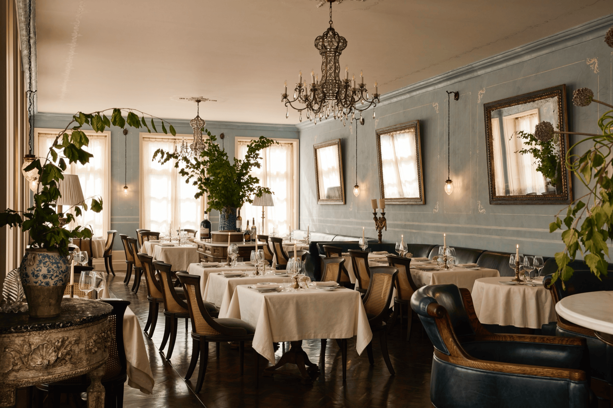
The ambition was clear: to transform a historic townhouse in Praça Carlos Alberto, at the heart of Porto, into a multifaceted destination for wine, gastronomy, and culture. This was never meant to be “just another” restaurant or wine bar. The brief demanded an iconic home for wine, a place that would combine open hospitality with a strong sense of exclusivity and community.
At the centre of this vision was Beatriz Leitão Carvalhosa Atkinson — the matriarch, half Portuguese and half British, who in 1891 married Andrew James Symington, weaving together two families deeply rooted in the Port wine trade. Renowned for her legendary hospitality, Beatriz had an extraordinary gift for bringing people together around food and wine. Her spirit has shaped the Symington family for five generations and became the inspiration for building a modern identity on tradition.
Another key source of inspiration was the British tradition of private members’ clubs — refined spaces where members could socialise, dine, and feel at home away from home. With their libraries, lounges and dining rooms, these clubs embodied belonging and sophistication. Drawing on this heritage felt natural, given the Symingtons’ Anglo-Portuguese roots, and it also influenced both the brand identity and the interior design concept.
Work
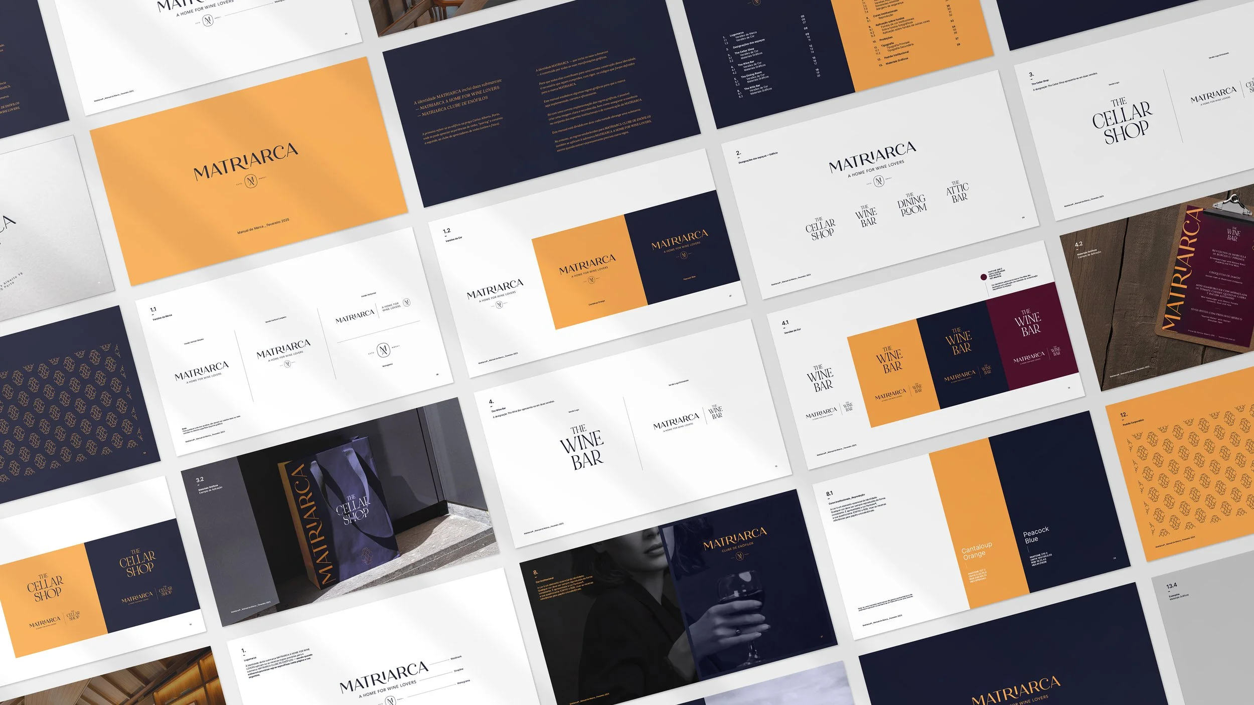
Wonder\Why shaped Matriarca as a holistic brand universe, designed to live across both its physical home (restaurant, wine bar, cellar shop, attic bar, wine academy) and its community dimension (the Clube de Enófilos).
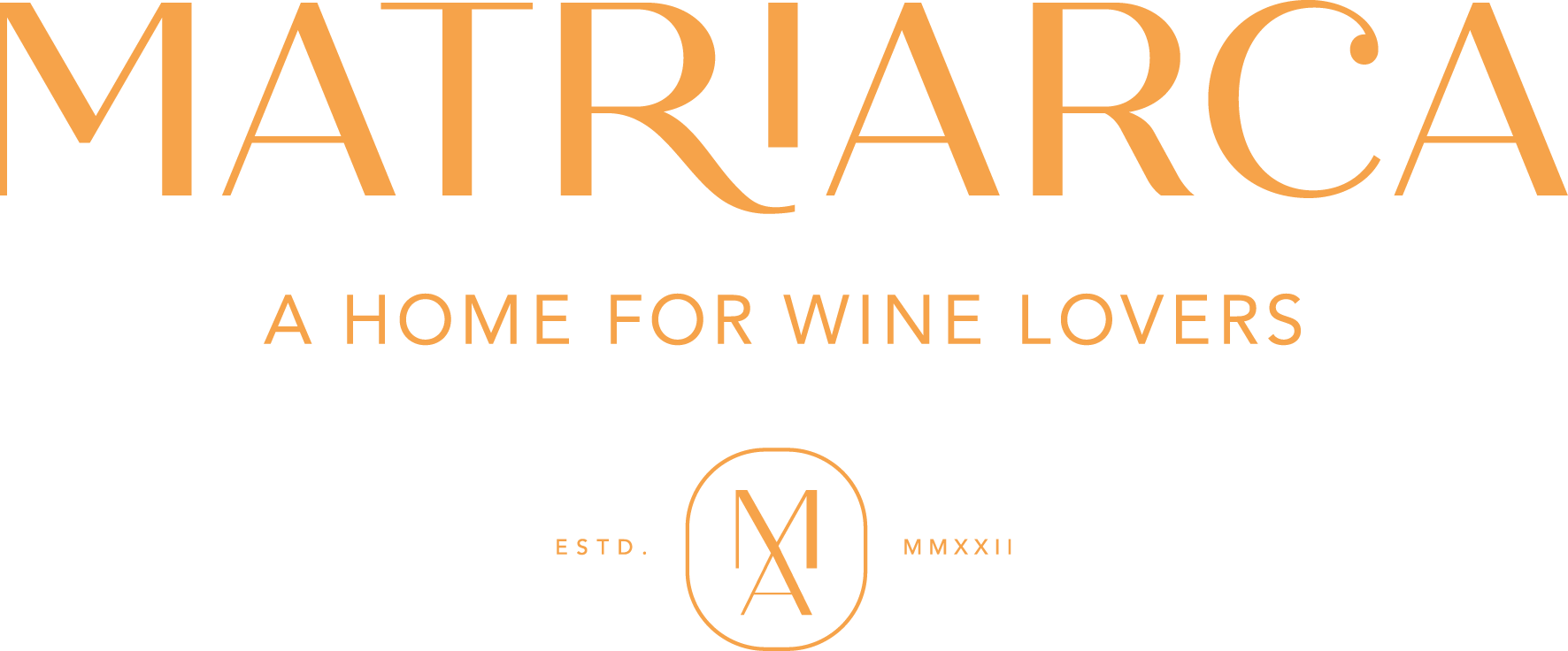
Brand platform. Matriarca was defined as “A Home for Wine Lovers” — a place where guests are warmly welcomed yet surrounded by an atmosphere of elegance, exclusivity, and belonging.
Beatriz, the Matriarch. Beatriz became the personification of the brand: an enduring symbol of generosity, hospitality, and Anglo-Portuguese friendship. Her story gave Matriarca not only a name but also a soul.
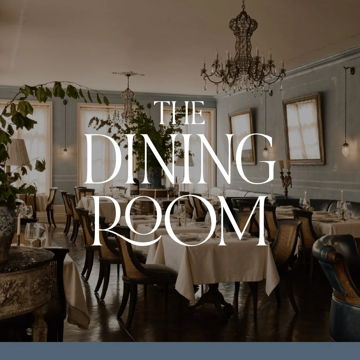
British club inspiration. We borrowed the essence of British clubhouses — not their Victorian formality, but their atmosphere of intimacy and characterful spaces. Each area of the building was designed with its own personality, echoing the structure of London’s private clubs but reimagined with a contemporary Portuguese spirit.
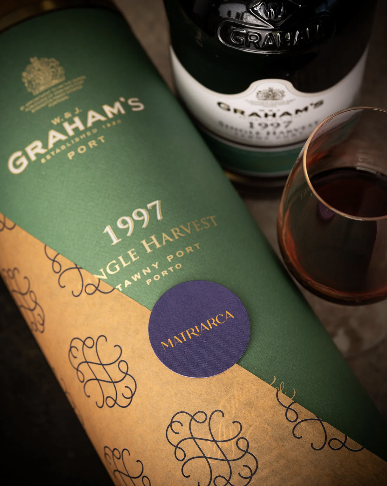
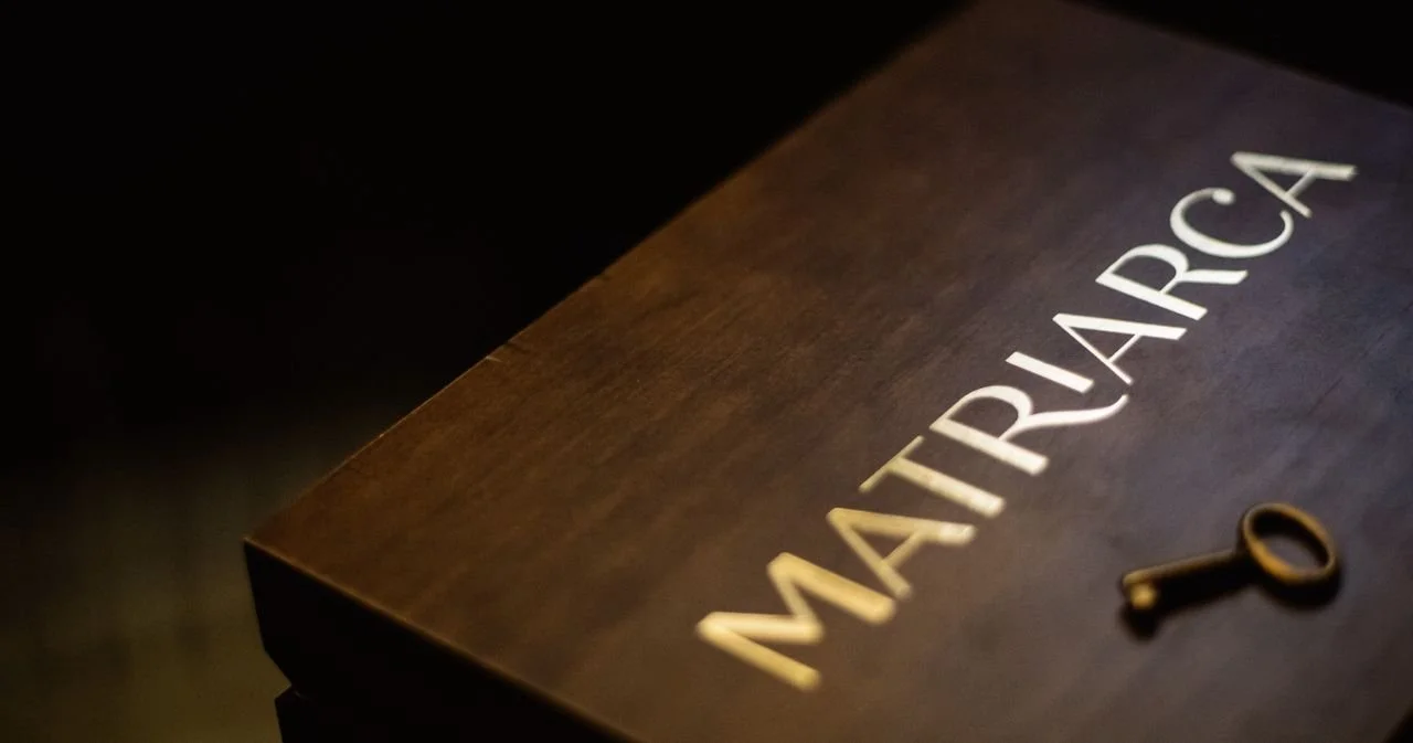
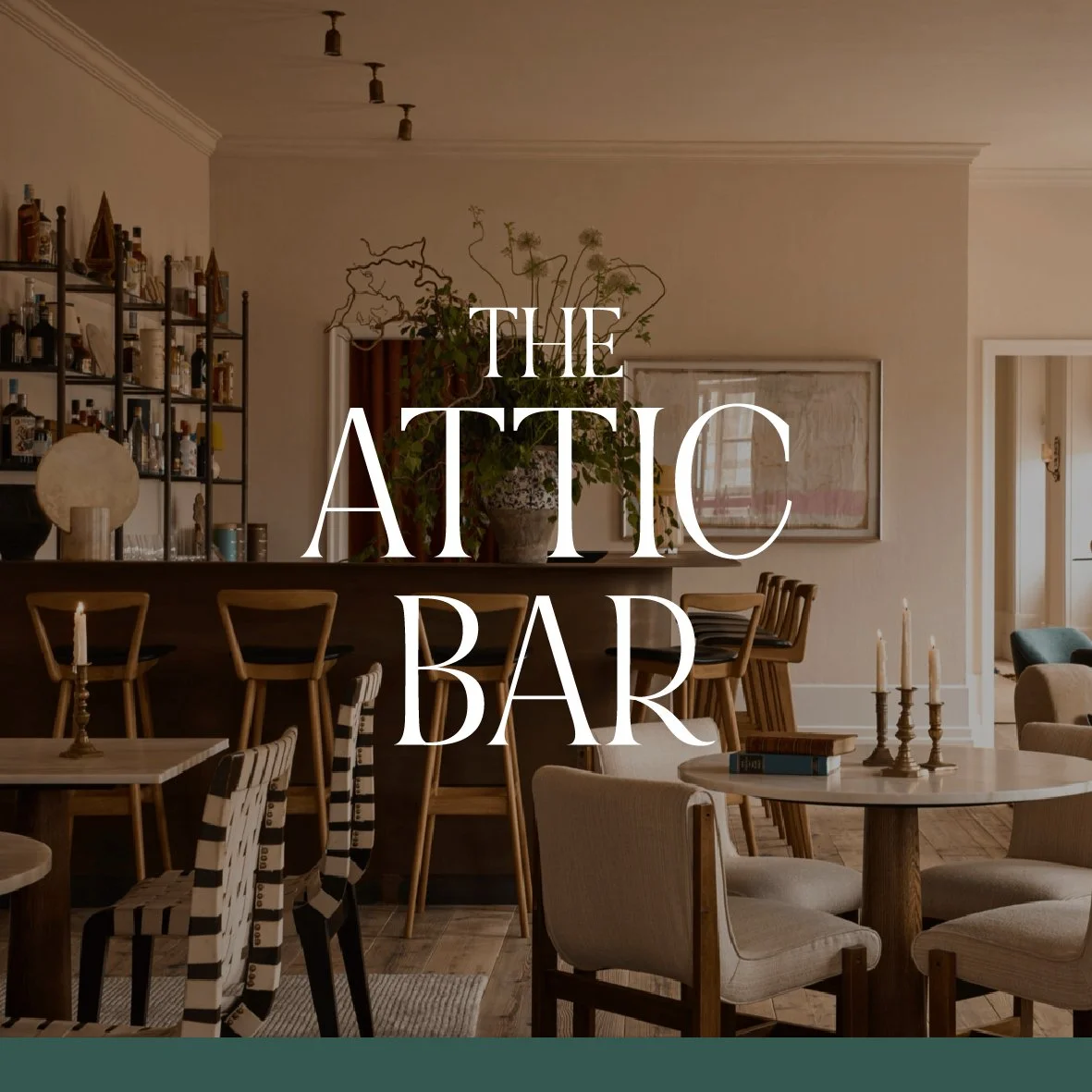
Visual identity. We developed a modular logotype (monogram, wordmark, strapline), anchored in a distinctive colour palette: Cantaloup Orange and Peacock Blue. Each room was also assigned a chromatic code — the deep burgundy of the Wine Bar, the muted blue-grey of the Dining Room, the green of the Attic Bar — reinforcing individuality while ensuring coherence.
Typography & graphics. The pairing of Inter (modern, digital-first) with Cinzel (classic, heritage-inspired) reflects the balance between clarity and tradition. A bespoke brand pattern brings refinement and unity to all branded materials.

Brand architecture. The identity unfolds into two sub-brands:
Matriarca Clube de Enófilos: with a digital-first presence that is essential — the website serves as the entry point for recruiting members, communicating benefits, and connecting the community. Unlike traditional British clubs that lived almost entirely in physical spaces, Matriarca’s club is built as much online as it is in its Porto home.
Matriarca — A Home for Wine Lovers: with a digital presence focused on awareness, information and utility.
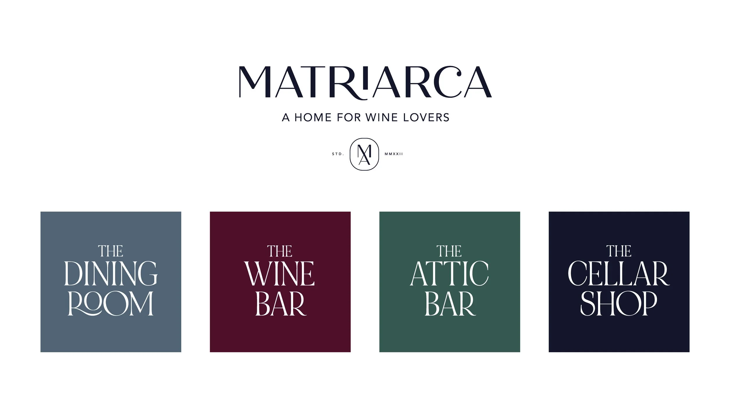
Giving each space a name. Within the building’s sub-brand, Matriarca – A Home for Wine Lovers, we developed distinctive names for each division. The aim was to clarify their purpose while giving them a subtle layer of personality — always complementing, rather than overshadowing, the identity of the house and the Clube de Enófilos.
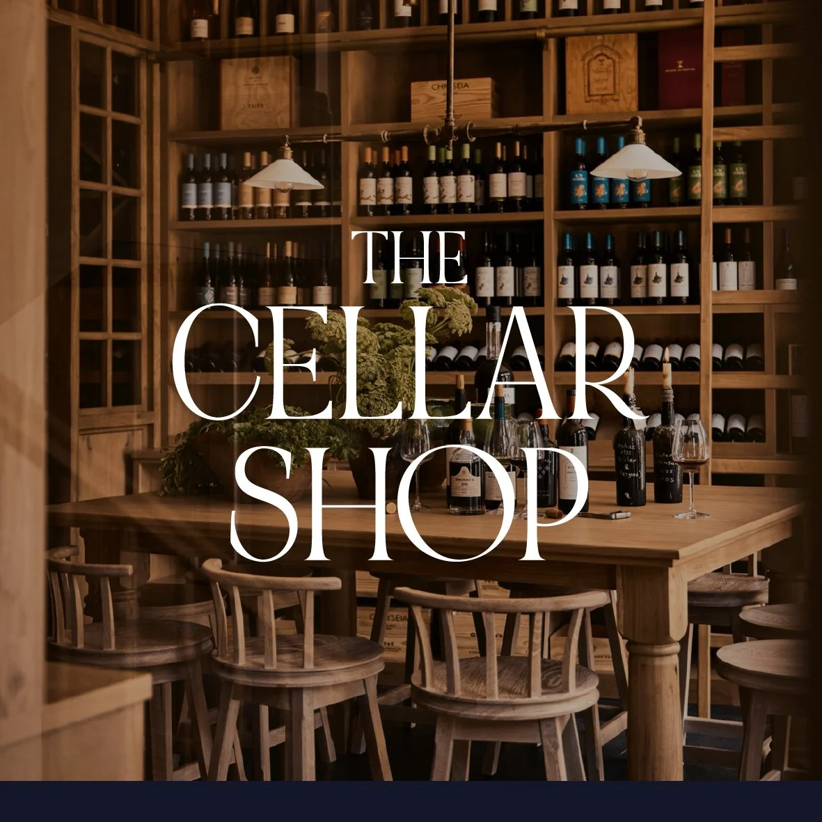
Each space was therefore named according to its function: The Dining Room, The Wine Bar, The Attic Bar (dedicated to cocktails), and The Cellar Shop.
The logotype was designed in line with the elegance and graphic codes of the Matriarca mother brand, ensuring consistency across every touchpoint.

Collaboration. The brand development was the result of close collaboration between Wonder\Why, Symington team, and architectural partners. In particular, the brand identity was carefully aligned with the interiors designed by Thurstan UK — ensuring respect for the building’s heritage while delivering a coherent experience across design, communication, and architecture.
We believe Matriarca will emerge as a brand that both honours and redefines tradition. A cosmopolitan landmark in Porto, it is a contemporary wine club with soul, where every detail — from the logotype to the glass of wine served — reinforces the idea of belonging.