Challenge
For 20 years, Grande Consumo built something rare: relevance.
What started as a trade magazine evolved into a respected voice across retail, industry, logistics and consumer goods. A true meeting point for professionals, ideas and perspectives. A network. A platform. A reference.
But its identity hadn’t kept pace.
Despite the quality, depth and authority of its content, the brand still carried visual cues from another era — closer to a “category look” than to the editorial ambition it had achieved. As highlighted in the strategic phase, there was a clear misalignment: the brand didn’t look like the journalism it produced.
The 20th anniversary became the moment to address that gap.
The challenge was not to redesign a magazine.
It was to reposition it.
To shift perception:
from publication to platform
from category player to category leader
from content distributor to thinking generator
And to do so without losing the equity built over two decades.

Work
The rebranding of Grande Consumo started with a simple but powerful idea:
Bring journalism back into the brand.
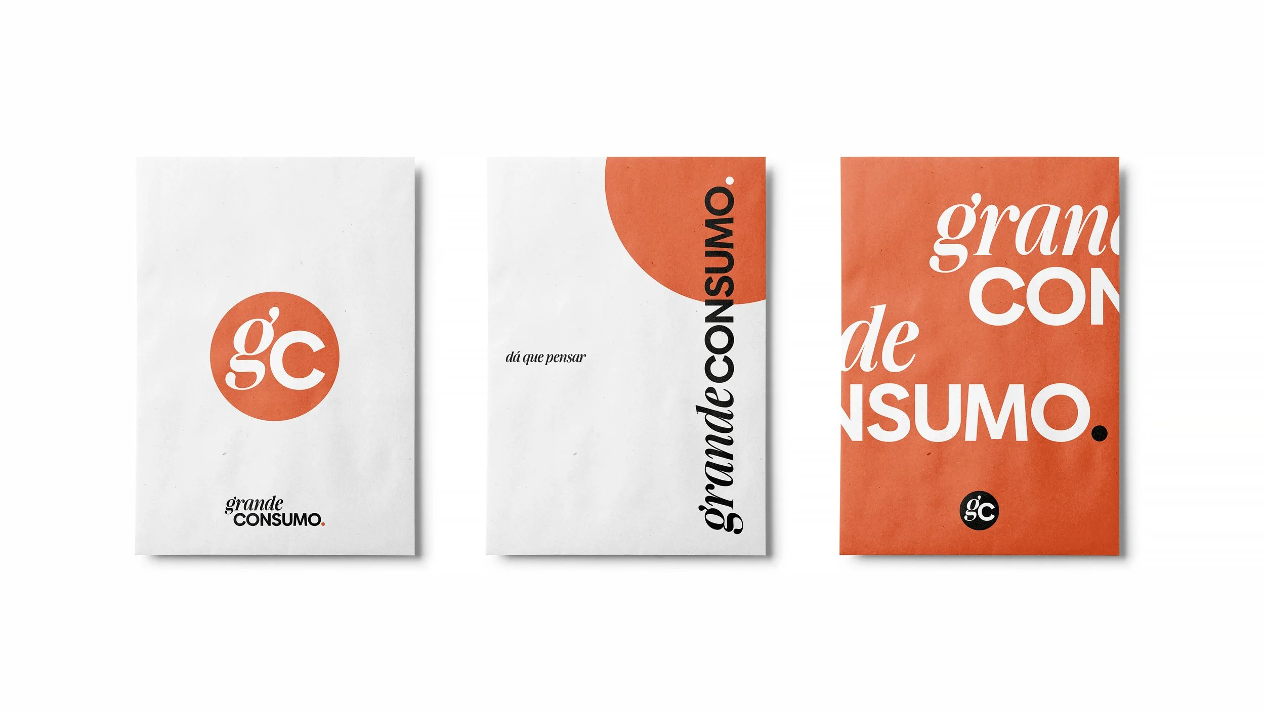
A logo that behaves like editorial
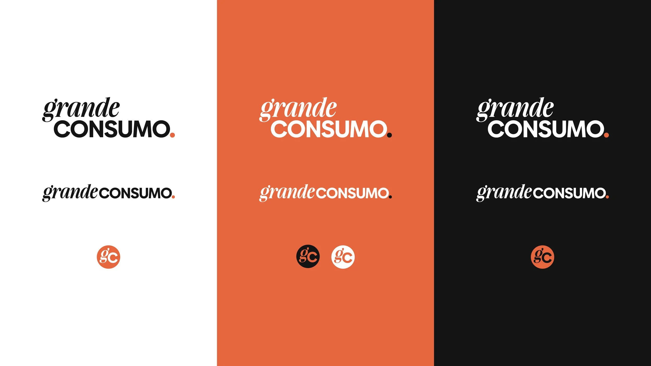
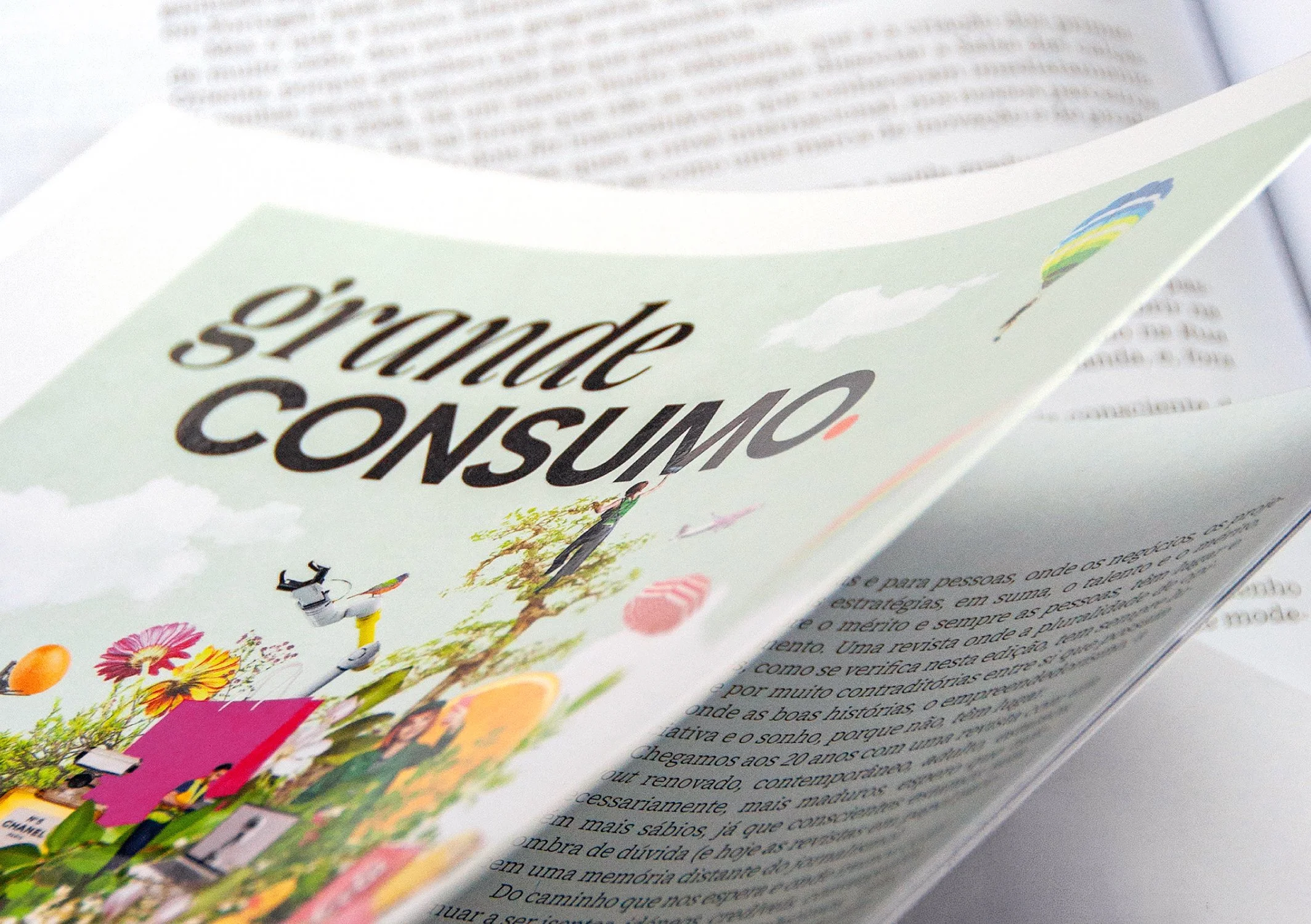
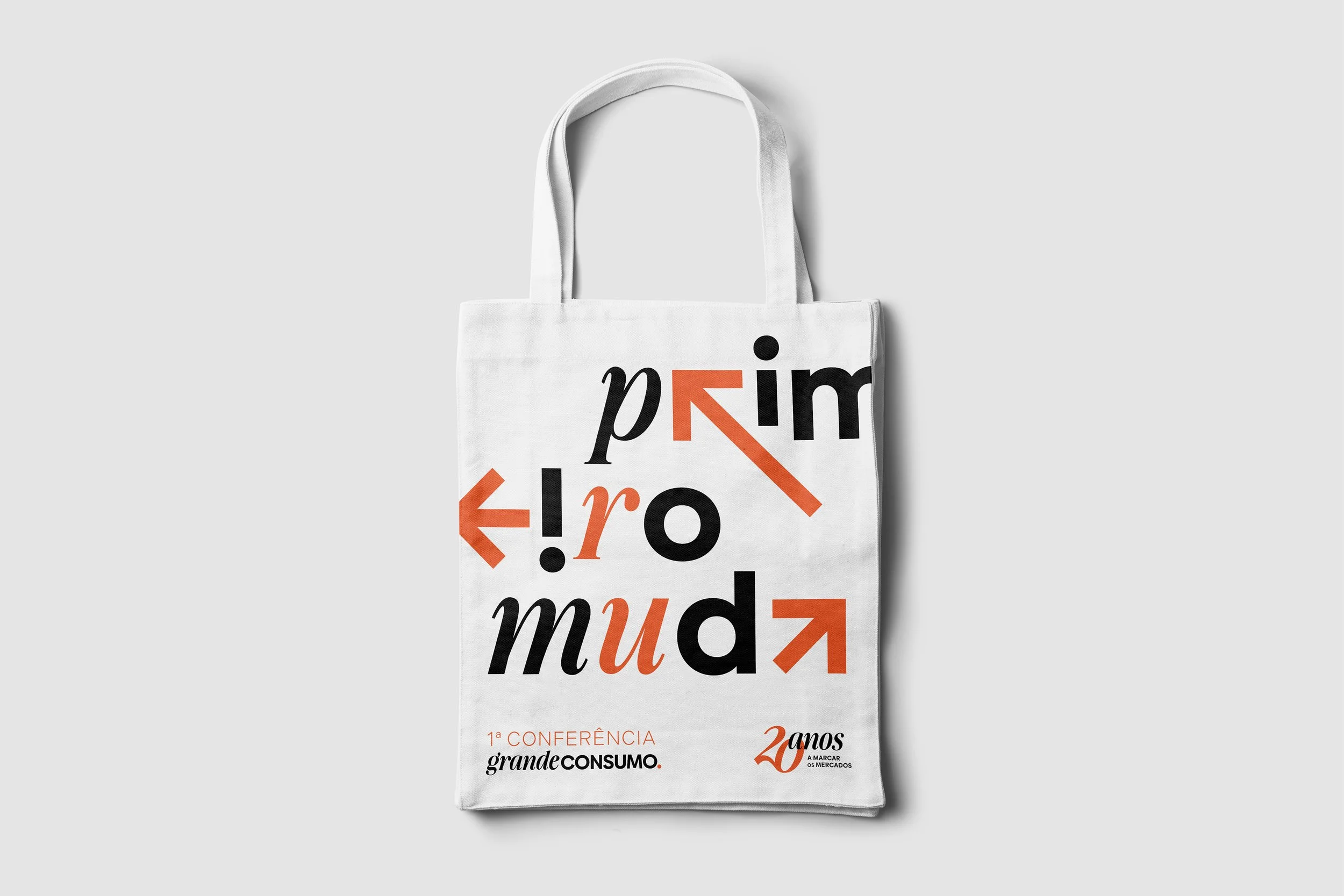
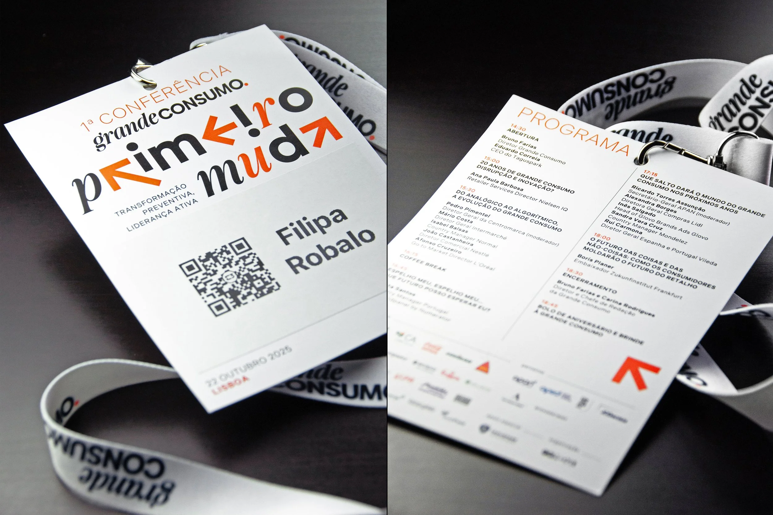
The new identity begins with the wordmark — a deliberate tension between two worlds.
“grande” in a serif, italic typeface: expressive, human, editorial
“CONSUMO” in a sans-serif, uppercase typeface: solid, credible, authoritative
This duality mirrors the nature of the brand itself: storytelling and rigor, curiosity and credibility.
A graphic dot is introduced as a symbolic device — a point of encounter. A visual metaphor for where perspectives meet, ideas collide, and thinking begins.
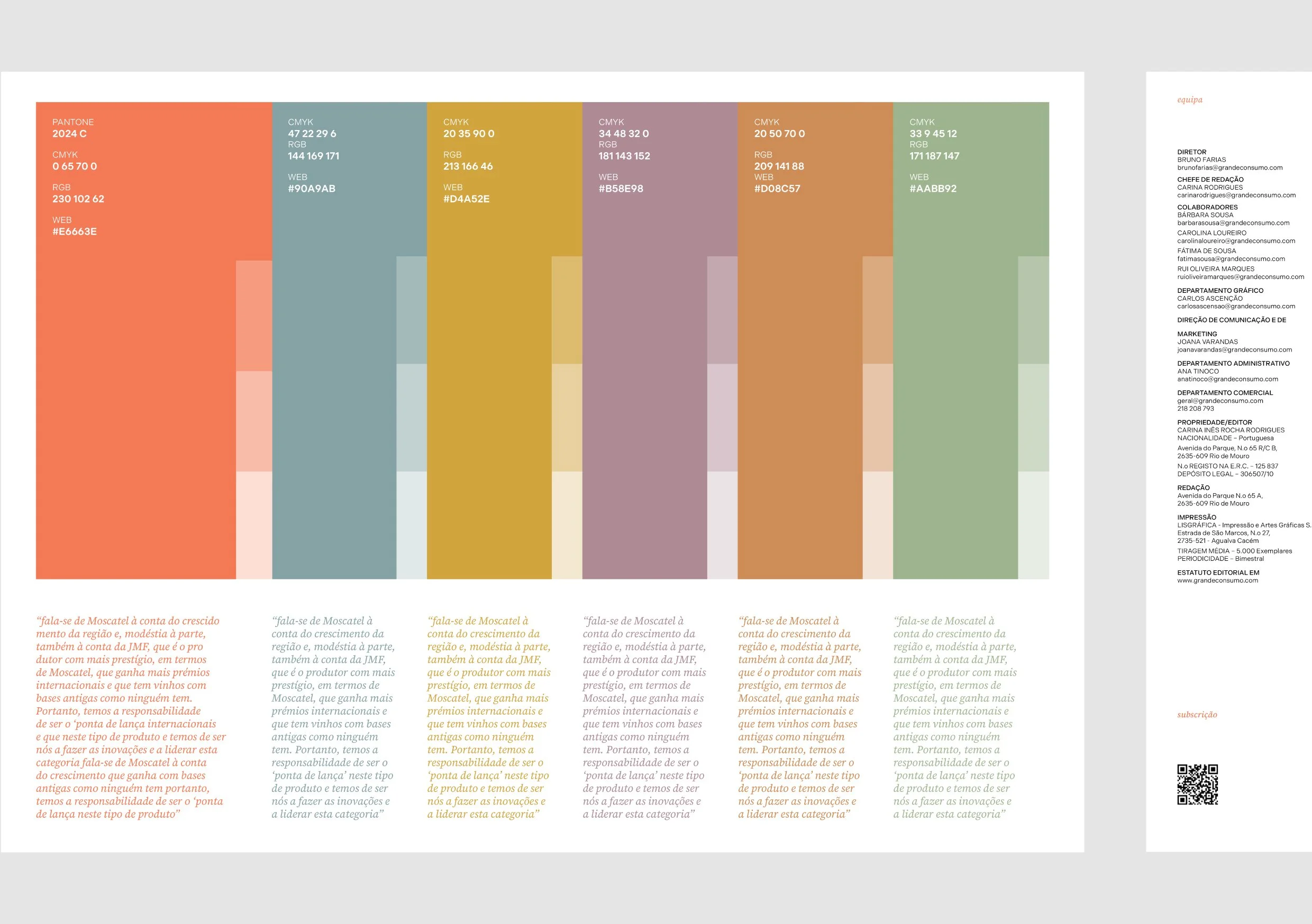
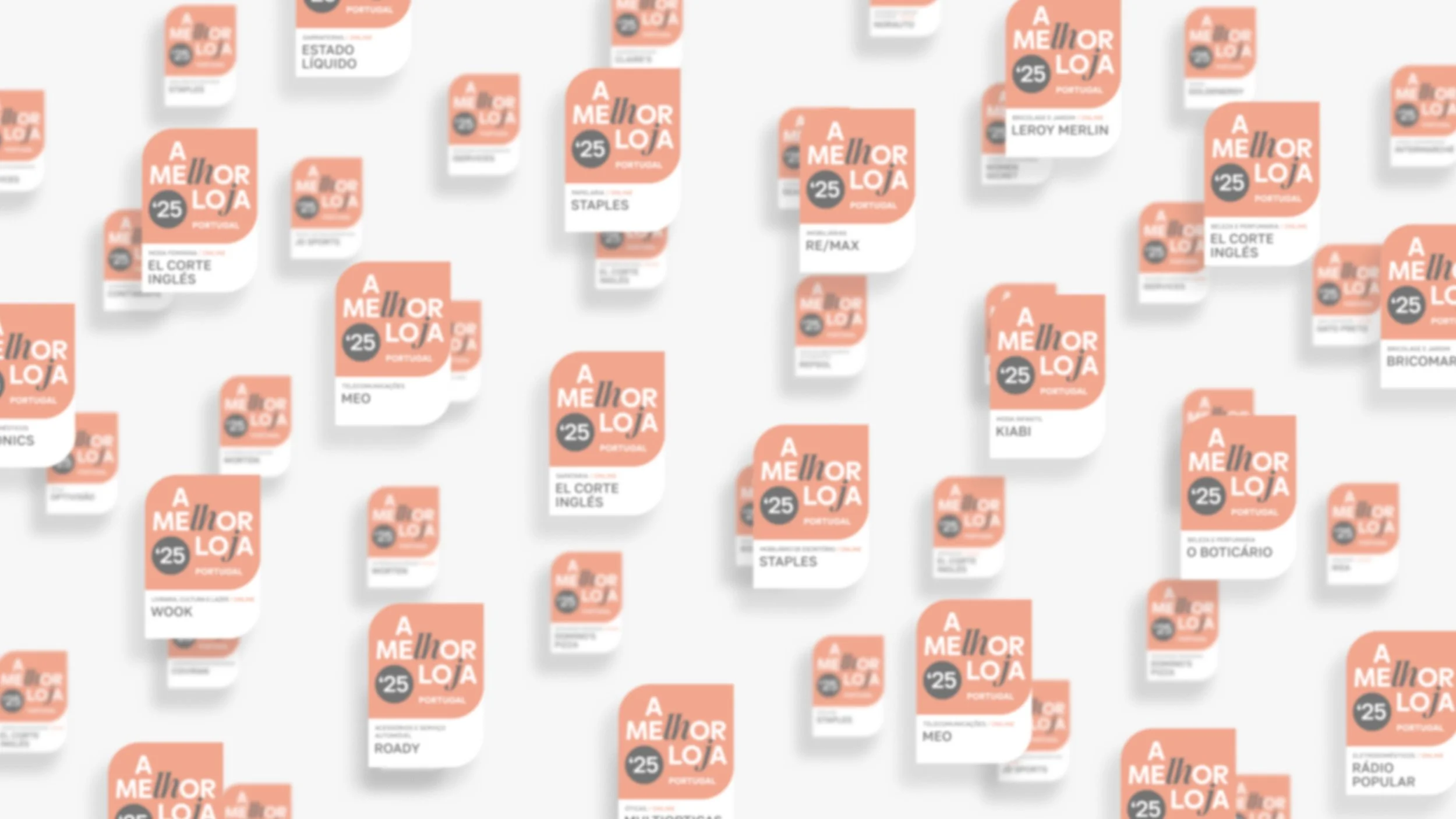
The colour system moves away from the expected reds of the category into a more distinctive orange, positioning the brand closer to the visual codes of economic journalism rather than mass consumption.
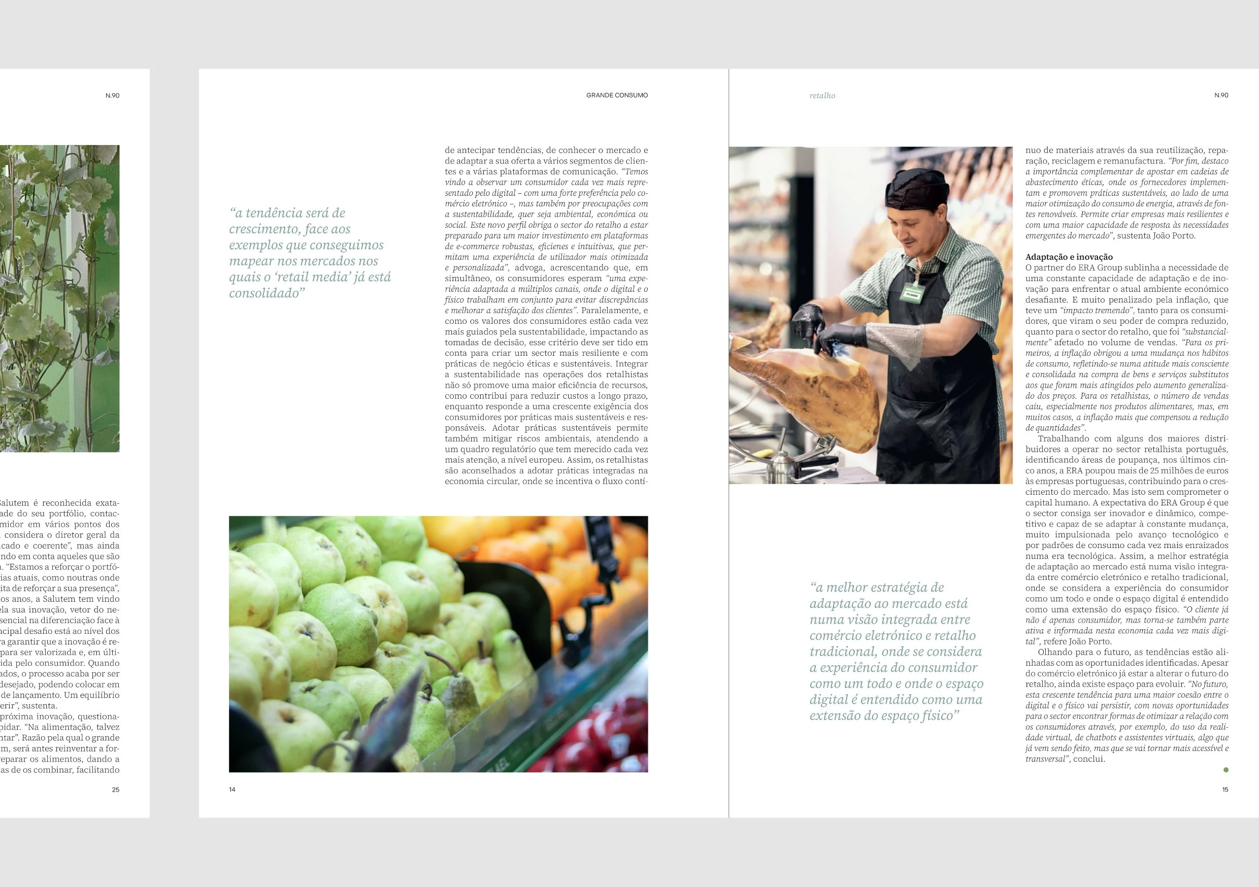
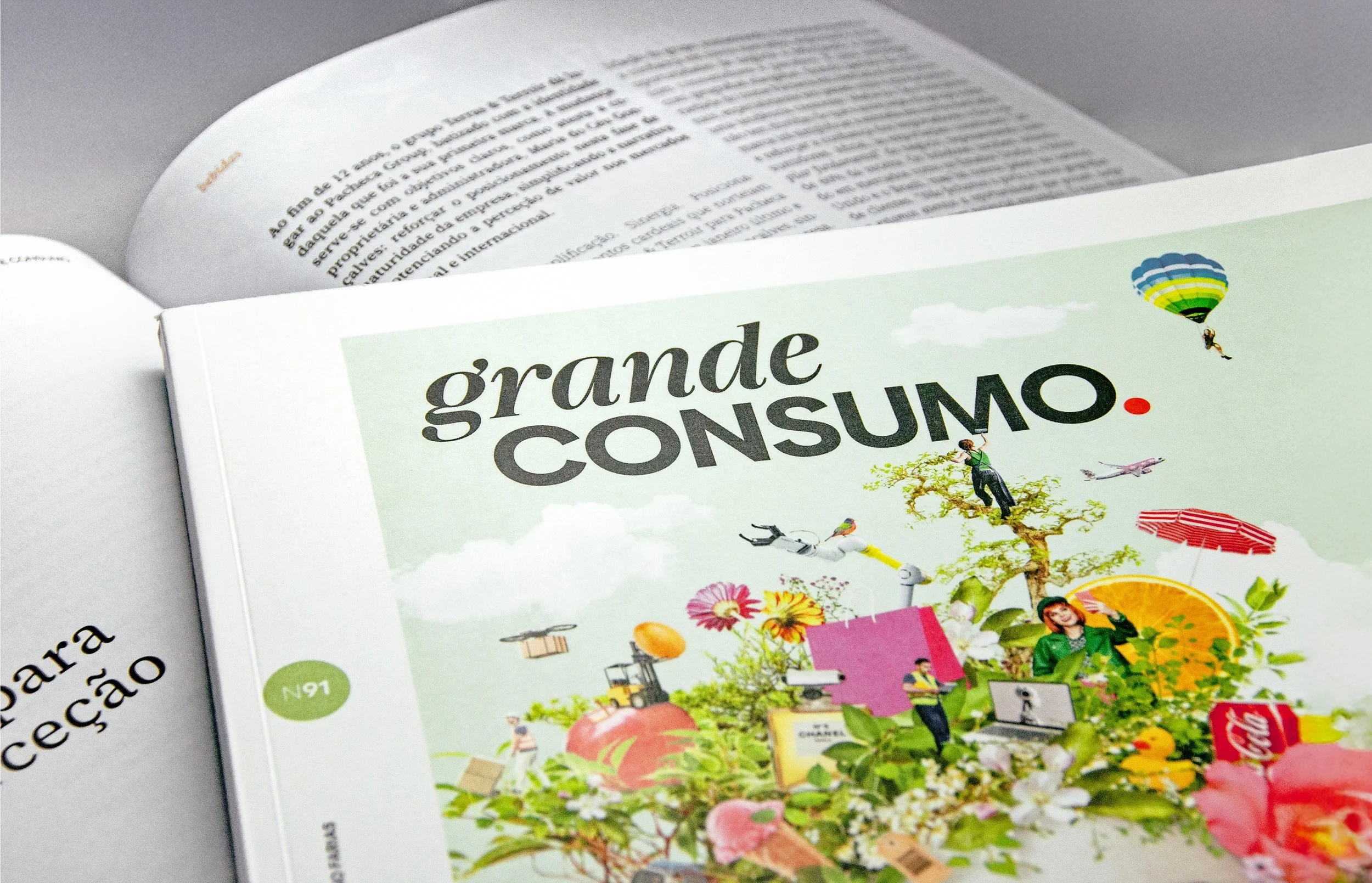
Reimagining the editorial design
If the brand was the strategy, the magazine was the proof.
The editorial redesign became central to the project — not an application, but a validation of the new identity.
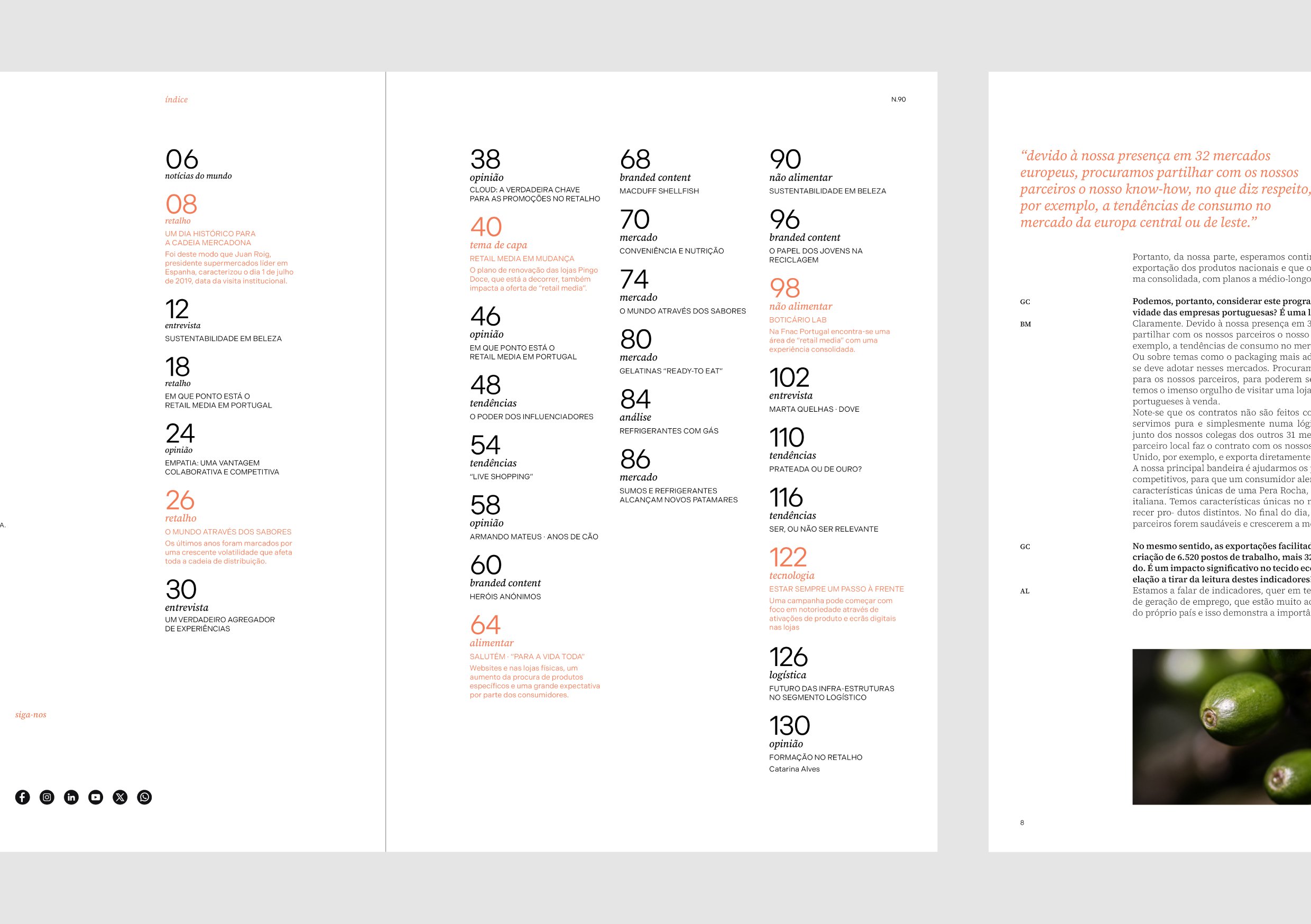
New grids, typographic hierarchies and layout principles were developed to transform the reading experience:
more white space, more clarity, more rhythm
content prioritization through design, not decoration
photography with space to breathe, not compete
The goal was simple:
design that serves thinking.
Covers became more conceptual and editorially driven, capable of translating complex themes into strong, visual narratives — reinforcing the magazine’s role as a curator of ideas, not just news.
As described in the project, if the magazine didn’t absorb the new brand, there would be no new brand.
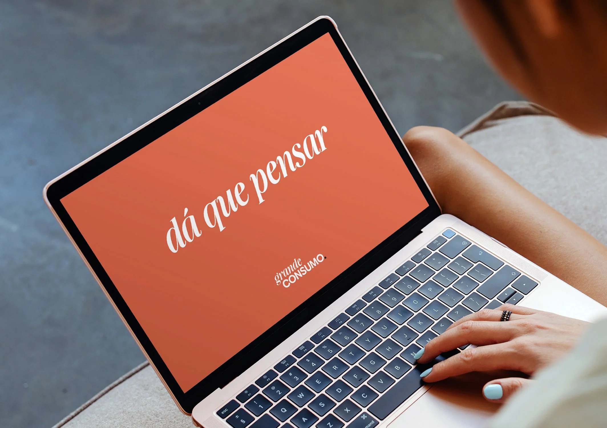
From saying what it does to what it provokes
The verbal identity evolves from a descriptive claim to a promise:
“dá que pensar” (“makes you think”)
A shift from function to impact.
From information to reflection.
Because Grande Consumo is not just about reporting the industry — it’s about making sense of it.
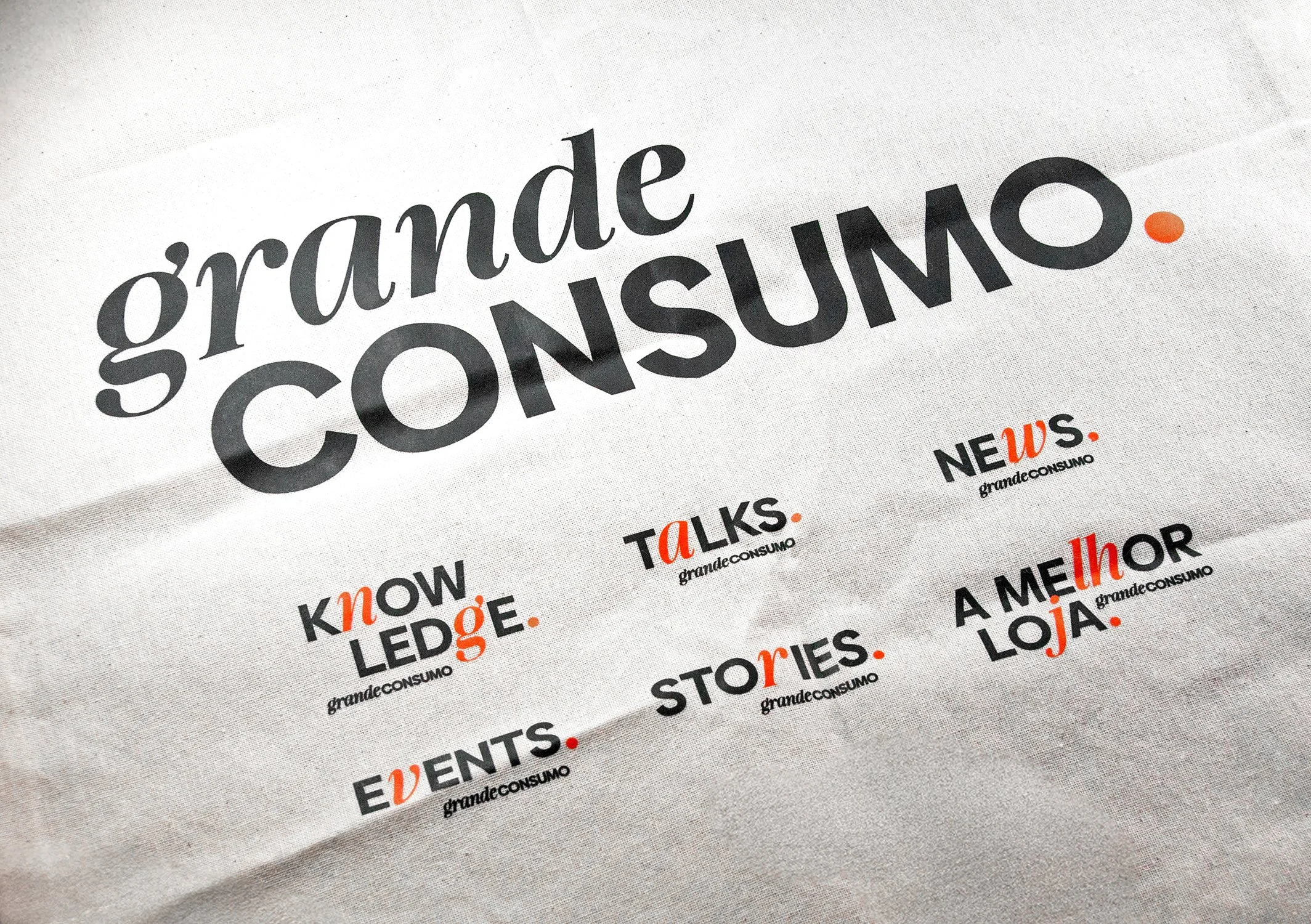
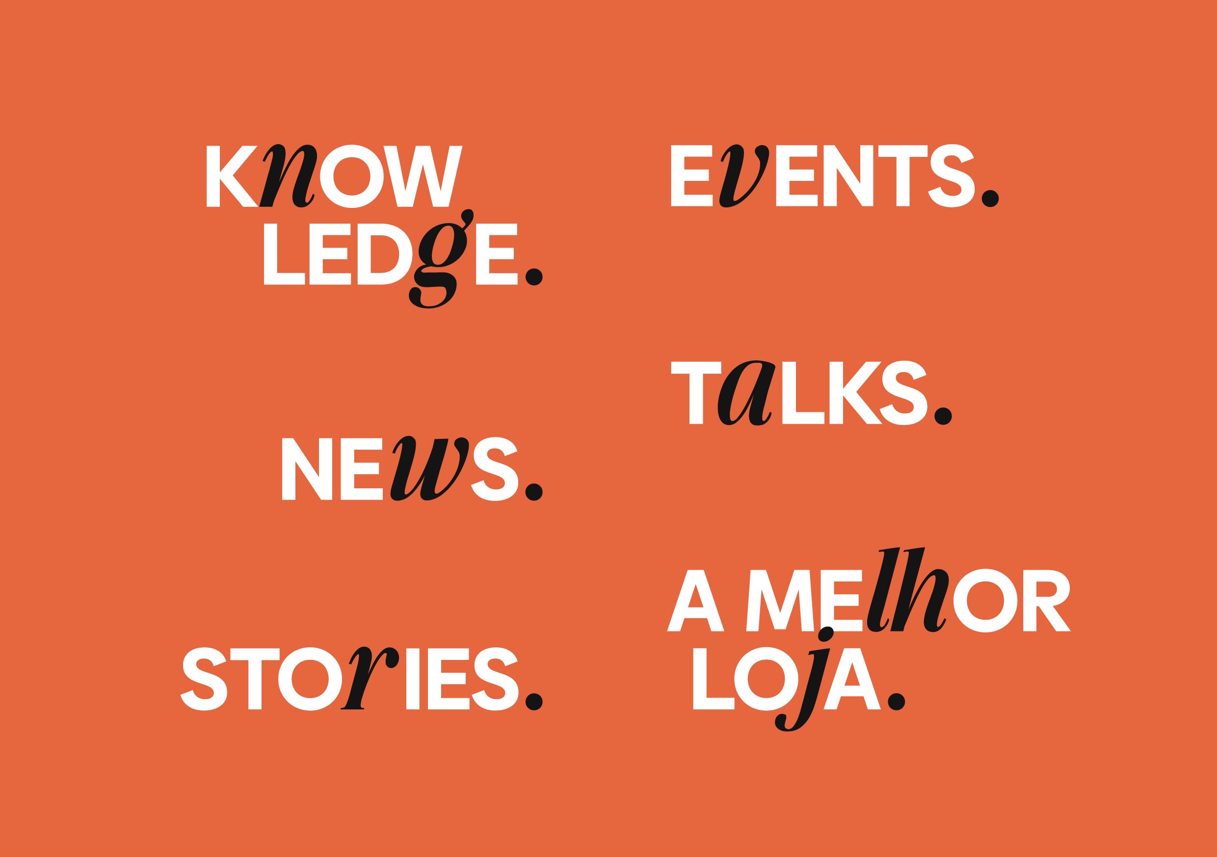
Designing a brand system, not just a brand
The identity was built to live across a growing ecosystem:
print, digital, social, events, podcasts, newsletters.
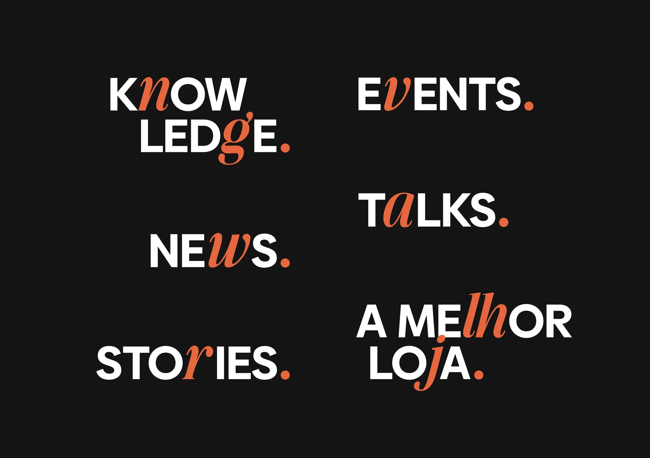
A modular system of sub-brands (News, Talks, Stories, Knowledge, Events) extends the core identity, ensuring consistency while enabling flexibility.
A comprehensive brand manual guarantees that every touchpoint reinforces the same visual and verbal logic — because in branding, consistency is not optional, it’s cumulative value.
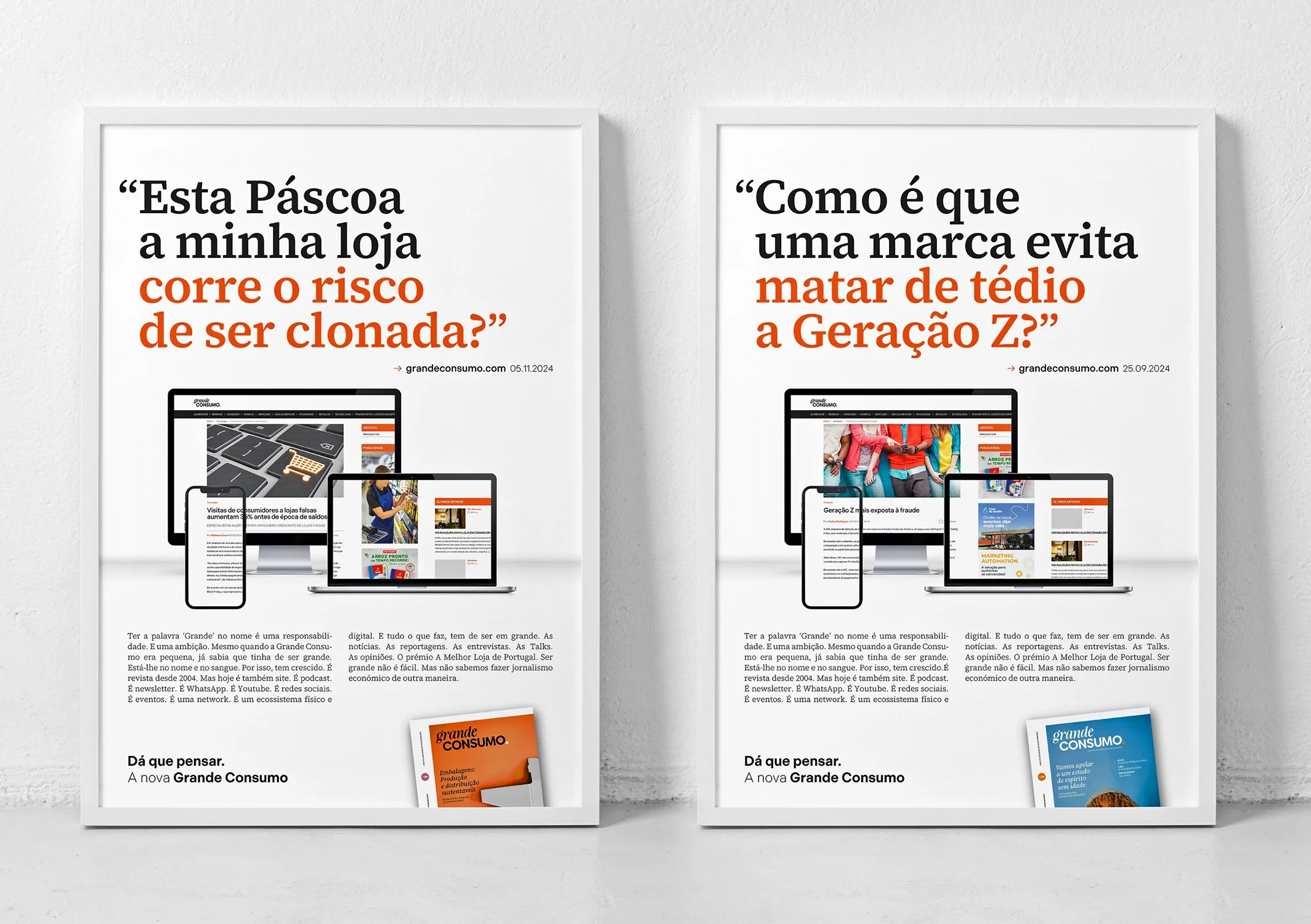
From identity to advertising
The launch advertising campaign extended the same idea into communication:
if Grande Consumo “gives something to think about”, what does that thinking look like?
Each headline was crafted as a question — inspired by real editorial content — turning articles into provocations.
Because the brand doesn’t close conversations.
It opens them.

The Outcome
Grande Consumo didn’t just change how it looks.
It changed how it positions itself.
From a magazine that reports the market to a platform that helps interpret it.
From content consumption to critical thinking.
A brand that now reflects what it has always been: a point of encounter that moves the industry forward.