
Challenge
If the rebranding repositioned Grande Consumo as a platform for thinking, the covers had to prove it — every single issue.
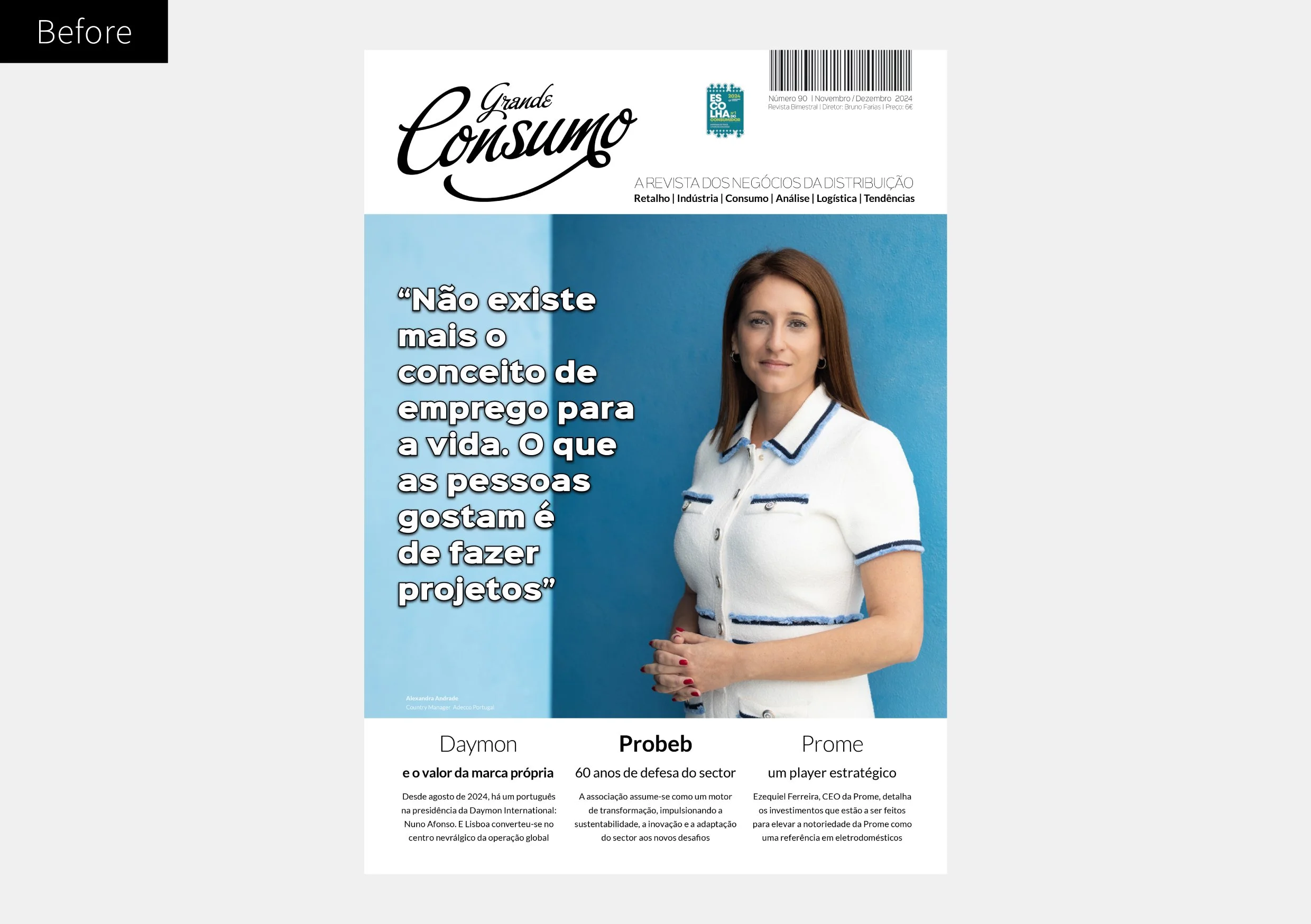
For years, the magazine’s covers were solid, well-crafted, even careful. But they operated within the visual codes of the category: illustrative, descriptive, expected.
They informed. They didn’t provoke.
At the same time, Grande Consumo itself was evolving — becoming sharper, more editorial, more interpretative.
The gap was clear: the covers no longer reflected what the brand had become.
The challenge was not just to “improve” the covers. It was to redefine their role.
From visual summaries to editorial statements. From illustrating themes to interpreting them. From decoration to provocation.
Each cover needed to do what the new brand promised: not just communicate a topic — but give something to think about.
And do it under real editorial pressure: tight timelines, complex themes, and the need to stand out both on a newsstand and in a conference context — where impact wasn’t optional, it was expected

Work
The approach to covers followed a simple principle:
treat each one as an idea, not a layout.
From topic to tension
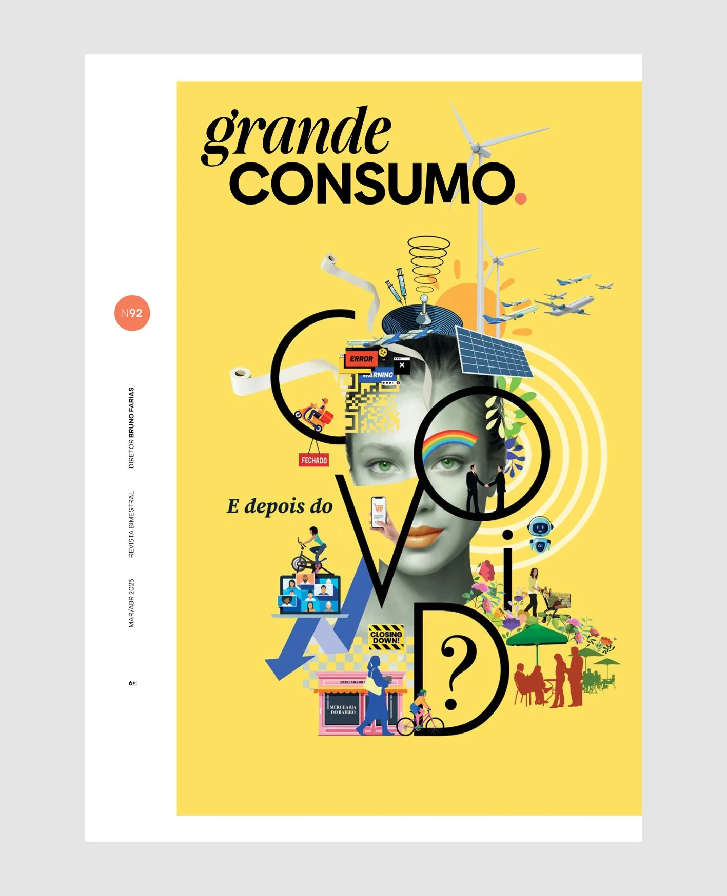
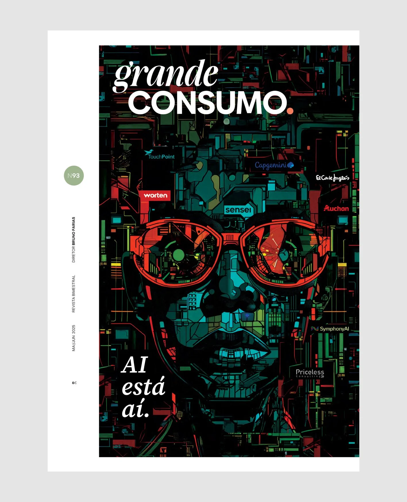
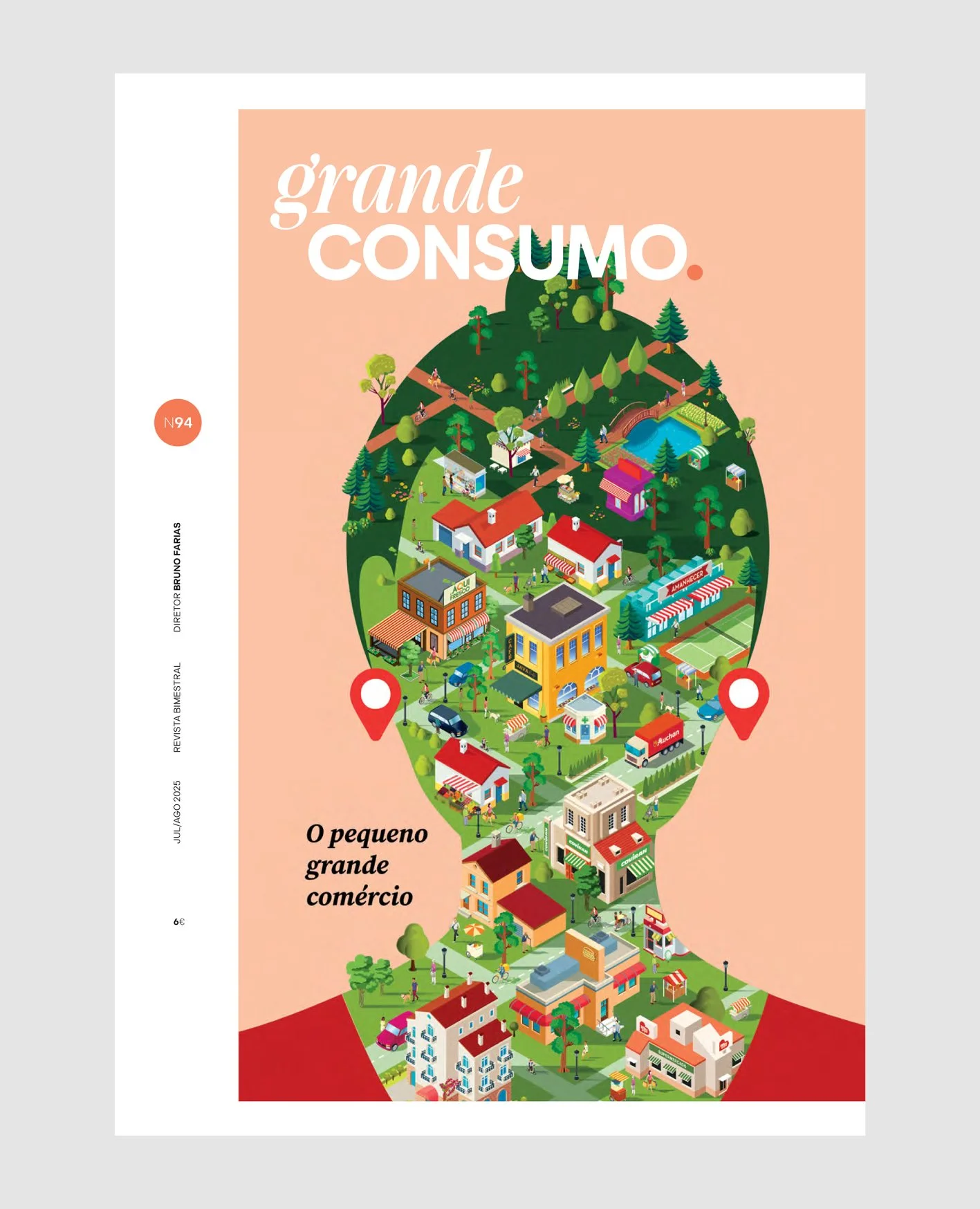
Every cover starts with a theme.
But instead of translating it literally, we reframed it into a tension, a question, a point of view.
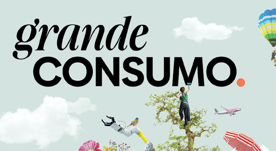
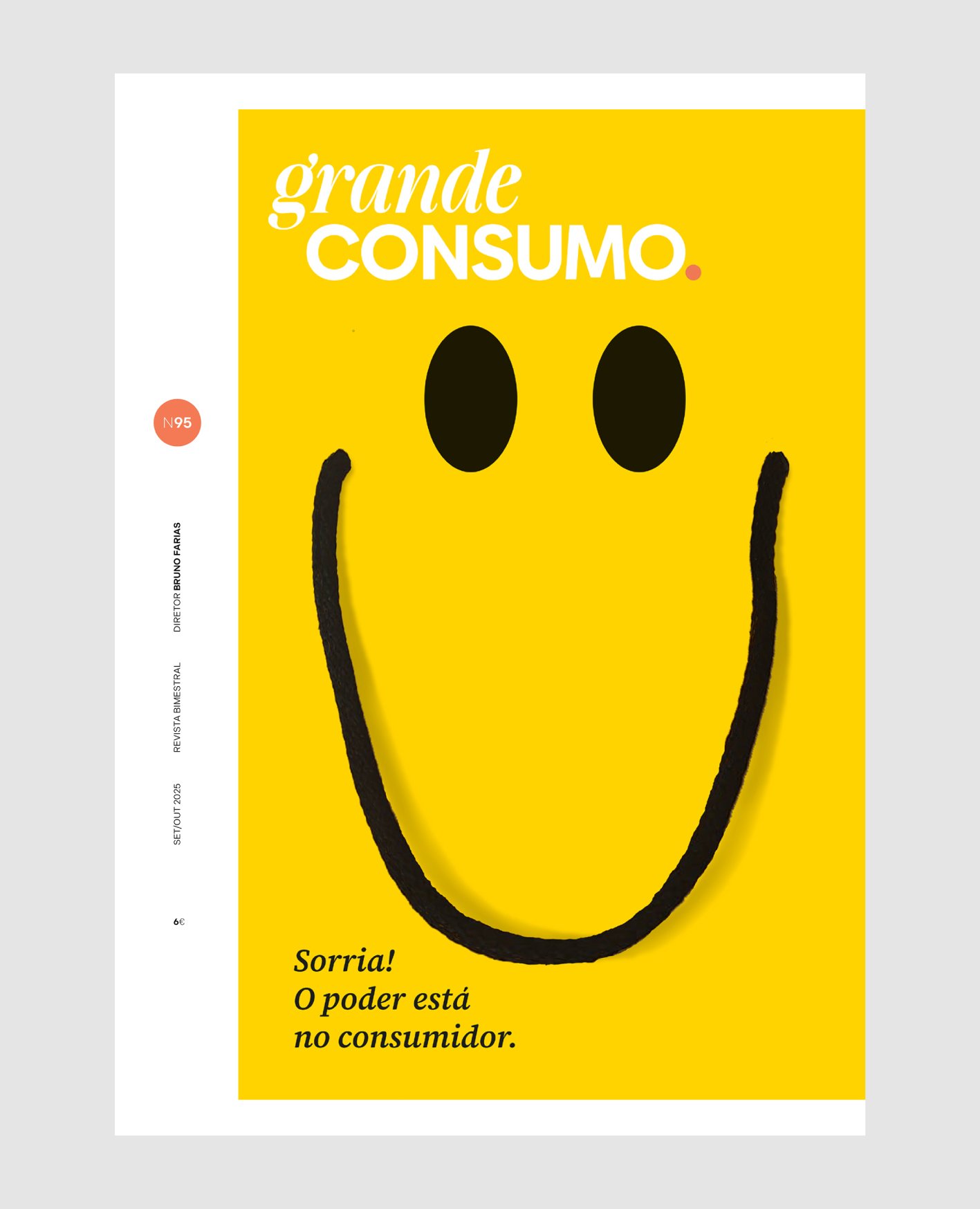
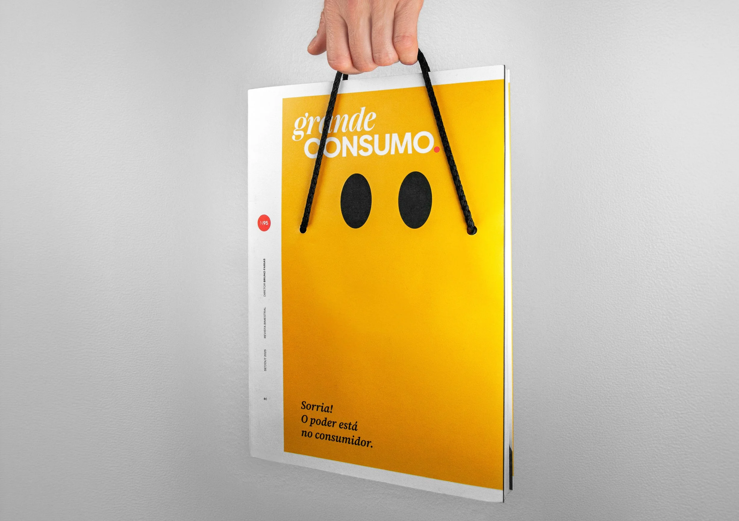
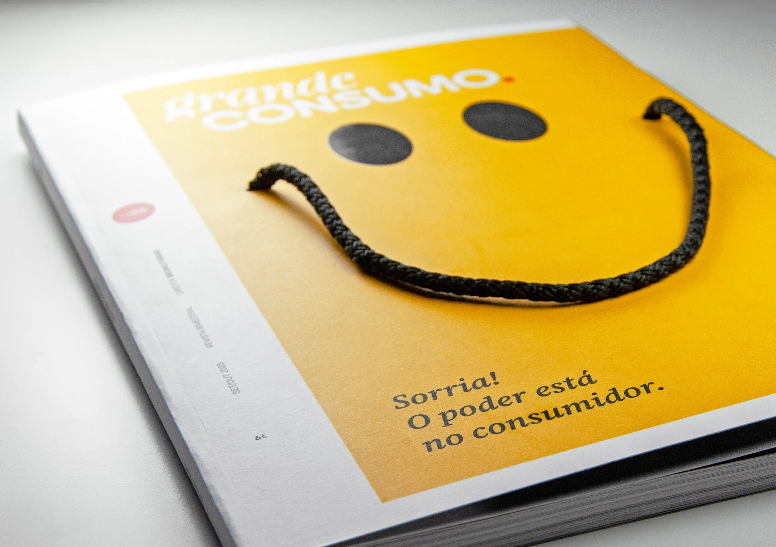
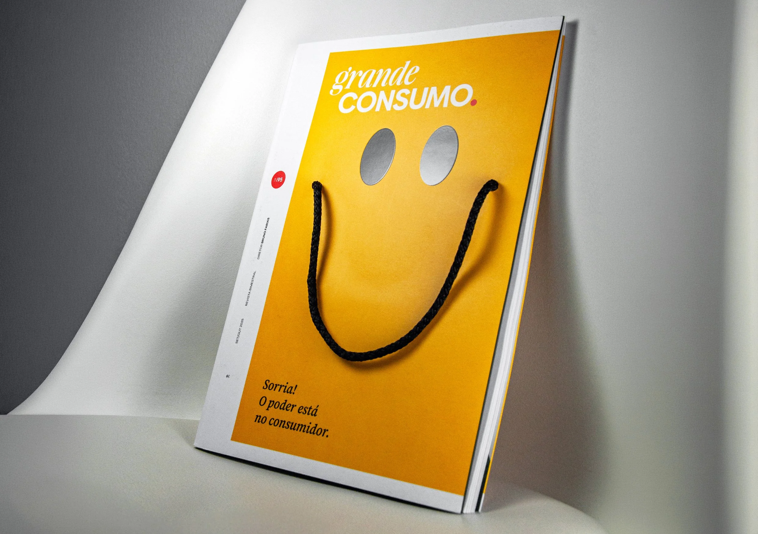
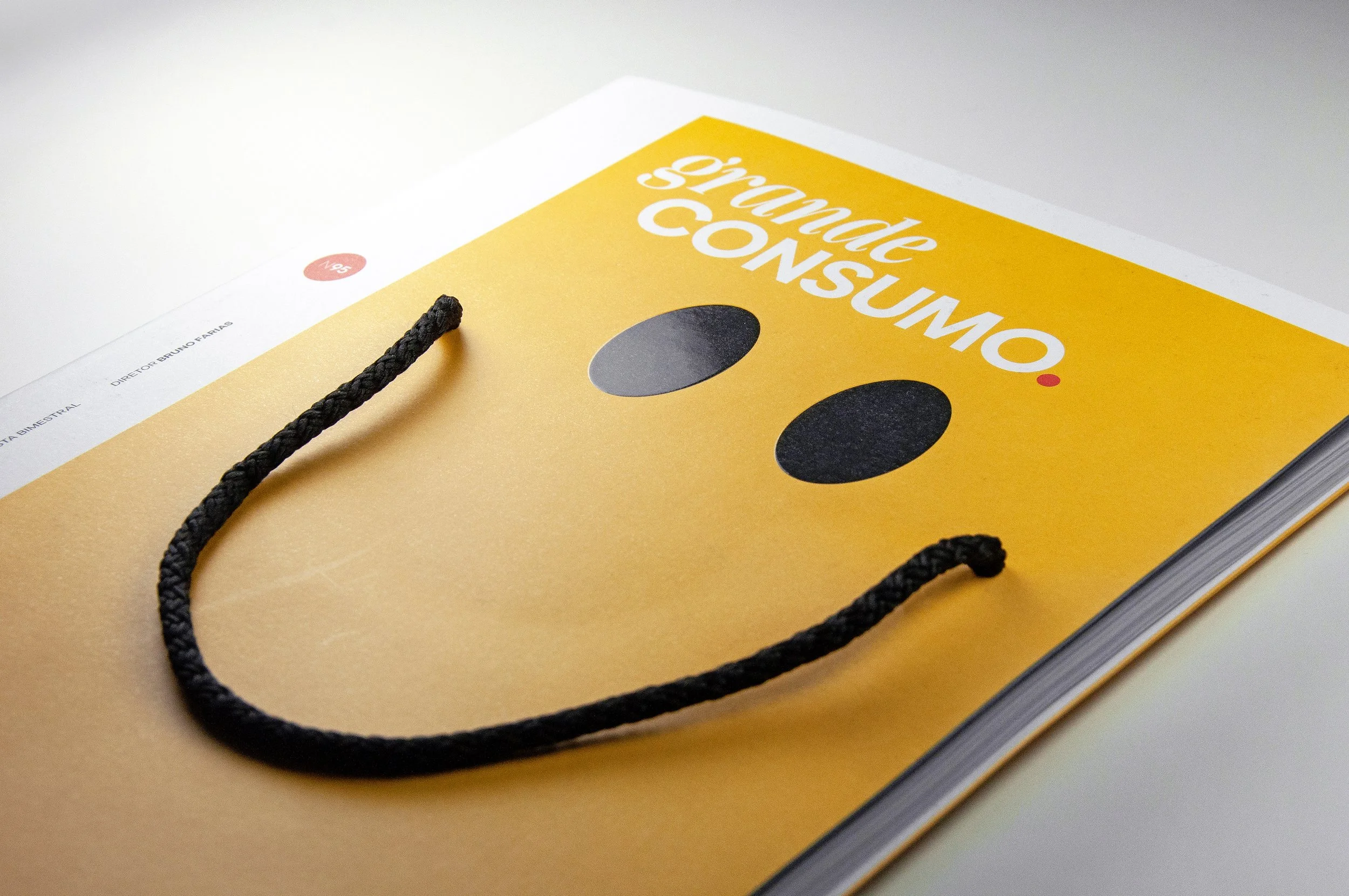
Take Edition 95: the empowered, activist consumer.
Rather than illustrating behavior, the idea became symbolic: a visual that puts power — quite literally — in the hands of the consumer.
The result wasn’t descriptive.
It was interpretative.
And immediately readable
Simplicity as impact
In a category often driven by visual overload, we moved in the opposite direction: reduction.
The strongest covers came from the simplest ideas:
a magazine that becomes a shopping bag
a single gesture that creates a smile
a bold, almost naïve visual language that carries a serious message
As defined in the creative rationale, simplicity wasn’t a limitation — it was the strategy: the fastest way to communicate, the hardest to achieve, and the most memorable.
Designing for “WOW”
Some editions demanded more than relevance — they demanded presence.
Edition 95, designed to appear in a conference setting, had a clear ambition: to “leave people open-mouthed” .
This translated into covers that:
work at distance, not just up close
create immediate visual recognition
invite reaction before explanation
Because in those contexts, the cover isn’t just seen. It competes.
From cover to object
The thinking didn’t stop at the flat page.
Several solutions explored the physicality of the magazine:
turning it into a shopping bag, reinforcing the theme of consumption
using gestures, folds or implied movement
treating the cover as an object in the real world, not just a printed surface
This added a layer of meaning — and memorability — beyond graphics.
A system, not isolated moments
While each cover is conceptually distinct, they all belong to the same logic:
bold central idea
strong, reduced composition
editorial tone over decorative style
alignment with the brand’s visual and verbal identity
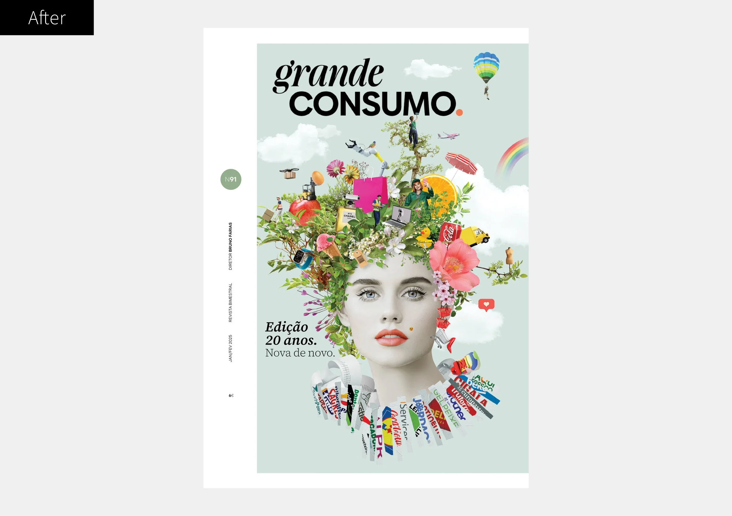
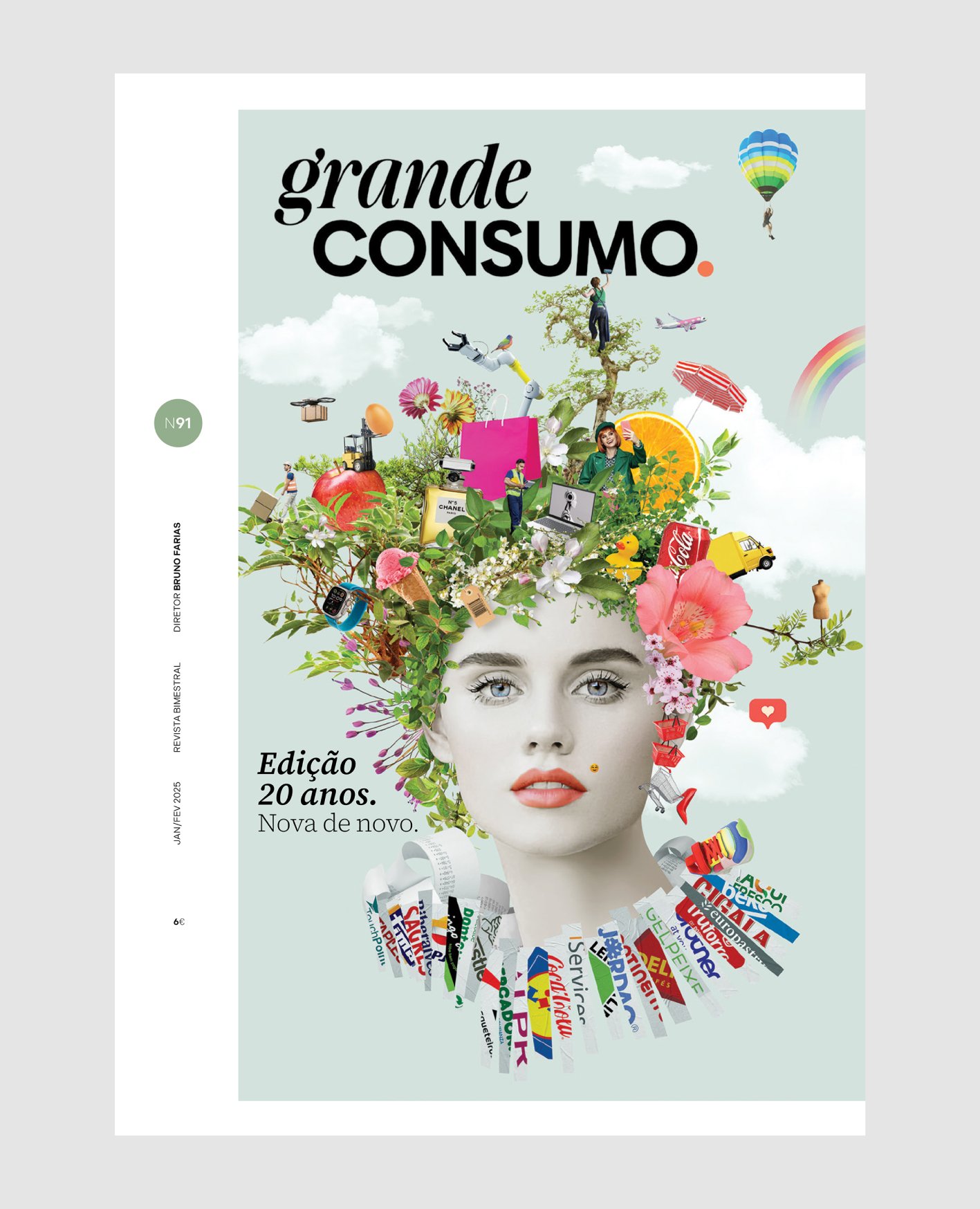
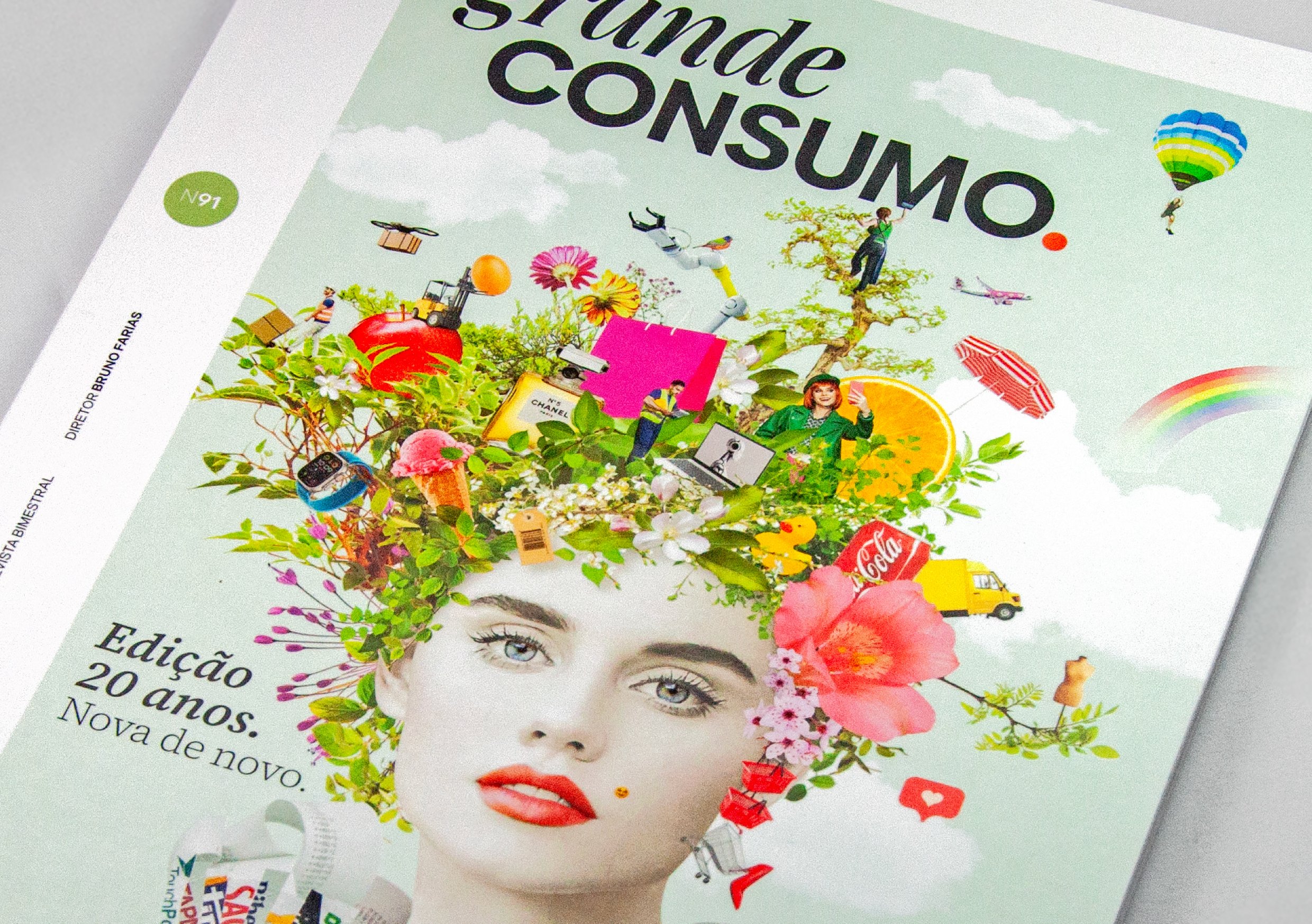
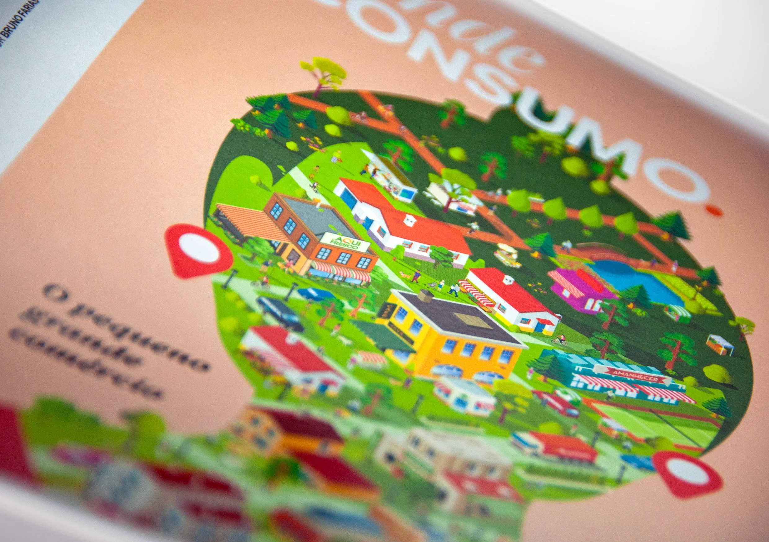
As seen across editions 91 to 97, the covers evolved into a coherent collection of thinking pieces, not disconnected executions.
Thinking forward, not reporting back
The covers also became a space for anticipation.
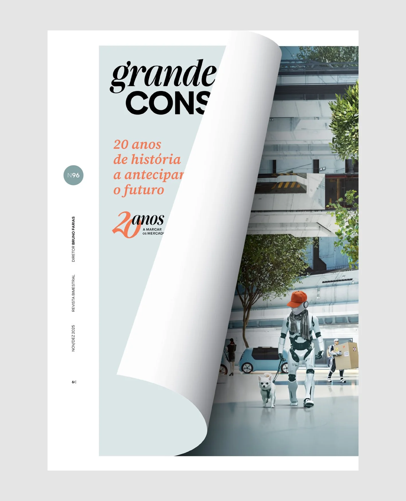
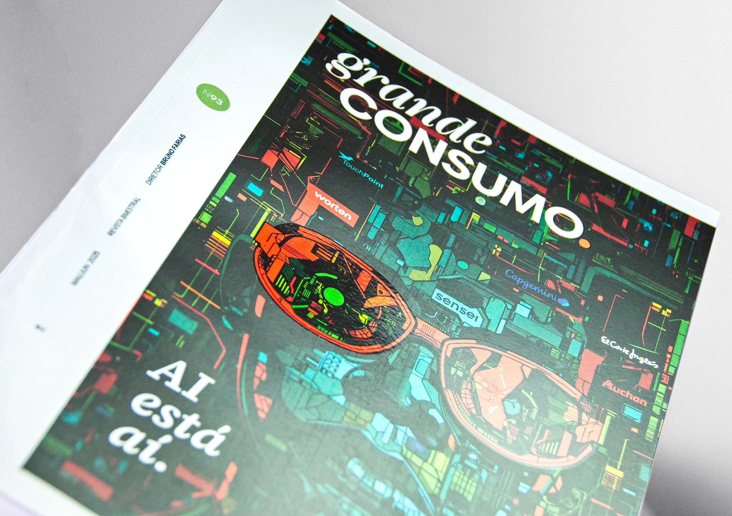
Edition 96, for example, was not about summarizing a conference, but about projecting what comes next — a “point of ignition” where thinking turns into movement.
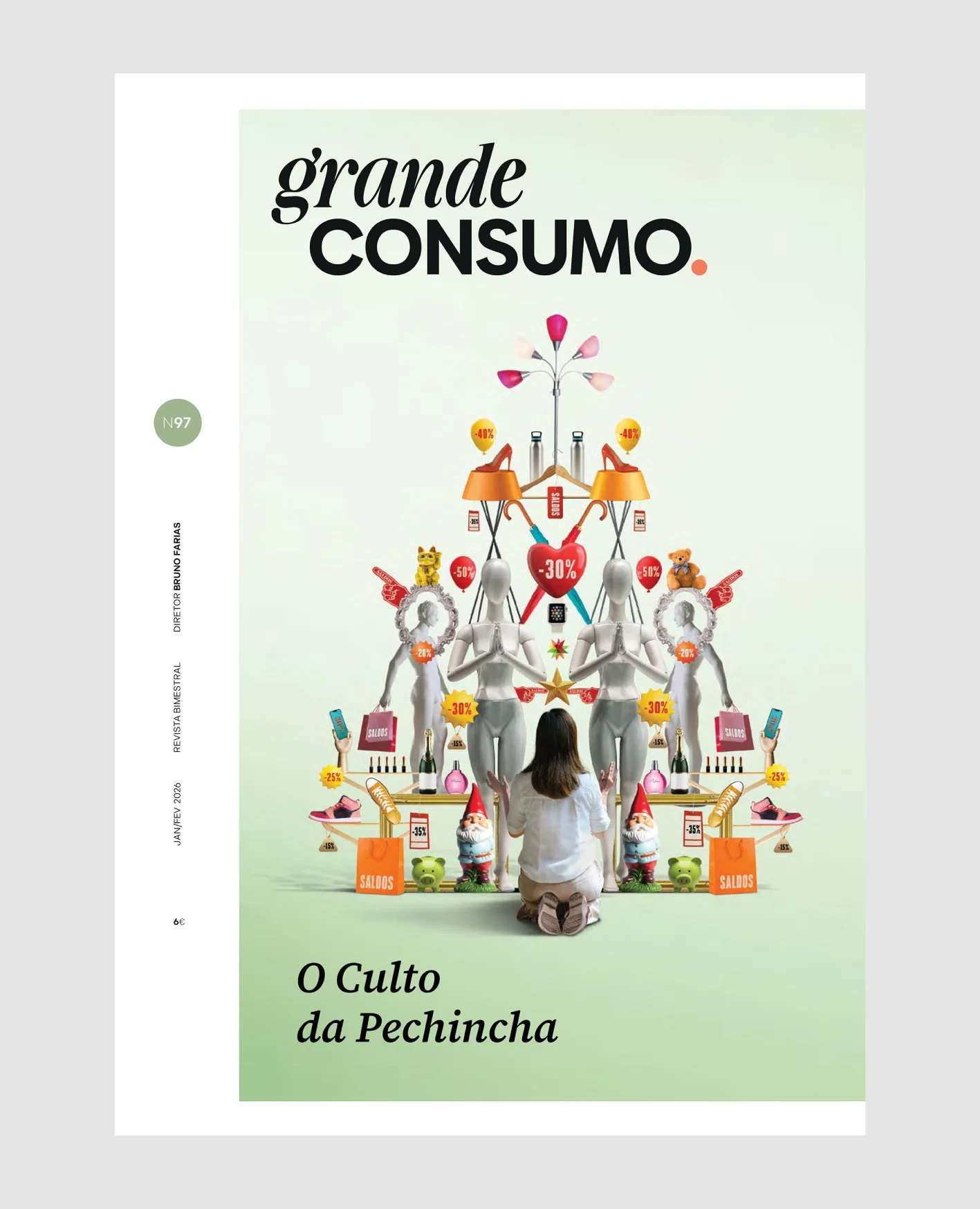
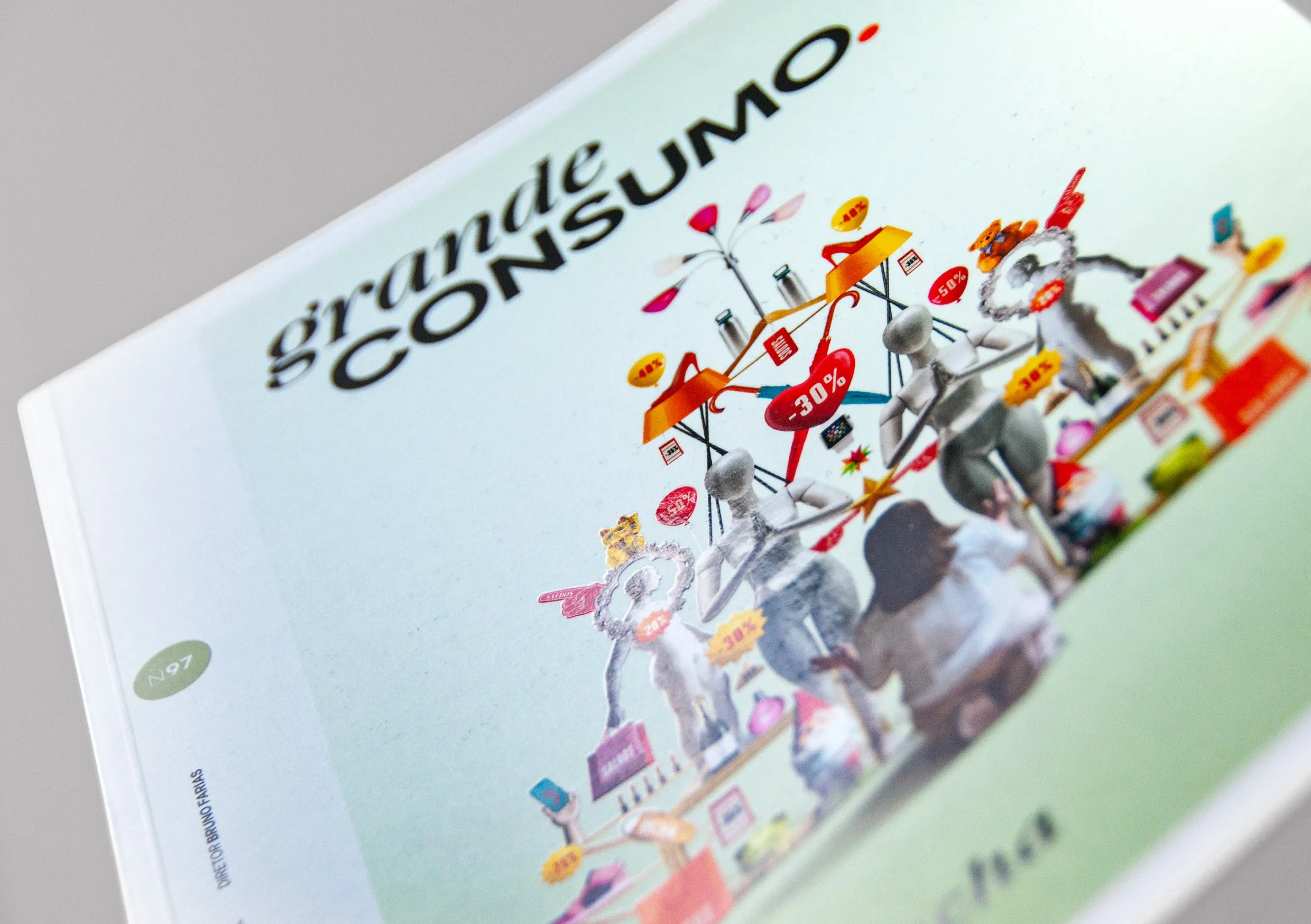
Edition 97 explored emerging behaviors like the “cult of the bargain”, combining cultural observation with future implications.
In both cases, the role of the cover shifted: from documenting reality to interpreting and projecting it.
The Outcome
The covers stopped being entry points to content. They became content themselves.
Each edition now acts as:
a visual editorial
a provocation
a statement of intent
Together, they form a growing collection of ideas — consistent with the brand, but never predictable.
Because if Grande Consumo “gives something to think about”, its covers are where that thinking begins.