
Challenge
Formed in 1994, Centromarca is an association created to protect consumer brands from the practices and policies of big retail chains. It helped brands cope with unfair commercial relationships.
Centromarca means “brand centred” in Portuguese. It wanted the economy to focus on the importance of brands.
Centromarca encouraged businessmen to register their brands so that they would be protected by law. To emphasise this need, the logo had a trademark symbol.
Some of its associates were well-known consumer brand companies such as Nestlé, Procter & Gamble, Unilever Fima, Super Bock Group, Matutano, Beiersdorf, Pernod Ricard, Coca-Cola, and others.
25 years have passed.
Times have changed. Brands have changed. They became empowered. Centromarca has changed. Now it needs to challenge brands to evolve. To open their minds to technology, trends, the digital universe, empathy, and human nature. Its visual identity needed to reflect the challenges brought by these new times.
Centromarca has evolved from an association that assumed a defensive position, to a modern organisation, which also goes on the offensive.
The brand image needed to reflect this change.


Work
We wondered how we could bring a new active “go get ’em” attitude into the brand’s ID. We started with the symbol.
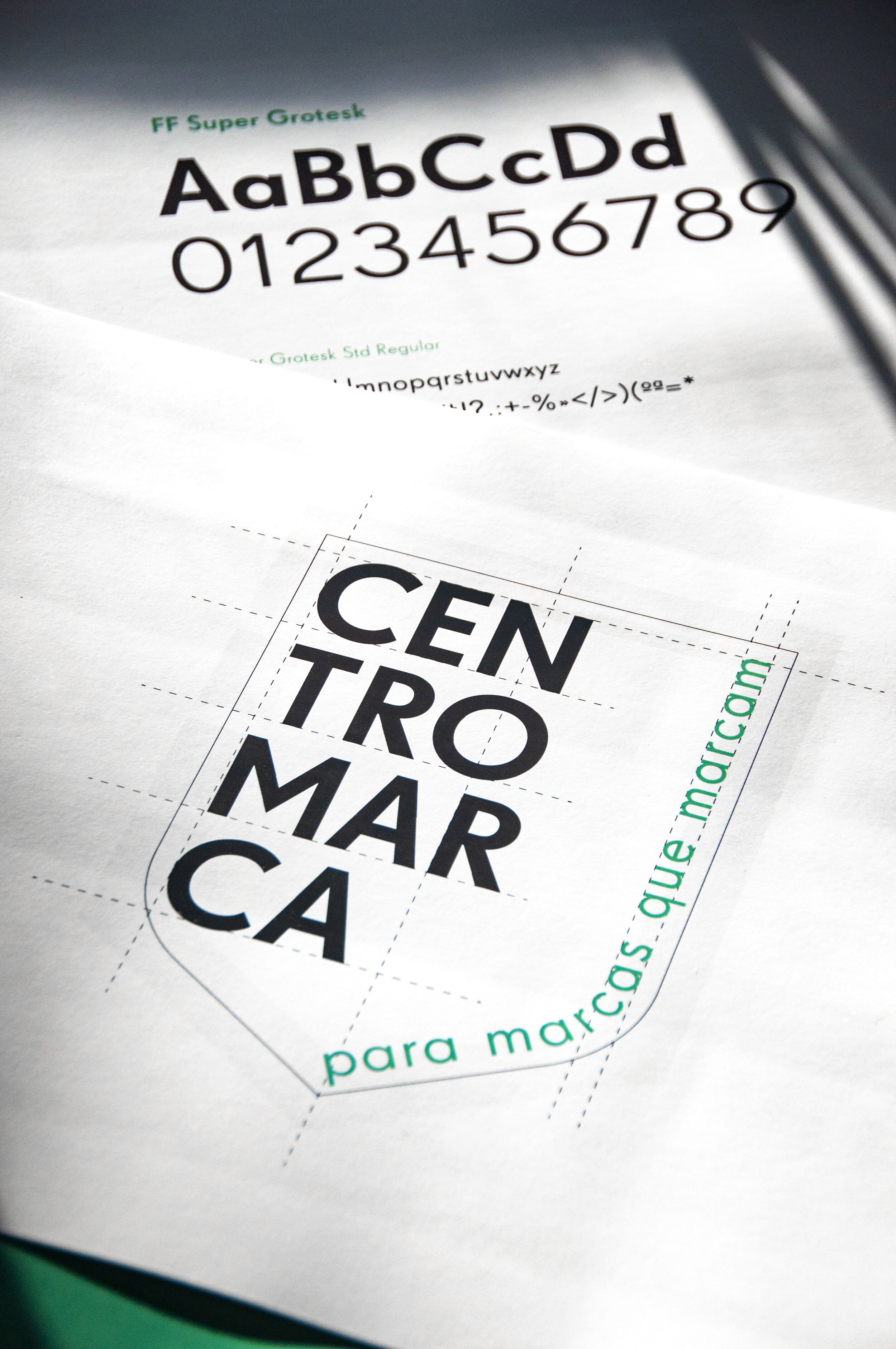
New symbol – we created a shield, but not a classical shield. This shield is half-open. It still protects brands, but it also opens up brands to new technologies, trends, and possibilities. It’s also a shield made of a typographic “trompe l’oeil”. It’s a conceptual symbol, which takes shape in the viewer’s eye.
New colour – the brand had a bright green, which we thought competed visually with the vivid colours used by the consumer brands of their associates. We chose a lighter green that we felt gave Centromarca a more dignified, mature stance.
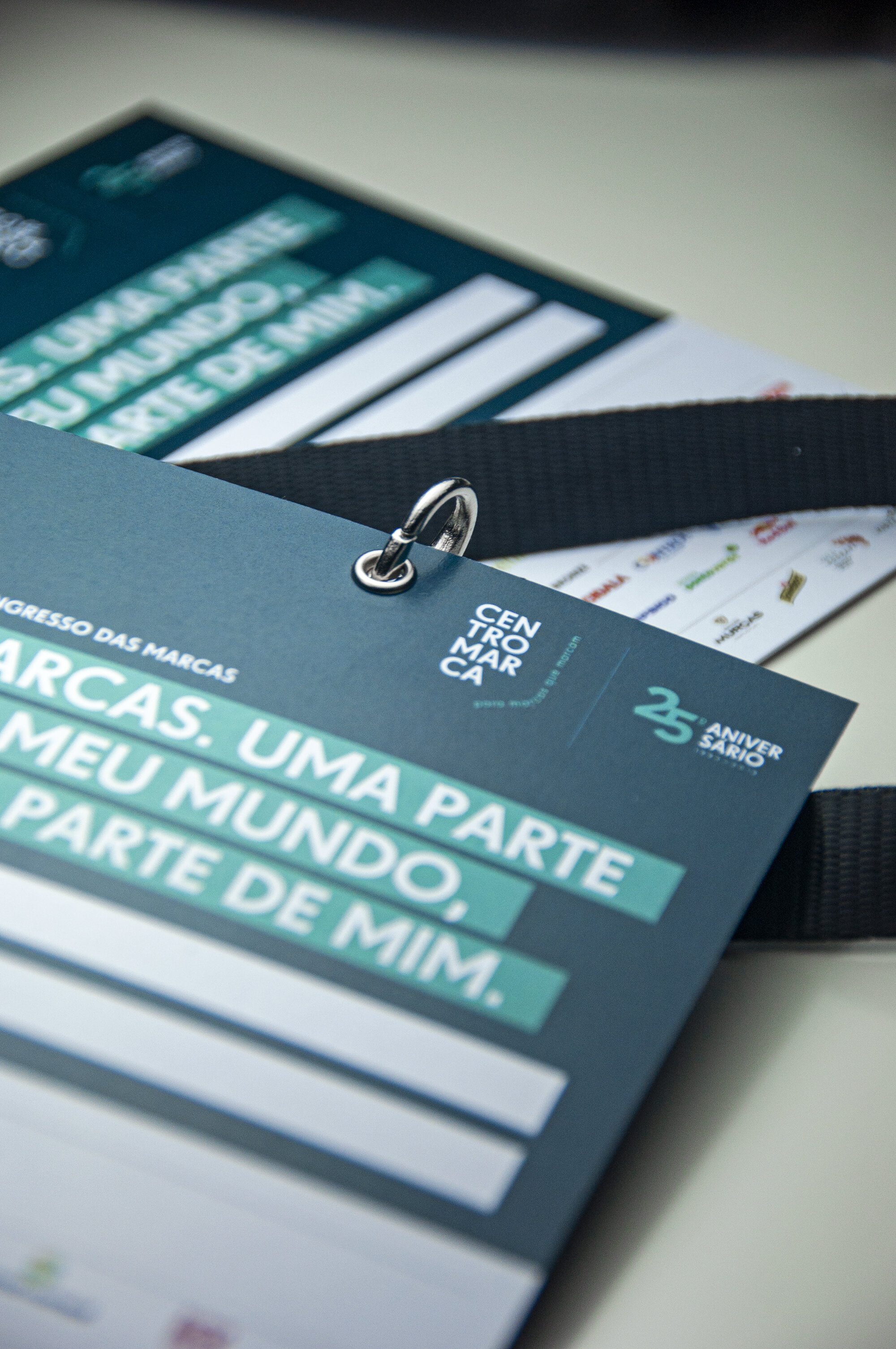
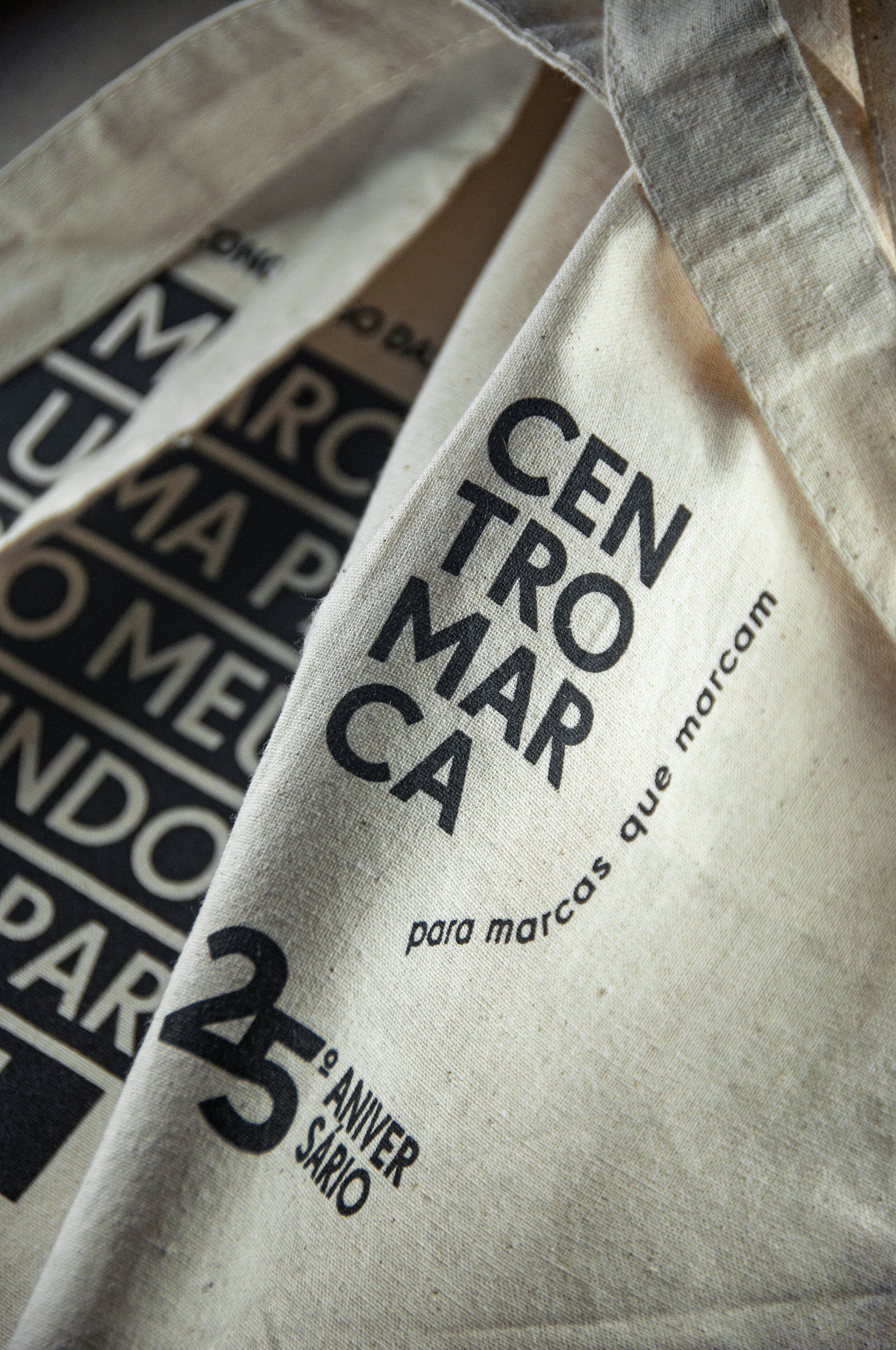
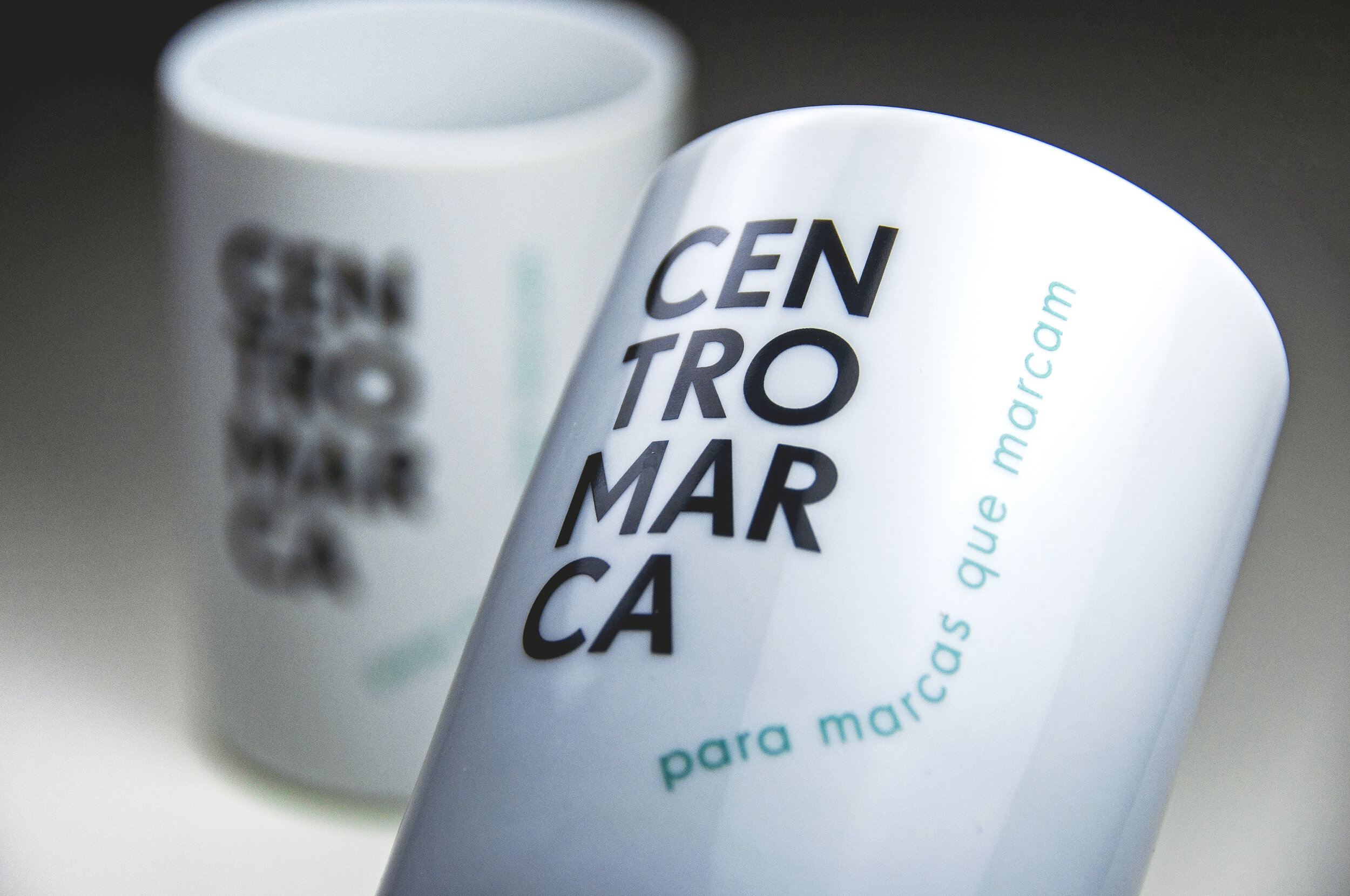
New tagline – “para marcas que marcam”, which means (in Portuguese) “for brands who leave a long-lasting impression on people”. 21st century brands don’t just want to be sold; they want to mean something, deeper, to become human. They have a purpose now.
New name composition – to emphasize its well-earned awareness, we broke it down graphically.
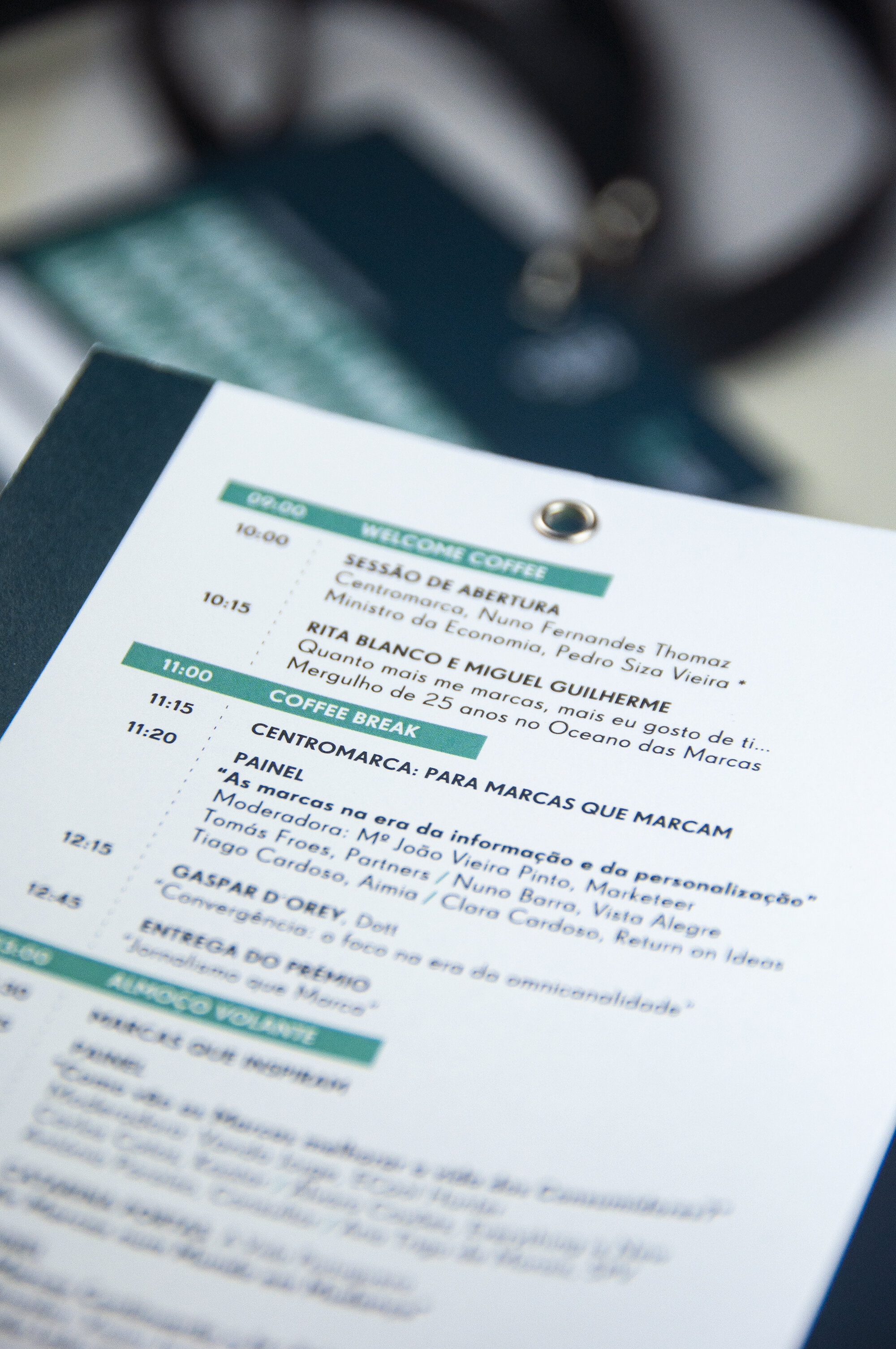
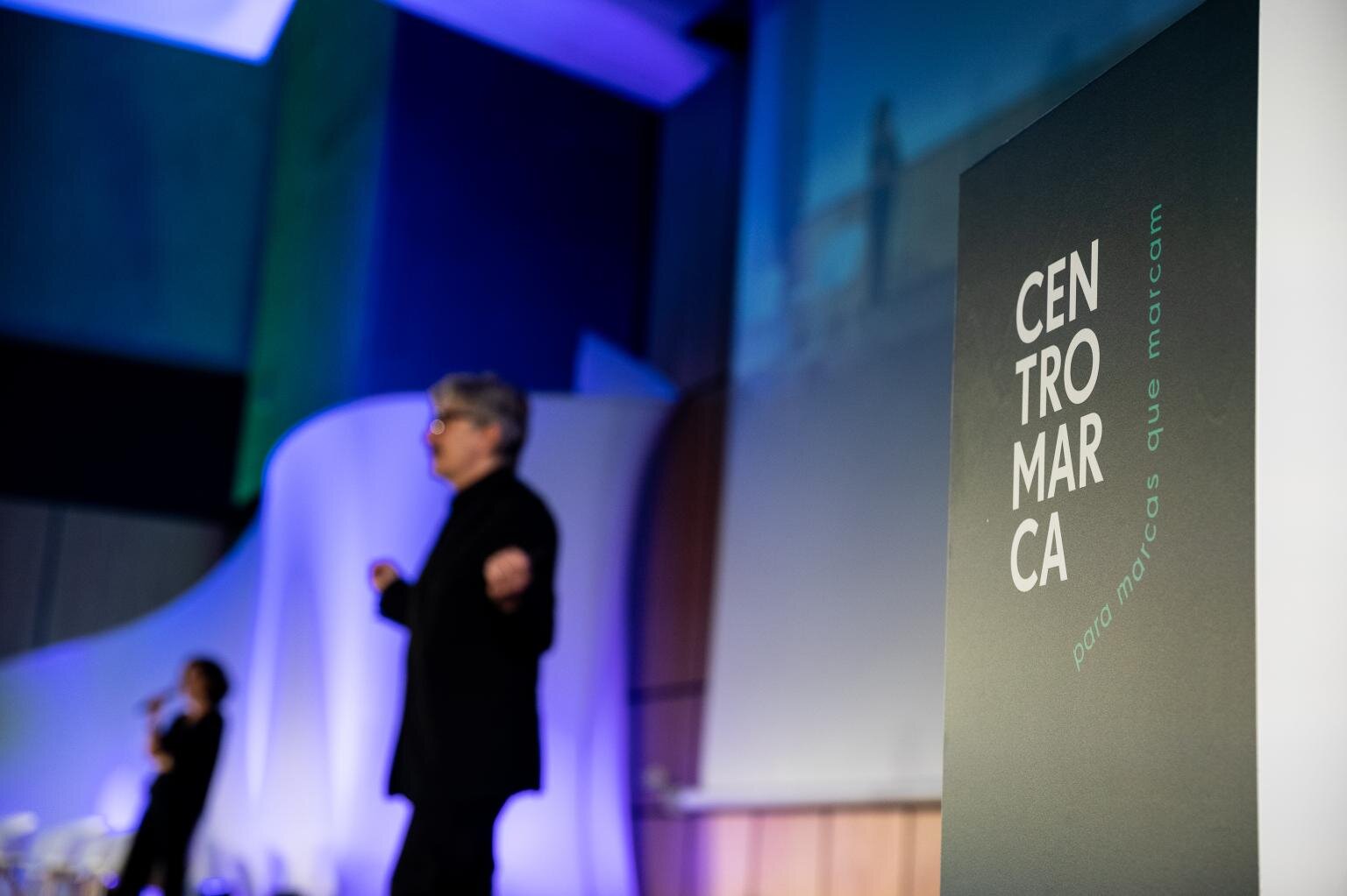
New Look & Feel – this was a feature the brand didn’t have. The new Look & Feel allowed the brand to express itself on all platforms and events, such as the Congresso das Marcas (Brand Summit), the first of its kind, which took place in November 2019 and was a smashing success.