


The Background
Imagine you’re in a market, born in pre-Historic times, 6.000 years BC. It’s not easy to be innovative in such a market. When something lasts for so long it probably means people treasure its product just the way it is, with minimal upgrades. Even more so in a country that proudly stated that drinking wine meant feeding 1 million of its inhabitants. The Symington family established themselves in such a country in the 19th century and has lived and produced wine in the Portuguese Douro valley ever since. Not regular wine, but its stronger ‘cousin’, Port wine.
By the end of the 20th century, Symington Family Estates started dreaming of expanding its wine business to the more elusive table-wine market. It did so in the new century with success. But the Symingtons wanted more. To reach a tricky new audience not too keen on wine.

The Challenge
Typically, the focus of a wine brand is on the name, the bottle, the label design, and the back label, which includes information about grape varieties, terroir, notes about the wine (appearance, aroma, flavour) and, sometimes, pairing (which dishes should be savoured with the wine).
Once this is done, the brand creation process is over, communication starts.
However, the Symingtons wanted to sell this wine to a new millennial audience, instead of the traditional wine-loving over-40 target. The goal was to reach a new generation of explorers & wine lovers.


The Work
When you want different results, you need different methods. The creative process was therefore developed in a new way: as if we were creating a Netflix series. This time, no grapes, terroir or tradition would be evoked.


Methodology:
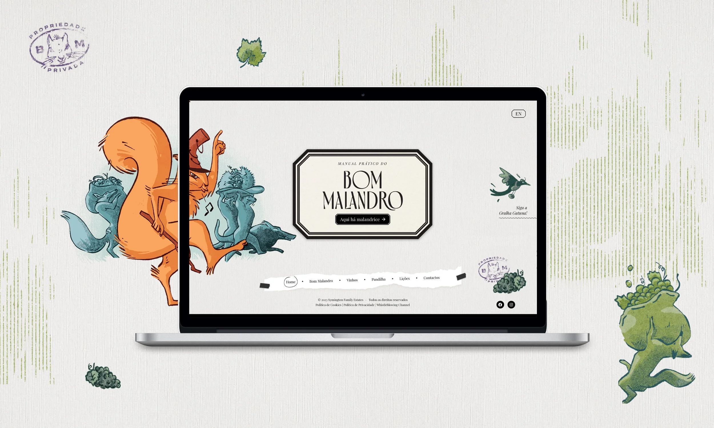
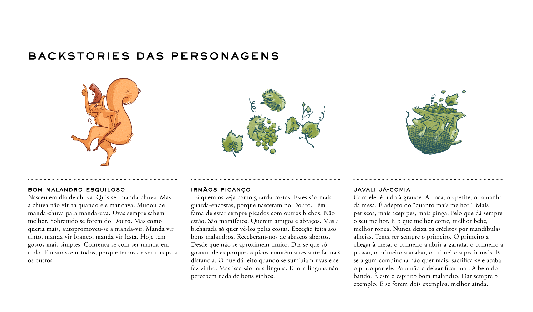
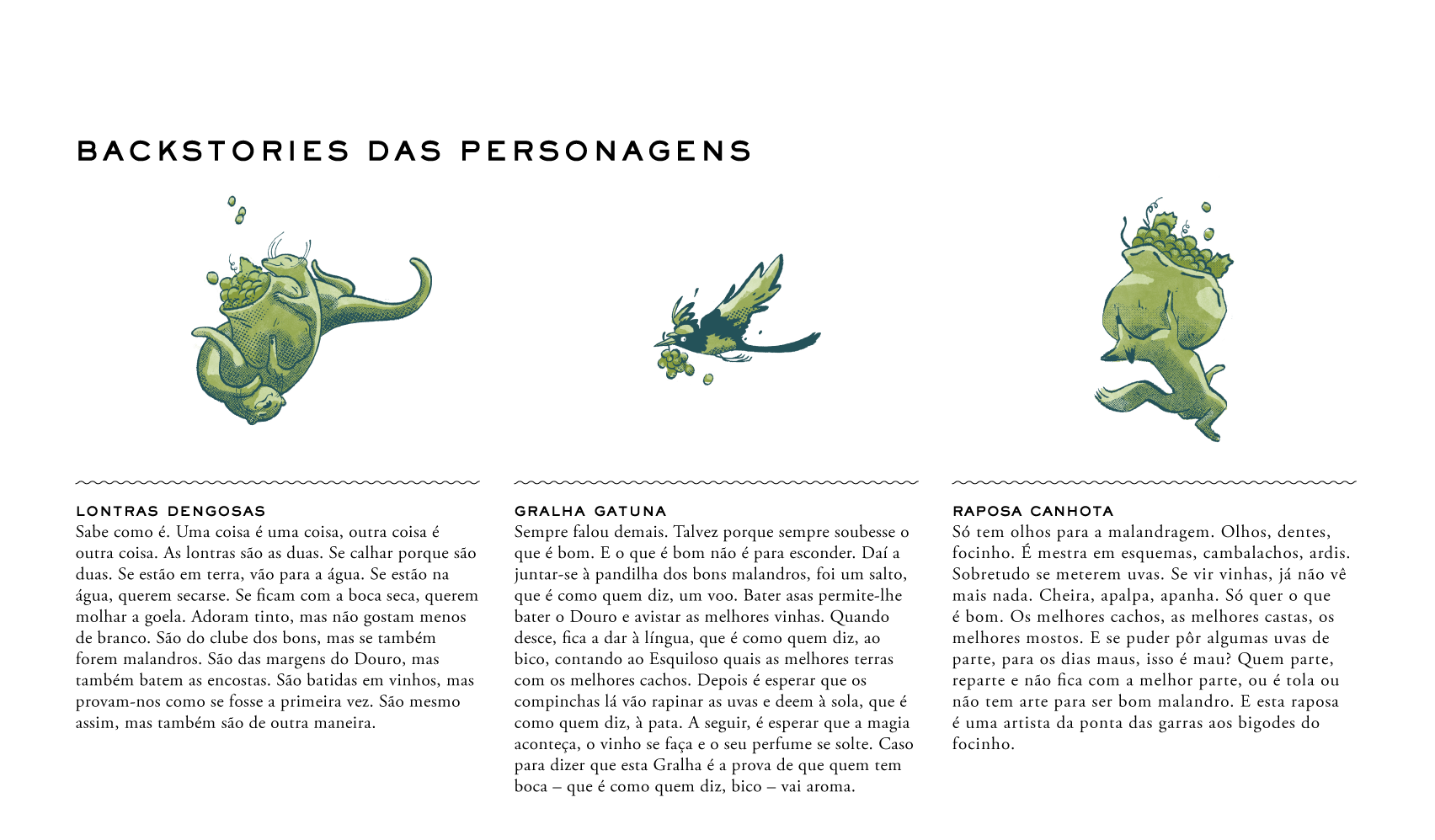
Strategy determined we should create a scenic name for the wine brand (“Bom Malandro”, transl. cheeky rascal); the name led us to the 'hero' (squirrel); the 'hero' to the secondary characters (gang of animals native to the Douro valley); the gang led us to the storytelling (they steal grapes to make wine and feast); storytelling determined the brand voice (fables); the brand voice allowed us to define the tone of voice, and this one led us to the backstories of each character (6 in total).
From this brand-building universe all touchpoints were then created, making sure everything was consistent.
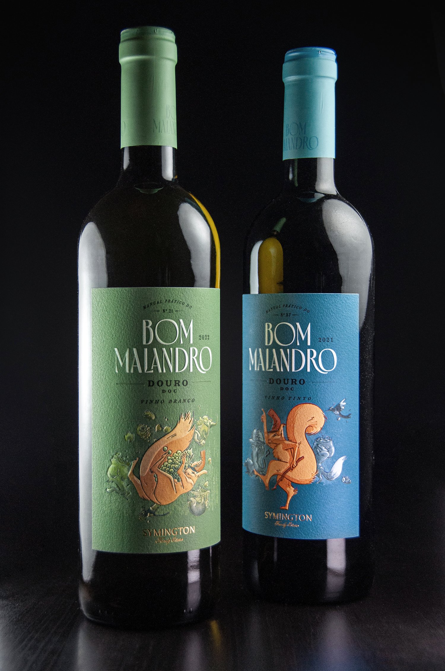
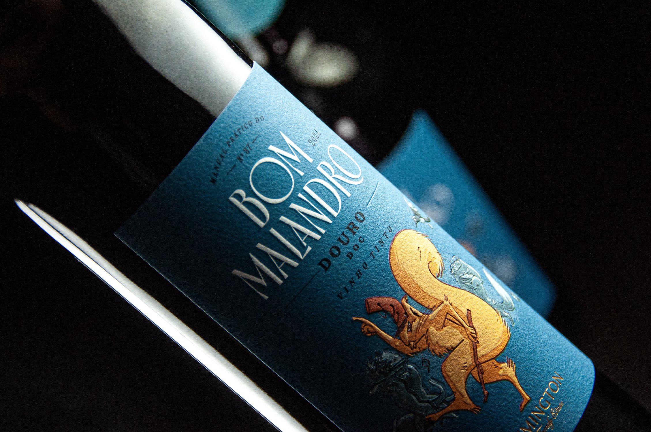
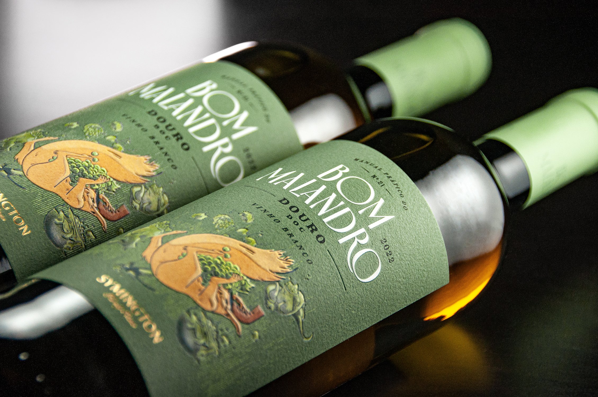
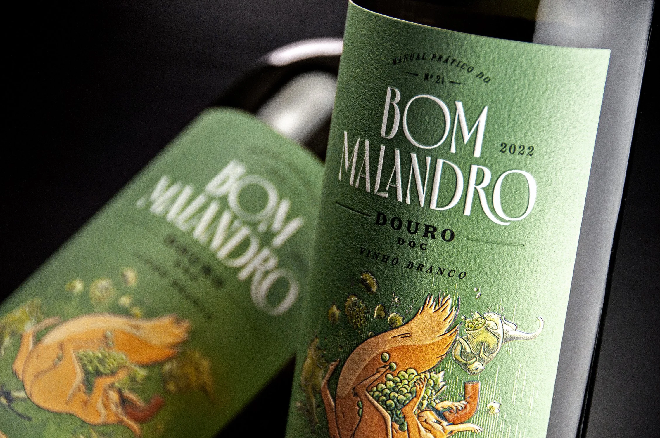
The storytelling would be illustrated on the label of both the red and white wine. The white wine would show the gang stealing grapes; the red, would show the gang running from the “crime scene” led by the squirrel. The story would continue to play out throughout various media: back label, shipping cases, packaging, gift case, website, launch party event, social media, and more.
Brand Concept:
The concept of this project was to take the Bom Malandro (good rascal) name on itself and design the label as a cover of an imaginary pocket book with practical lessons; a sort of survival guide of how to be a rascal in the winery of the Douro valley.
Design ID:
The identity was idealised to project a certain look from the literature golden age, where books were carefully bounded and covers were typographical rich and lush. The logo had to have this balance and tension of vintage yet contemporary.
Typographic fonts were chosen to reinforce this duality of old and new.
Illustration:
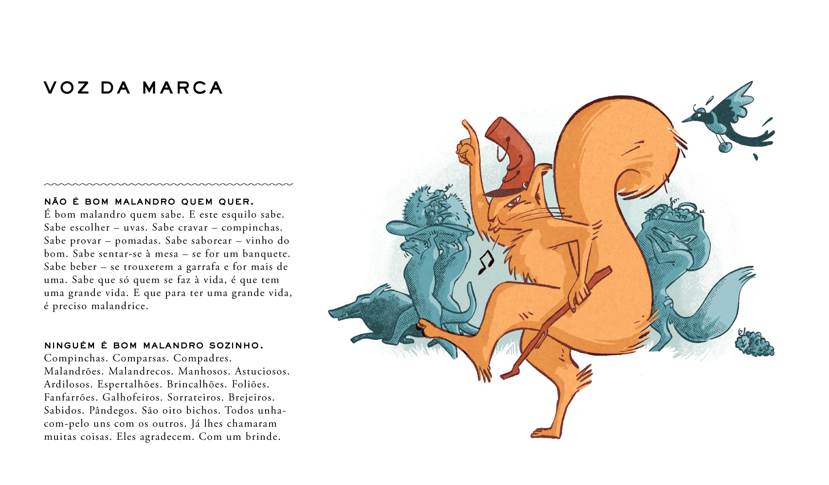
The same approach was taken for the illustrations and its characters. The rascal and his gang were conceived as characters of some La Fontaine fable. Different autochthonous animals from the valley with different trades and crime specialities and names alluding to a gang style bunch. Albeit a gang, the Bom Malandro is lead by the Esquilo Esquiloso (a squirrel) - a very mischievous little guy with an provocateur attitude.
To dramatize the brand's creative vision, we recruited renowned Spanish illustrator Luis Mendo, based in Tokyo, who drew the two emblematic scenes for the story: the “grape theft” (white wine label) and the escape from the “crime scene” (red wine label).
Colours:
In terms of colors, Bom Malandro leans on more natural pigments, reflecting a bit the landscape of the Douro valley itself.
Back Label:
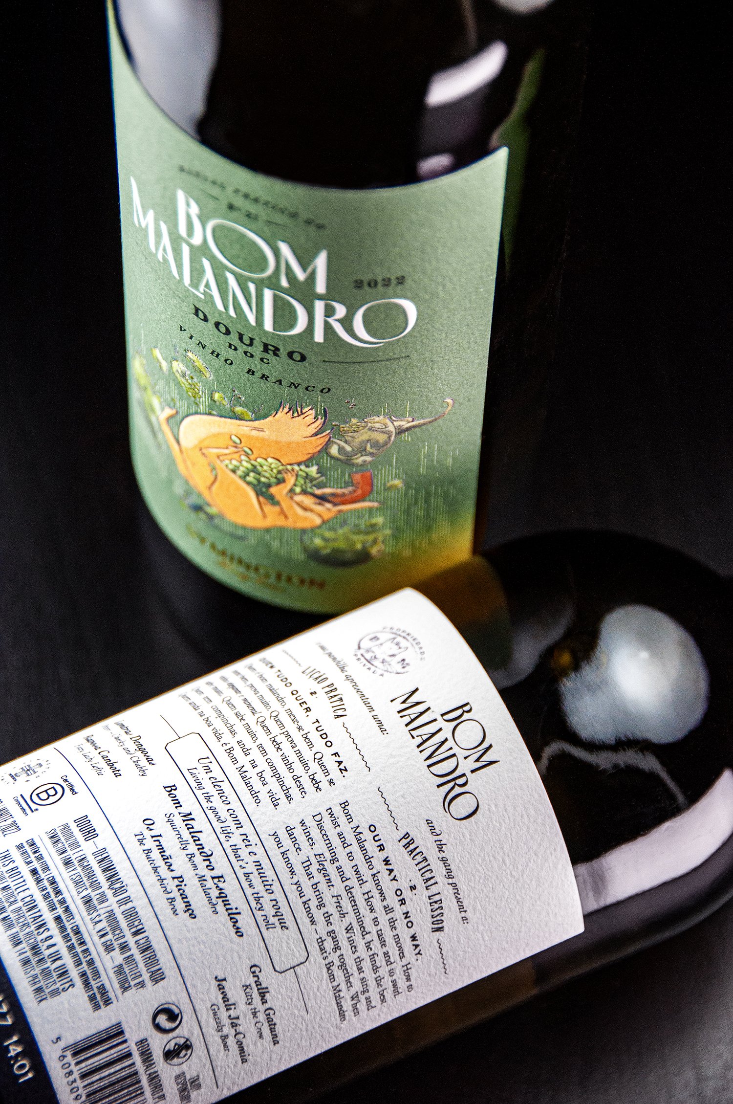
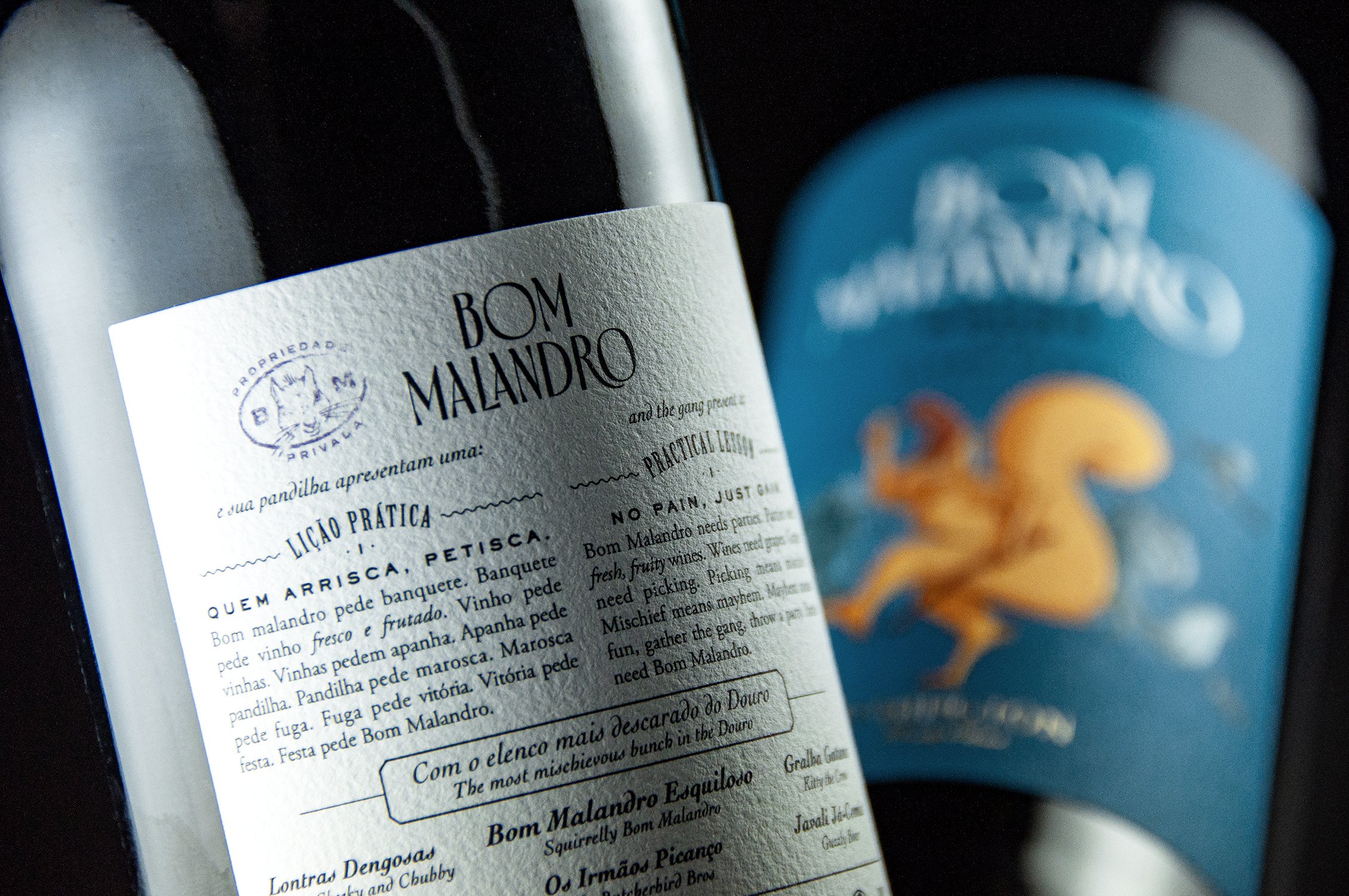
To expand the brand backstory and give a peek at what this practical guide actual teaches, the back label is used to feature a short lesson and our characters.
Brand philosophy:
In an age of political correctness like today, to live a good life one needs a dose of (good) trickery, a quality which is activated when we’re sitting at the table with friends, holding a glass of wine.