


CHALLENGE
The Augma Group, a collective of companies rooted in the pharmaceutical and healthcare sectors, was born from the well-established Quilaban company. It was founded by João Cordeiro, a legendary figure in the Portuguese pharmaceutical and pharmacy market and president of the National Association of Pharmacies for many years.
As the group grew in both scope and geography, expanding into multiple health-related areas across various countries, it faced a significant challenge: how to establish an autonomous brand identity that reflects its collective strength and future ambitions while preserving the deep emotional and historical ties to its origins.
In addition, the name Quilaban was being used as the group's name, which led to confusion among potential partners.
The task was clear—create a brand name and a brand that could embody the group’s new reality without severing the bonds to its past.

WORK
We undertook the branding challenge by crafting an identity that could serve both the utilitarian and symbolic needs of the Augma Group.

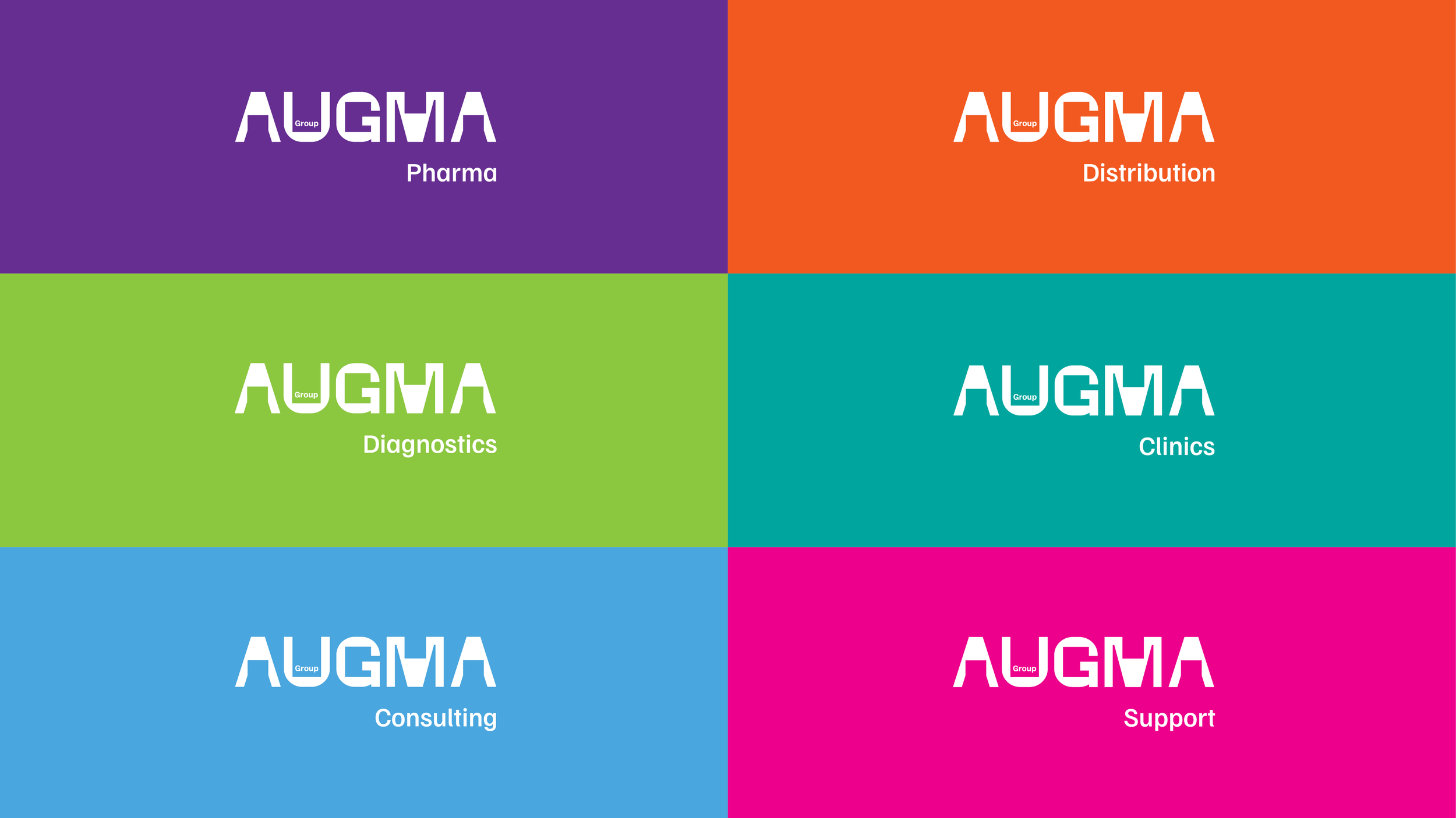
Brand Name: first we needed a powerful name. After a long development – creating brand names is always a daring and stormy process –, AUGMA was chosen, a fusion of an English word, “augment”, and a Portuguese word, “alma” (soul).
Brand Logotype Shape: a square forms the backbone of the logo, symbolizing the group’s unity and foundational strength. This square is subtly embedded in the design of each letter, providing an invisible yet impactful structure that reinforces the coherence across the group’s diverse companies.
Brand Personality: defined by a balance between order and disruption. The square's strict geometry allows for a vibrant and expansive visual universe that, even when fragmented, maintains a consistent and purposeful identity. This duality reflects the group's commitment to scientific precision and human-centered care.
Typography: played a crucial role in conveying the brand’s dual nature. The chosen typeface combines clean, precise lines with subtle, handcrafted cuts, marrying the scientific with the artisanal. This typographic approach mirrors the group's philosophy—combining rigorous science with a human touch.
Color Palette: a deliberate choice of neutral colors—black and white—was made to ensure the Augma brand identity remains strong and clear, allowing the various business areas and companies to shine in their own vibrant colors. This contrast underscores the brand’s role as a unifying force, amplifying the individuality of its component entities.
Brand Voice and Storytelling: emphasize empowerment and collaboration. The tagline "Empowering partners for health" encapsulates the brand’s mission, while the accompanying narrative stresses the importance of partnerships, reflecting the group's ethos of growth rooted in shared values and mutual support. Through careful listening, collaboration, and action, Augma Group positions itself as both a leader and a partner in the global health landscape, continually growing with its partners while staying true to its soulful origins.


FEEDBACK
“We would like to thank Wonder\Why for the extraordinary work carried out over three years that has led us to this brand that so sensitively captures the ambition and soul of our Group. The approach to our people to interpret and understand our essence was decisive for our success and very revealing of your incredible sensitivity and creativity.
Partnership, innovation and passion, trust and commitment are the values that mould our identity and of which we find an echo and harmony in our relationship with Wonder\Why on this journey of discovering the expression of our Augma Group identity. Thank you to Filipa Robalo, Ricardo Miranda and the WonderTeam for making this project an extraordinary discovery of the expression of our essence.”
Sérgio Luciano, CEO Augma Group
